Developers often make the same mistake after learning ARIA. They understand the concept, but they are unsure when and how to apply it in real projects.
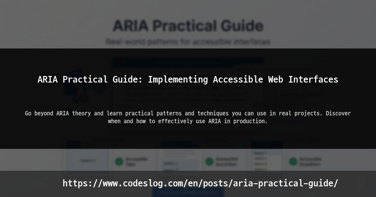
Cover image example: visual that symbolizes applying ARIA attributes · Generated by Nanobanana AI
You may have heard the phrase: “ARIA is a last resort.” Use semantic HTML first, and add ARIA only when native HTML is not enough. This guide follows that principle and shows how to use ARIA effectively in real work.
1. The Golden Rule of ARIA: When to Use It, When Not to#
1.1 When You Should NOT Use ARIA#
Many developers overuse ARIA. Start by checking cases where ARIA is unnecessary.
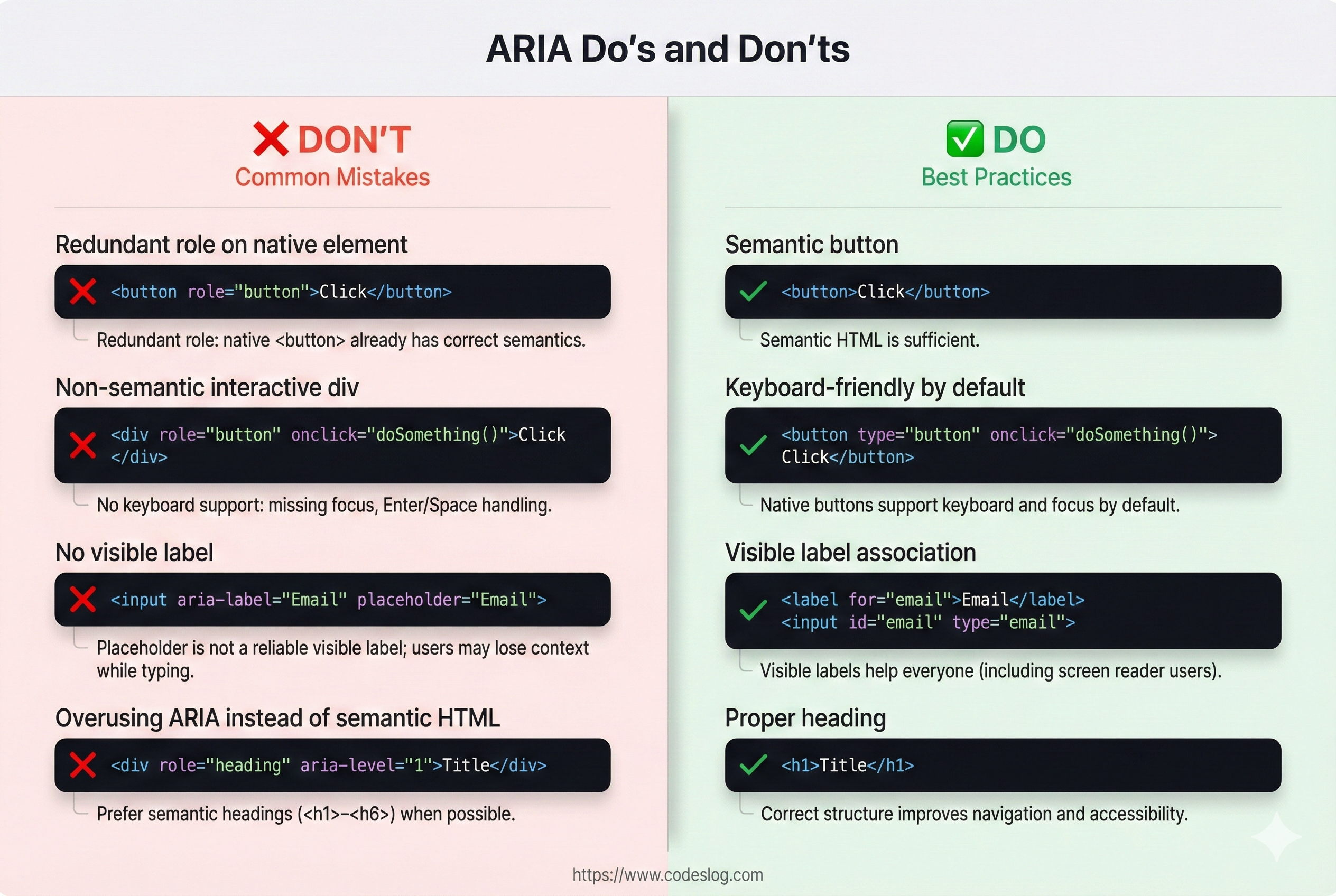
Before/after comparison of ARIA usage · Generated by Nanobanana AI
<!-- ❌ Bad: Unnecessary ARIA -->
<button role="button" aria-label="Click">Click</button>
<!-- <button> is already a button; role is redundant -->

<!-- ❌ Bad: ARIA used when semantic HTML exists -->
<div role="heading" aria-level="1">Title</div>
<!-- Use <h1>Title</h1> instead -->

<!-- ❌ Bad: aria-label when visible text already exists -->
<button aria-label="Save">
  <i class="icon-save"></i> Save
</button>
<!-- If visible text exists, aria-label is unnecessary -->

<!-- ✅ Good: No ARIA needed (semantic HTML is enough) -->
<button>Save</button>
<h1>Title</h1>
<form>
  <label for="email">Email</label>
  <input id="email" type="email">
</form>
Elements that are sufficient without ARIA:
- Button:
<button> - Link:
<a> - Form:
<form>,<input>,<textarea>,<select> - Headings:
<h1>~<h6> - Navigation:
<nav> - Main:
<main> - Article:
<article> - Section:
<section>
1.2 When You SHOULD Use ARIA#
ARIA is needed in cases like these:
- No semantic HTML exists: custom widgets or special UI
- Provide extra information: native HTML is not enough
- Announce state changes: dynamic updates for screen readers
<!-- ✅ Case 1: Custom widget -->
<div class="custom-tabs">
<div role="tablist">
<button role="tab" aria-selected="true" aria-controls="panel-1" tabindex="0">
Tab 1
</button>
<button role="tab" aria-selected="false" aria-controls="panel-2" tabindex="-1">
Tab 2
</button>
</div>
<div id="panel-1" role="tabpanel">Content 1</div>
<div id="panel-2" role="tabpanel" hidden>Content 2</div>
</div>
<!-- ✅ Case 2: Additional info -->
<button aria-label="Open chart">📊</button>
<!-- Icon-only button requires aria-label -->
<!-- ✅ Case 3: Announce state change -->
<span aria-live="polite" aria-atomic="true" id="notifications"></span>
<script>
// Add message after user action
document.getElementById('notifications').textContent = 'Saved.';
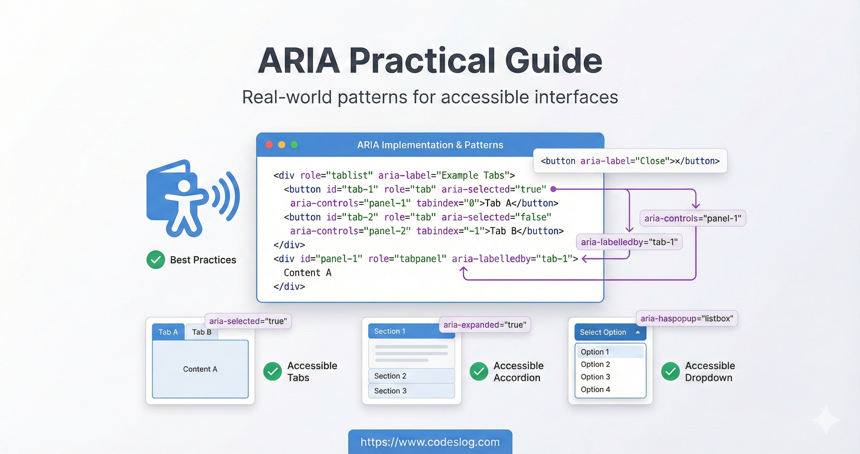
</script>2. Practical ARIA Patterns#
Hierarchy of ARIA role types · Generated by Nanobanana AI
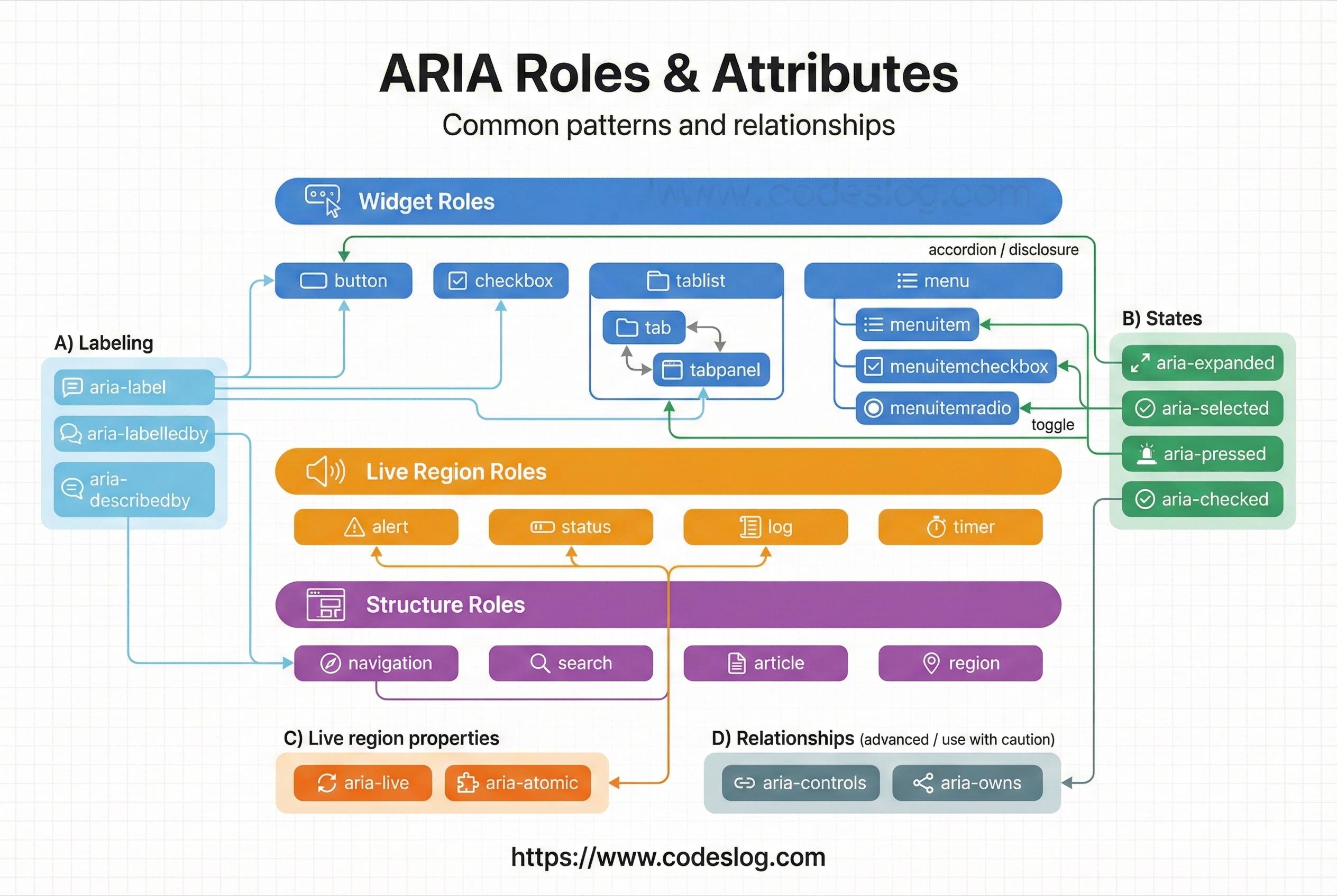
2.1 Labeling: aria-label vs aria-labelledby#
These attributes tell assistive technologies what an element is.
aria-labelis best when you need a short, direct label (icon buttons).aria-labelledbyis best when you can reference existing visible text, keeping visual and spoken labels aligned.
<!-- 1. aria-label: simple label -->
<button aria-label="Close">×</button>

<!-- 2. aria-labelledby: reference another element -->
<h2 id="dialog-title">User Settings</h2>
<div role="dialog" aria-labelledby="dialog-title">
  <!-- Dialog content -->
</div>

<!-- 3. Combine labels from multiple elements -->
<span id="search-label">Product search</span>
<span id="search-hint">(name, category)</span>
<input
  aria-labelledby="search-label search-hint"
  placeholder="Search"
>

<!-- 4. Visually hidden label -->
<style>
  .sr-only {
    position: absolute;
    width: 1px;
    height: 1px;
    padding: 0;
    margin: -1px;
    overflow: hidden;
    clip: rect(0, 0, 0, 0);
    border: 0;
  }
</style>

<button>
  <span class="sr-only">Back</span>
  ←
</button>
2.2 Descriptions and Hints: aria-describedby#
aria-describedby links supplementary information. Use it for hints, error messages, and extra context that should be read after the main label. Clear separation between label and description keeps information structured.
<!-- Additional help text -->
<label for="password">Password</label>
<input
  id="password"
  type="password"
  aria-describedby="pwd-requirements pwd-strength"
>
<div id="pwd-requirements" class="hint">
  Minimum 8 chars, include uppercase, numbers, and symbols (@, #, $)
</div>
<div id="pwd-strength" aria-live="polite">
  Strength: Weak
</div>

<!-- Complex image description -->
<img
  src="chart.png"
  alt="Monthly sales"
  aria-describedby="chart-desc"
>
<p id="chart-desc">
  Sales from January to December 2024.
  Peak in July at 15,000 units, lowest in February at 5,000.
</p>

<!-- Error message -->
<label for="email">Email</label>
<input id="email" type="email" aria-describedby="email-error">
<span id="email-error" role="alert">
  Please enter a valid email address.
</span>
2.3 States: aria-checked, aria-pressed, aria-current#
These attributes communicate current UI state to assistive technologies. The goal is to mirror what sighted users see (checked, pressed, current location, expanded). Native elements expose state automatically, so you usually manage these only for custom widgets.
<!-- 1. Checkbox/radio state -->
<label>
  <input type="checkbox">
  I agree to the terms
</label>

<!-- Native checkbox/radio already exposes state.
     Use aria-checked only for custom widgets. -->

<!-- 2. Toggle button state -->
<button
  aria-pressed="false"
  aria-label="Mute"
  id="mute-btn"
>
  🔊
</button>

<script>
  const muteBtn = document.getElementById('mute-btn');
  muteBtn.addEventListener('click', function() {
    const isPressed = this.getAttribute('aria-pressed') === 'true';
    this.setAttribute('aria-pressed', !isPressed);
    // Toggle mute logic
  });
</script>

<!-- 3. Current page in navigation -->
<nav>
  <a href="/products">Products</a>
  <a href="/blog" aria-current="page">Blog</a>
  <a href="/about">About</a>
</nav>

<!-- 4. Expand/collapse state -->
<button aria-expanded="false" aria-controls="submenu">
  Categories
</button>
<ul id="submenu" hidden>
  <li><a href="#">Submenu 1</a></li>
  <li><a href="#">Submenu 2</a></li>
</ul>

<script>
  document.querySelector('button').addEventListener('click', function() {
    const isExpanded = this.getAttribute('aria-expanded') === 'true';
    this.setAttribute('aria-expanded', !isExpanded);
    document.getElementById('submenu').hidden = isExpanded;
  });
</script>
Quick summary
aria-checked: expresses a selection/checked state. Use it for custom checkboxes, radios, and switches.aria-pressed: expresses on/off for toggle buttons.aria-current: indicates the current location, most often the current page in navigation.aria-expanded: communicates expanded/collapsed state for accordions, dropdowns, trees, etc.
3. Live Regions: Announcing Dynamic Updates#
Live regions inform screen reader users when content changes without a page refresh.
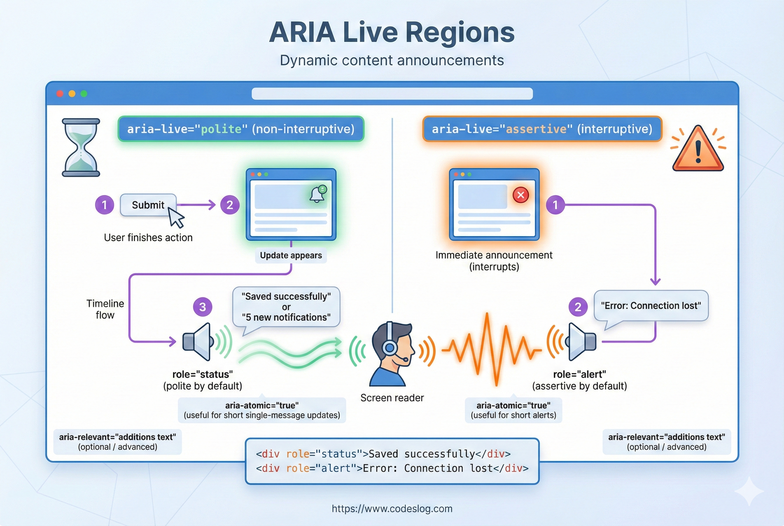
Live region announcement flow · Generated by Nanobanana AI
3.1 aria-live#
aria-live marks regions that should be announced automatically when they change. It’s essential for dynamic updates such as save confirmations, errors, or live search results. Use it only where necessary to avoid interrupting users too often.
<!-- 1. aria-live="polite" (default) -->
<!-- Announces after the user finishes the current task -->
<div id="notifications" aria-live="polite">
  <!-- Messages appear here -->
</div>

<!-- 2. aria-live="assertive" -->
<!-- Announces immediately (use for urgent alerts only) -->
<div id="error-alert" aria-live="assertive">
  <!-- Immediate error message -->
</div>

<!-- 3. aria-atomic="true" -->
<!-- Announces the whole region, not just the changed part -->
<div aria-live="polite" aria-atomic="true" id="search-results">
  <p>Results: 23</p>
  <ul>
    <li>Item 1</li>
    <li>Item 2</li>
  </ul>
</div>

<!-- 4. aria-relevant="additions text" -->
<!-- Control which changes are announced -->
<div aria-live="polite" aria-relevant="additions text">
  <!-- Only additions and text changes announced -->
</div>Tip: Use aria-live="assertive" only for urgent alerts (errors, security warnings). For most status updates, keep it polite to avoid interrupting users.
3.2 Example: Live Search#
Live search updates are obvious visually, but screen reader users won’t know results changed unless you announce them. Using role="status" or aria-live ensures they receive the same feedback.
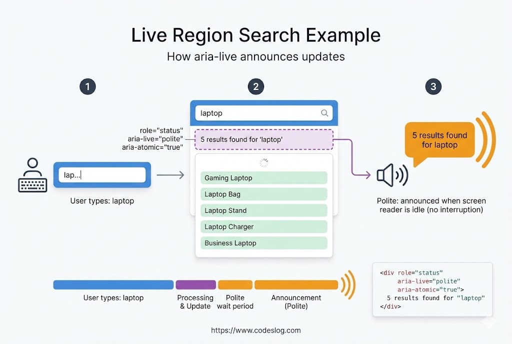
Live search announcement example · Generated by Nanobanana AI
<div class="search-container">
  <input
    id="search-input"
    type="text"
    placeholder="Search..."
    aria-describedby="search-help"
  >
  <span id="search-help" class="sr-only">
    Results update as you type.
  </span>
</div>

<!-- Live region for search results -->
<div
  id="search-results"
  role="status"
>
  <!-- Results appear here -->
</div>

<script>
  const input = document.getElementById('search-input');
  const resultsDiv = document.getElementById('search-results');

  input.addEventListener('input', function(e) {
    const query = e.target.value.trim();

    if (!query) {
      resultsDiv.innerHTML = '';
      return;
    }

    // API request (example)
    fetch(`/api/search?q=${query}`)
      .then(res => res.json())
      .then(data => {
        resultsDiv.innerHTML = `
          <p>
            Found ${data.count} results.
          </p>
          <ul>
            ${data.items.map(item => `<li>${item.name}</li>`).join('')}
          </ul>
        `;
      });
  });
</script>
4. Custom Widget Implementations#
Use ARIA when semantic HTML alone cannot cover complex UI.
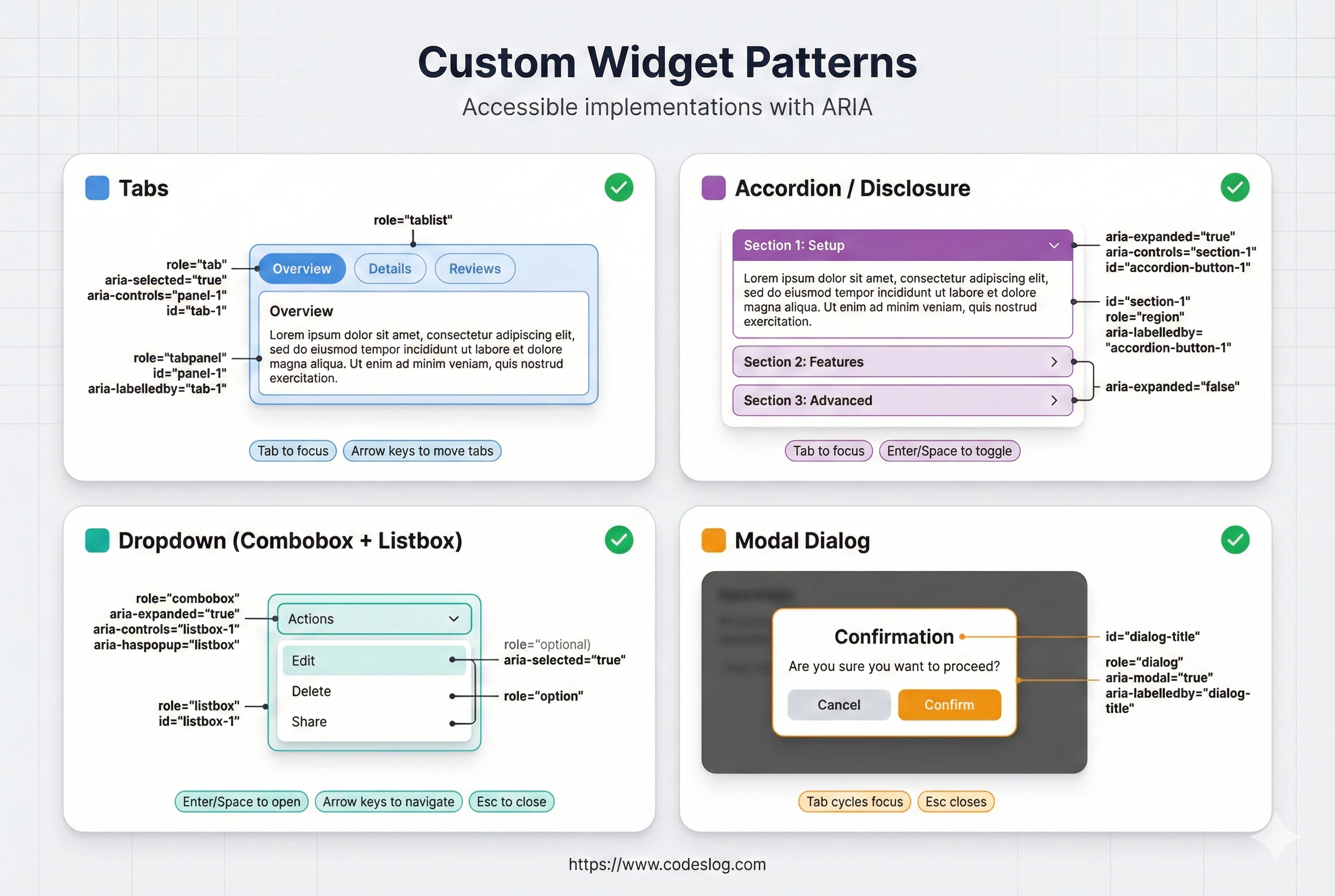
Summary of widget patterns (tabs/accordion/dropdown/modal) · Generated by Nanobanana AI
4.1 Tabs#
Tabs are a classic custom widget. The tablist/tab/tabpanel roles define structure, and keyboard rules (arrow keys, Home/End) are required for full accessibility.
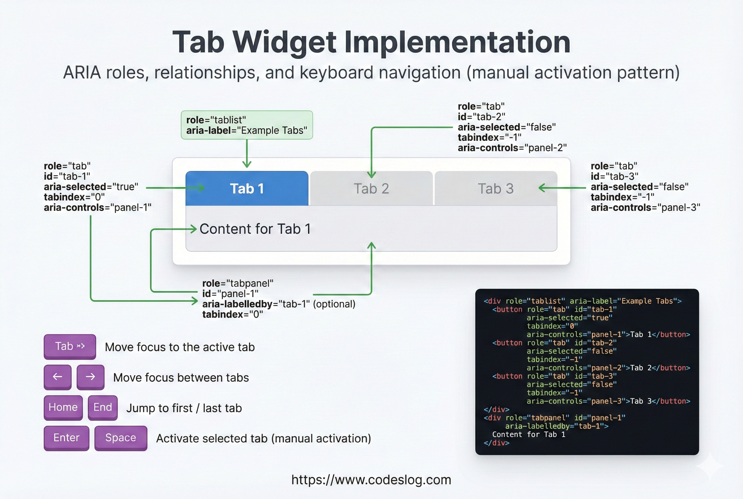
Tabs widget: role/aria wiring and keyboard flow · Generated by Nanobanana AI
<div class="tabs">
  <div role="tablist">
    <button
      role="tab"
      aria-selected="true"
      aria-controls="panel-1"
      tabindex="0"
      id="tab-1"
    >
      Basic Info
    </button>
    <button
      role="tab"
      aria-selected="false"
      aria-controls="panel-2"
      tabindex="-1"
      id="tab-2"
    >
      Details
    </button>
  </div>

  <div id="panel-1" role="tabpanel" aria-labelledby="tab-1">
    Basic info content
  </div>
  <div id="panel-2" role="tabpanel" aria-labelledby="tab-2" hidden>
    Detailed content
  </div>
</div>

<style>
  [role="tab"][aria-selected="false"] {
    opacity: 0.6;
  }
</style>

<script>
  const tabs = document.querySelectorAll('[role="tab"]');
  const panels = document.querySelectorAll('[role="tabpanel"]');

  tabs.forEach(tab => {
    tab.addEventListener('click', function() {
      // Deactivate all tabs
      tabs.forEach(t => {
        t.setAttribute('aria-selected', 'false');
        t.setAttribute('tabindex', '-1');
      });
      panels.forEach(p => p.hidden = true);

      // Activate clicked tab
      this.setAttribute('aria-selected', 'true');
      this.setAttribute('tabindex', '0');
      const panelId = this.getAttribute('aria-controls');
      document.getElementById(panelId).hidden = false;
    });

    // Keyboard navigation
    tab.addEventListener('keydown', function(e) {
      let nextTab;
      if (e.key === 'ArrowRight' || e.key === 'ArrowDown') {
        nextTab = this.nextElementSibling || tabs[0];
      } else if (e.key === 'ArrowLeft' || e.key === 'ArrowUp') {
        nextTab = this.previousElementSibling || tabs[tabs.length - 1];
      } else if (e.key === 'Home') {
        nextTab = tabs[0];
      } else if (e.key === 'End') {
        nextTab = tabs[tabs.length - 1];
      }

      if (nextTab) {
        e.preventDefault();
        nextTab.click();
        nextTab.setAttribute('tabindex', '0');
        this.setAttribute('tabindex', '-1');
        nextTab.focus();
      }
    });
  });
</script>
4.2 Accordion#
Accordions rely on clear expanded/collapsed state. Expose it with aria-expanded, and link headers to panels with role="region" and aria-labelledby so screen readers understand the structure.
<div class="accordion">
  <div class="accordion-item">
    <button
      aria-expanded="false"
      aria-controls="section-1"
      id="accordion-1"
      class="accordion-btn"
    >
      FAQ 1
    </button>
    <div
      id="section-1"
      role="region"
      aria-labelledby="accordion-1"
      hidden
      class="accordion-content"
    >
      <p>Answer 1</p>
    </div>
  </div>

  <div class="accordion-item">
    <button
      aria-expanded="false"
      aria-controls="section-2"
      id="accordion-2"
      class="accordion-btn"
    >
      FAQ 2
    </button>
    <div
      id="section-2"
      role="region"
      aria-labelledby="accordion-2"
      hidden
      class="accordion-content"
    >
      <p>Answer 2</p>
    </div>
  </div>
</div>

<style>
  .accordion-content {
    max-height: 0;
    overflow: hidden;
    transition: max-height 0.3s ease;
  }

  .accordion-content:not([hidden]) {
    max-height: 500px;
  }

  button[aria-expanded="true"]::after {
    content: '▼';
  }

  button[aria-expanded="false"]::after {
    content: '▶';
  }
</style>

<script>
  document.querySelectorAll('.accordion-btn').forEach(btn => {
    btn.addEventListener('click', function() {
      const isExpanded = this.getAttribute('aria-expanded') === 'true';
      this.setAttribute('aria-expanded', !isExpanded);
      document.getElementById(this.getAttribute('aria-controls')).hidden = isExpanded;
    });
  });
</script>
4.3 Dropdown Menu#
Dropdowns are typically a toggle button plus a list. For most navigation use cases, a simple button + ul is the safest pattern. Use complex menu roles only when the interaction truly matches application menus.
<div class="dropdown">
  <button
    id="menu-btn"
    aria-expanded="false"
    aria-controls="menu-list"
  >
    Menu
  </button>

  <ul id="menu-list" hidden aria-labelledby="menu-btn">
    <li><a href="#">Option 1</a></li>
    <li><a href="#">Option 2</a></li>
    <li><a href="#">Option 3</a></li>
  </ul>
</div>

<script>
  const btn = document.getElementById('menu-btn');
  const menu = document.getElementById('menu-list');
  const items = menu.querySelectorAll('a');

  btn.addEventListener('click', () => {
    const isExpanded = btn.getAttribute('aria-expanded') === 'true';
    btn.setAttribute('aria-expanded', !isExpanded);
    menu.hidden = isExpanded;

    if (!isExpanded) {
      items[0].focus();
    }
  });

  // Close on Escape
  menu.addEventListener('keydown', (e) => {
    if (e.key === 'Escape') {
      btn.click();
      btn.focus();
    }
  });

  // Close on outside click
  document.addEventListener('click', (e) => {
    if (!e.target.closest('.dropdown')) {
      menu.hidden = true;
      btn.setAttribute('aria-expanded', 'false');
    }
  });
</script>
5. Modal/Dialog Pattern#
Modals are all about focus management. Move focus into the dialog on open, and restore it on close. aria-modal="true" tells assistive tech that the dialog is the active interaction context.
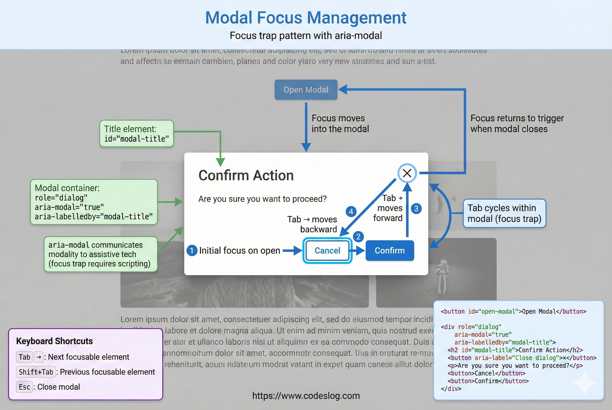
Modal focus management flow (open/close/restore) · Generated by Nanobanana AI
<button id="open-modal">Open modal</button>

<div
  id="modal"
  role="dialog"
  aria-labelledby="modal-title"
  aria-modal="true"
  hidden
>
  <div class="modal-content">
    <h2 id="modal-title">Important Info</h2>

    <p>This is modal content.</p>

    <button id="close-modal">Close</button>
  </div>
</div>

<style>
  #modal:not([hidden]) {
    display: flex;
    position: fixed;
    top: 0;
    left: 0;
    width: 100%;
    height: 100%;
    background: rgba(0, 0, 0, 0.5);
  }

  .modal-content {
    margin: auto;
    background: white;
    padding: 2rem;
    border-radius: 8px;
  }
</style>

<script>
  const modal = document.getElementById('modal');
  const openBtn = document.getElementById('open-modal');
  const closeBtn = document.getElementById('close-modal');
  let previousFocus = null;

  openBtn.addEventListener('click', () => {
    previousFocus = document.activeElement;
    modal.hidden = false;
    // Inert everything except the modal
    const siblings = Array.from(document.body.children).filter(el => el !== modal);
    siblings.forEach(el => (el.inert = true));

    // Move focus into the modal
    const focusableElements = modal.querySelectorAll(
      'button, [href], input, select, textarea, [tabindex]:not([tabindex="-1"])'
    );
    focusableElements[0]?.focus();

    // Focus trap inside modal
    focusableElements[focusableElements.length - 1].addEventListener('keydown', (e) => {
      if (e.key === 'Tab' && !e.shiftKey) {
        e.preventDefault();
        focusableElements[0].focus();
      }
    });

    focusableElements[0].addEventListener('keydown', (e) => {
      if (e.key === 'Tab' && e.shiftKey) {
        e.preventDefault();
        focusableElements[focusableElements.length - 1].focus();
      }
    });
  });

  closeBtn.addEventListener('click', () => {
    modal.hidden = true;
    const siblings = Array.from(document.body.children).filter(el => el !== modal);
    siblings.forEach(el => (el.inert = false));
    previousFocus?.focus();
  });

  // Close on Escape
  document.addEventListener('keydown', (e) => {
    if (e.key === 'Escape' && !modal.hidden) {
      closeBtn.click();
    }
  });
</script>
6. ARIA Validation#
6.1 Common ARIA Mistakes#
ARIA is powerful, but misuse can reduce accessibility. These are the most common real-world pitfalls to watch for during implementation and review.
<!-- ❌ Mistake 1: Misusing roles -->
<div role="button" onclick="alert('Click')">Click me</div>
<!-- Issue: no keyboard focus, no keyboard activation -->

<!-- ✅ Correct -->
<button onclick="alert('Click')">Click me</button>

<!-- ❌ Mistake 2: aria-label without a visible label -->
<input aria-label="Search" placeholder="Search">
<!-- Issue: visible users see no label, assistive tech gets a label -->

<!-- ✅ Correct -->
<label for="search">Search</label>
<input id="search" placeholder="Search">

<!-- ❌ Mistake 3: Overusing live regions -->
<div aria-live="assertive" id="log">
  Log messages...
</div>
<!-- Issue: announces everything, can be noisy -->

<!-- ✅ Correct -->
<div aria-live="polite" aria-atomic="false" id="notification">
  <!-- Only latest message -->
</div>

<!-- ❌ Mistake 4: Inconsistent tabindex in tabs -->
<div role="tablist">
  <div role="tab" tabindex="0">First</div>
  <div role="tab">Second</div> <!-- missing tabindex -->
  <div role="tab" tabindex="0">Third</div>
</div>
<!-- Issue: inconsistent focus order -->

<!-- ✅ Correct: only first tab is 0, others are -1 -->
<div role="tablist">
  <div role="tab" tabindex="0">First</div>
  <div role="tab" tabindex="-1">Second</div>
  <div role="tab" tabindex="-1">Third</div>
</div>
6.2 ARIA Validation Checklist#
When to use ARIA
- Is semantic HTML insufficient?
- Is this a custom widget?
- Is this information important for screen readers?
When using ARIA
- Did you set role, aria-label/labelledby, aria-describedby?
- Does keyboard navigation work?
- Do aria-* states reflect changes?
- Is focus managed properly? (e.g., on modal open)
- Are live regions used sparingly?
Testing
- Screen readers (NVDA, JAWS, VoiceOver)
- Keyboard-only navigation
- axe DevTools, Lighthouse
- Compare to WAI-ARIA Authoring Practices
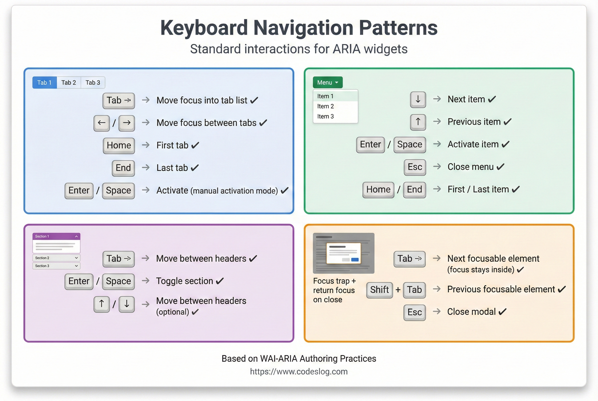
7. ARIA Tips and Best Practices#
Keyboard shortcuts by widget type · Generated by Nanobanana AI
7.1 Role Tips#
Roles add meaning to elements that lack semantics. Avoid duplicating roles on native elements; use roles only when needed.
<!-- 1. Avoid duplicating roles on native elements -->
<button>Good</button>
<div role="button">Use only when needed</div>

<!-- 2. Prefer changing elements over changing roles -->
<!-- ❌ Not good -->
<div id="button" role="button">Click</div>
<script>
  document.getElementById('button').setAttribute('role', 'link');
</script>

<!-- ✅ Good -->
<button>Click</button>

<!-- 3. Explicitly define composite roles -->
<div role="tablist">
  <div role="tab">Tab 1</div>
  <div role="tabpanel">Content 1</div>
</div>
7.2 ARIA and CSS#
Styling based on ARIA state keeps visual feedback aligned with accessibility state. For example, changing color when aria-pressed="true" makes the UI consistent for everyone.
/* Style based on ARIA state */
button[aria-pressed="true"] {
  background-color: #4A90E2;
  color: white;
}

button[aria-pressed="false"] {
  background-color: #f0f0f0;
  color: #333;
}

/* Focus indicators */
[role="button"]:focus {
  outline: 3px solid #4A90E2;
  outline-offset: 2px;
}

/* Optional: visualize live regions */
[aria-live="polite"] {
  border-left: 3px solid #27AE60;
  padding-left: 0.5rem;
}

/* Hidden panels */
[role="tabpanel"][hidden] {
  display: none;
}
7.3 Performance Considerations#
Live regions can be noisy and expensive if overused. Batch updates where possible and keep only the latest status to reduce cognitive and performance overhead.
// ❌ Bad: append each update individually
const notifications = document.getElementById('notifications');
for (let i = 0; i < 1000; i++) {
  notifications.innerHTML += `<p>Notification ${i}</p>`;
}

// ✅ Good: batch updates
const notifications = document.getElementById('notifications');
const fragment = document.createDocumentFragment();
for (let i = 0; i < 1000; i++) {
  const p = document.createElement('p');
  p.textContent = `Notification ${i}`;
  fragment.appendChild(p);
}
notifications.appendChild(fragment);

// ✅ Good: keep only the latest message
const notification = document.getElementById('notification');
function showNotification(message) {
  notification.innerHTML = message;
  setTimeout(() => {
    notification.innerHTML = '';
  }, 5000);
}
8. ARIA in Real Projects#
8.1 Libraries and Frameworks#
Many modern frameworks include ARIA support:
// React example
function Tabs() {
  const [selected, setSelected] = useState(0);

  return (
    <div role="tablist">
      {tabs.map((tab, i) => (
        <button
          key={i}
          role="tab"
          aria-selected={i === selected}
          aria-controls={`panel-${i}`}
          onClick={() => setSelected(i)}
        >
          {tab.label}
        </button>
      ))}
      {tabs.map((tab, i) => (
        <div
          key={i}
          id={`panel-${i}`}
          role="tabpanel"
          aria-labelledby={`tab-${i}`}
          hidden={i !== selected}
        >
          {tab.content}
        </div>
      ))}
    </div>
  );
}
8.2 ARIA Pattern Library#
The WAI-ARIA Authoring Practices is the official pattern library. Use proven patterns instead of reinventing the wheel:
- Buttons, links
- Form inputs
- Navigation
- Tabs, accordions, menus
- Dialogs, alerts
- Grids, tables
Conclusion#
ARIA is powerful, but it must be used responsibly. Remember:
- Use semantic HTML first: leverage native elements
- Add ARIA only when needed: keep it minimal
- Keyboard navigation is required: everything must work without a mouse
- Test with screen readers: verify real experience
- Manage focus and state: communicate dynamic changes
Accessible interfaces improve the experience for everyone. When you use ARIA correctly, both assistive tech users and all other users benefit.