Introduction#
“We used red and green to distinguish them, so it should be fine.”
It’s a thought that comes up naturally during development. But more people than you’d expect have difficulty telling those two colors apart. Statistics based on Northern European ancestry suggest that roughly 1 in 12 men and 1 in 200 women have red-green color vision deficiency. The exact ratio varies by region and genetic background, but the fact remains: there are always users who struggle to distinguish red from green.
And that’s not the whole picture. Users with low vision, older users, and anyone viewing a screen in bright sunlight are also affected by color contrast.
Color accessibility isn’t just about “making things visible for people with color blindness.” It’s about designing so that all users can clearly perceive information — and that color is never the only means of conveying that information.
In this post, we’ll cover everything from the theory behind color accessibility to practical tips and testing tools. We’ll also look at how to navigate this topic when working with designers.
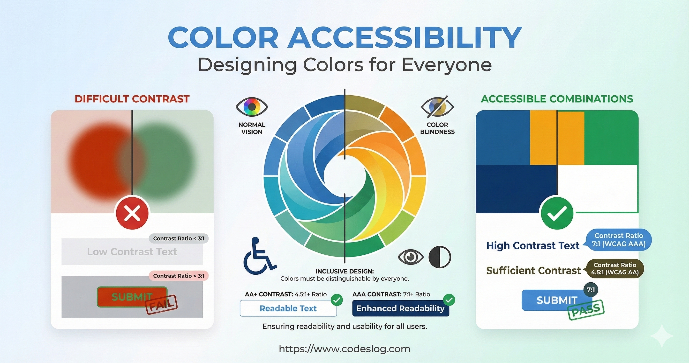
Image: Nanobanana
Image: Nanobanana
What Is Color Accessibility?#
Definition#
Color accessibility is the design principle of ensuring that all users — regardless of how they perceive color — can accurately understand the information on a website.
This includes:
- Users with color vision deficiency: People who have difficulty distinguishing certain colors
- Users with low vision: People who can’t read text when contrast is too low
- Older users: People whose ability to distinguish colors naturally diminishes with age
- Environmental constraints: Users viewing screens in bright sunlight or on low-quality monitors
Standards and Requirements#
Color accessibility is explicitly addressed in WCAG 2.2:
- SC 1.4.3 (Contrast Minimum): 4.5:1 for normal text, 3:1 for large text
- SC 1.4.6 (Contrast Enhanced): AAA level — 7:1 / 4.5:1
- SC 1.4.11 (Non-text Contrast): At least 3:1 for non-text elements such as icons, input fields, and focus indicators
- SC 2.4.11 / 2.4.12: Ensure focus indicators aren’t obscured by other elements
- SC 2.4.13 (Focus Appearance, AAA): Defines size and contrast requirements for focus indicators
Since many organizations and regulations reference WCAG 2.x, understanding these criteria makes real-world implementation much smoother.
The Business Case for Inclusivity#
Color accessibility isn’t just a legal obligation:
- More users can accurately read and understand information
- Better search optimization (clearer color contrast improves text readability)
- Brand reputation (being known as an accessible company)
- Improved usability (everyone reads more easily)
Understanding Color Vision Deficiency#
Types of Color Vision Deficiency#
1. Protanomaly: Reds appear grayish
- Reduced sensitivity to red wavelengths
2. Protanopia: Complete inability to see red
- The world appears in shades of blue and yellow only
3. Deuteranomaly: Greens appear grayish
- The most common type
4. Deuteranopia: Complete inability to see green
5. Tritanomaly / Tritanopia: Difficulty distinguishing blue and yellow
- A very rare type
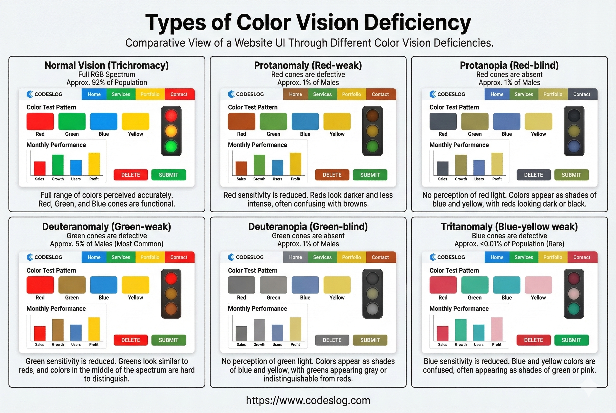
Image: Nanobanana
Luminance Contrast#
WCAG Criteria#
WCAG 2.2 defines luminance contrast between text and background in numeric terms:
| Level | Normal Text | Large Text |
|---|---|---|
| A | (no requirement) | (no requirement) |
| AA | 4.5:1 | 3:1 |
| AAA | 7:1 | 4.5:1 |
Definition of large text:
- 18pt or larger, or
- 14pt or larger and bold (weight 700+)
Additional checks (WCAG 2.2):
- Non-text contrast (SC 1.4.11): Maintain at least 3:1 contrast for non-text elements like icons, borders, and input fields.
- Focus not obscured (SC 2.4.11/2.4.12): Ensure focus indicators aren’t hidden behind other UI elements.
- Focus appearance (SC 2.4.13, AAA): Defines size and contrast requirements for focus indicators. (Refer to this if targeting a higher conformance level.)
Calculating Luminance#
// Formula for converting RGB to luminance (WCAG)
function getLuminance(r, g, b) {
  // Normalize from 0-255 to 0-1
  r = r / 255;
  g = g / 255;
  b = b / 255;

  // Gamma correction
  if (r <= 0.03928) {
    r = r / 12.92;
  } else {
    r = Math.pow((r + 0.055) / 1.055, 2.4);
  }

  if (g <= 0.03928) {
    g = g / 12.92;
  } else {
    g = Math.pow((g + 0.055) / 1.055, 2.4);
  }

  if (b <= 0.03928) {
    b = b / 12.92;
  } else {
    b = Math.pow((b + 0.055) / 1.055, 2.4);
  }

  return 0.2126 * r + 0.7152 * g + 0.0722 * b;
}

function getContrast(foreground, background) {
  const l1 = getLuminance(...foreground); // RGB array
  const l2 = getLuminance(...background);

  const lighter = Math.max(l1, l2);
  const darker = Math.min(l1, l2);

  return (lighter + 0.05) / (darker + 0.05);
}

// Example: black text #000000 vs white background #FFFFFF
const contrast = getContrast([0, 0, 0], [255, 255, 255]);
console.log(contrast); // 21 (excellent!)
Practical Contrast Combinations#
Always check these:
/* ✅ Good — 4.5:1 or higher */
.good-contrast {
  color: #000000;        /* black */
  background: #FFFFFF;   /* white */
  /* contrast: 21:1 */
}

/* ❌ Bad — below 3:1 */
.bad-contrast {
  color: #777777;        /* gray */
  background: #CCCCCC;   /* light gray */
  /* contrast: ~2.79:1 */
}

/* ✅ Dark mode example */
@media (prefers-color-scheme: dark) {
  body {
    color: #EEEEEE;      /* light gray text */
    background: #1a1a1a; /* dark background */
    /* contrast: ~15:1 */
  }
}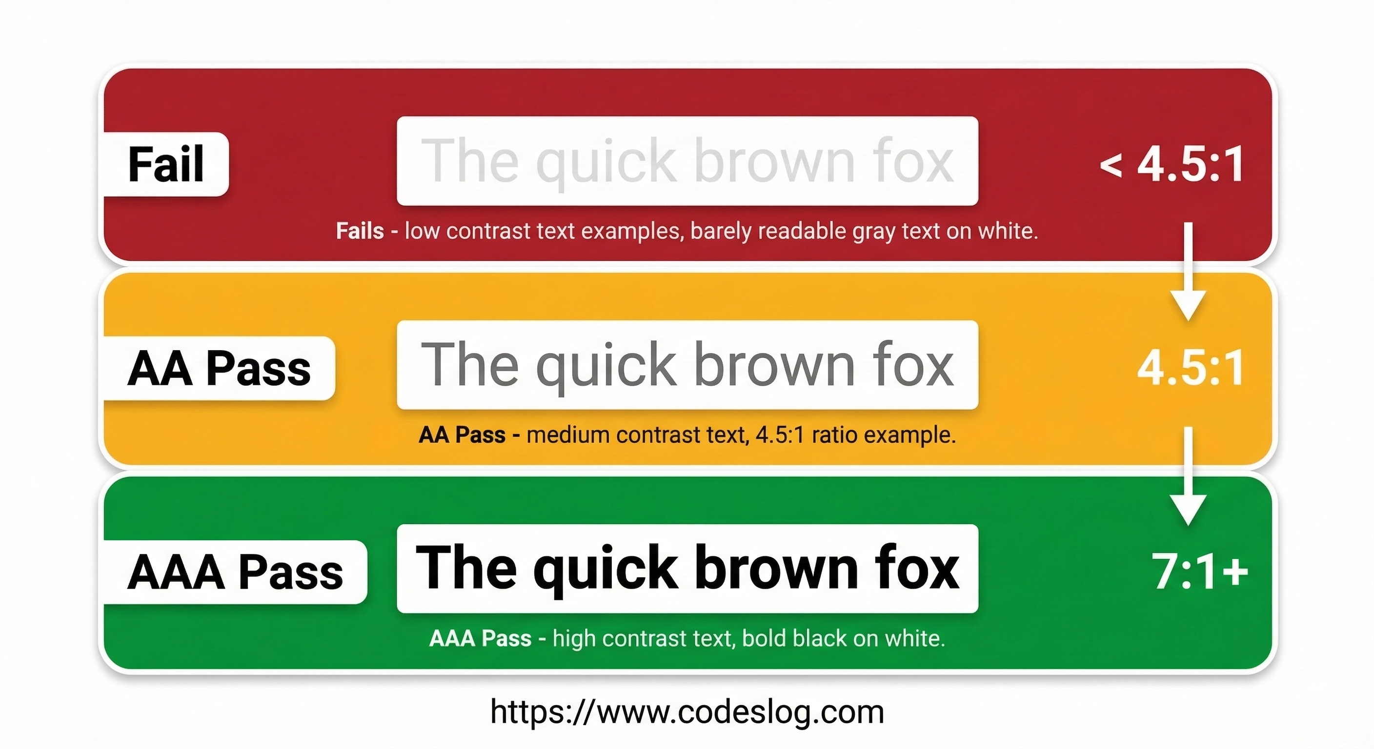
Image: Nanobanana
Testing with Tools#
- WebAIM Contrast Checker: https://webaim.org/resources/contrastchecker/
- Chrome DevTools: Elements > Inspect > Color picker
- Contrast Ratio website: https://contrast-ratio.com/
Don’t Convey Information Through Color Alone#
The Problem#
<!-- ❌ Bad example -->
<div>
  <span style="color: red">Error</span>
  <span style="color: green">Success</span>
</div>

<!-- Users with color vision deficiency may see both as the same color -->Solutions#
<!-- ✅ Good example 1: include text labels -->
<div>
  <span style="color: red">❌ Error</span>
  <span style="color: green">✅ Success</span>
</div>

<!-- ✅ Good example 2: icon + text -->
<div>
  <span style="color: red" aria-label="Error">
    <i class="icon-error"></i> Error message
  </span>
</div>

<!-- ✅ Good example 3: use patterns -->
<svg width="100" height="100">
  <!-- red + diagonal pattern -->
  <rect fill="red" width="50" height="50"/>
  <pattern id="diag" patternUnits="userSpaceOnUse" width="8" height="8">
    <path d="M0,8 l8,-8 M-2,2 l4,-4 M6,10 l4,-4" stroke="black" stroke-width="1"/>
  </pattern>
  <rect fill="url(#diag)" width="50" height="50"/>
</svg>
Form Validation Example#
<!-- ❌ Color only -->
<input type="email" style="border: 2px solid red;">

<!-- ✅ Color + icon + message -->
<div class="form-group">
  <input
    type="email"
    class="form-input has-error"
    aria-describedby="email-error">
  <svg class="error-icon" aria-hidden="true">
    <use xlink:href="#icon-error"></use>
  </svg>
  <p id="email-error" class="error-message">
    Please enter a valid email address
  </p>
</div>.form-input.has-error {
border: 2px solid #d32f2f; /* red */
background-color: #ffebee; /* light red */
}
.error-icon {
color: #d32f2f; /* red */
}
.error-message {
color: #d32f2f;
/* clearly describes the problem in text */
}Color Selection Guide#
Step 1: Design in Grayscale First#
/* Design in black and white before adding color */
body {
  color: #333333; /* dark gray text */
  background: #ffffff; /* white background */
}

/* Already at 4.5:1 or better at this point */
Step 2: Add Color#
/* Add color while maintaining luminance */
.primary {
  color: #0962db; /* blue — luminance maintained */
  background: #ffffff;
  /* luminance contrast: ~5.6:1 */
}

.secondary {
  color: #1e7e34; /* green — luminance maintained */
  background: #ffffff;
  /* luminance contrast: ~5.1:1 */
}
Step 3: Test with Color Blindness Simulation#
// Color transformation for Deuteranopia (green blindness)
function simulateDeuteranopia(rgb) {
  const [r, g, b] = rgb;
  return [
    0.625 * r + 0.375 * g,
    0.7 * r + 0.3 * g,
    b
  ];
}

// Test
const primary = [9, 98, 219]; // blue #0962db
const simulated = simulateDeuteranopia(primary);
// Result: [42, 36, 219] — blue looks slightly different but still distinguishable
// Note: Accurate color blindness simulation requires LMS color space conversion. This function is an educational approximation.
Recommended Color Palette#
/* Example palette (designed to meet AA or better) */

/* Gray tones */
:root {
  --gray-900: #111827; /* near black */
  --gray-700: #374151; /* dark gray */
  --gray-500: #6b7280; /* mid gray */
  --gray-100: #f3f4f6; /* light gray */
  --gray-50: #f9fafb;  /* near white */
}

/* Functional colors (re-verify contrast based on usage context) */
:root {
  --success: #065f46;   /* dark green */
  --danger: #7f1d1d;    /* dark red */
  --warning: #92400e;   /* dark amber */
  --info: #0c4a6e;      /* dark blue */
}

/* Used on white backgrounds */
.success { color: var(--success); background: white; }
.danger { color: var(--danger); background: white; }
.warning { color: var(--warning); background: white; }
.info { color: var(--info); background: white; }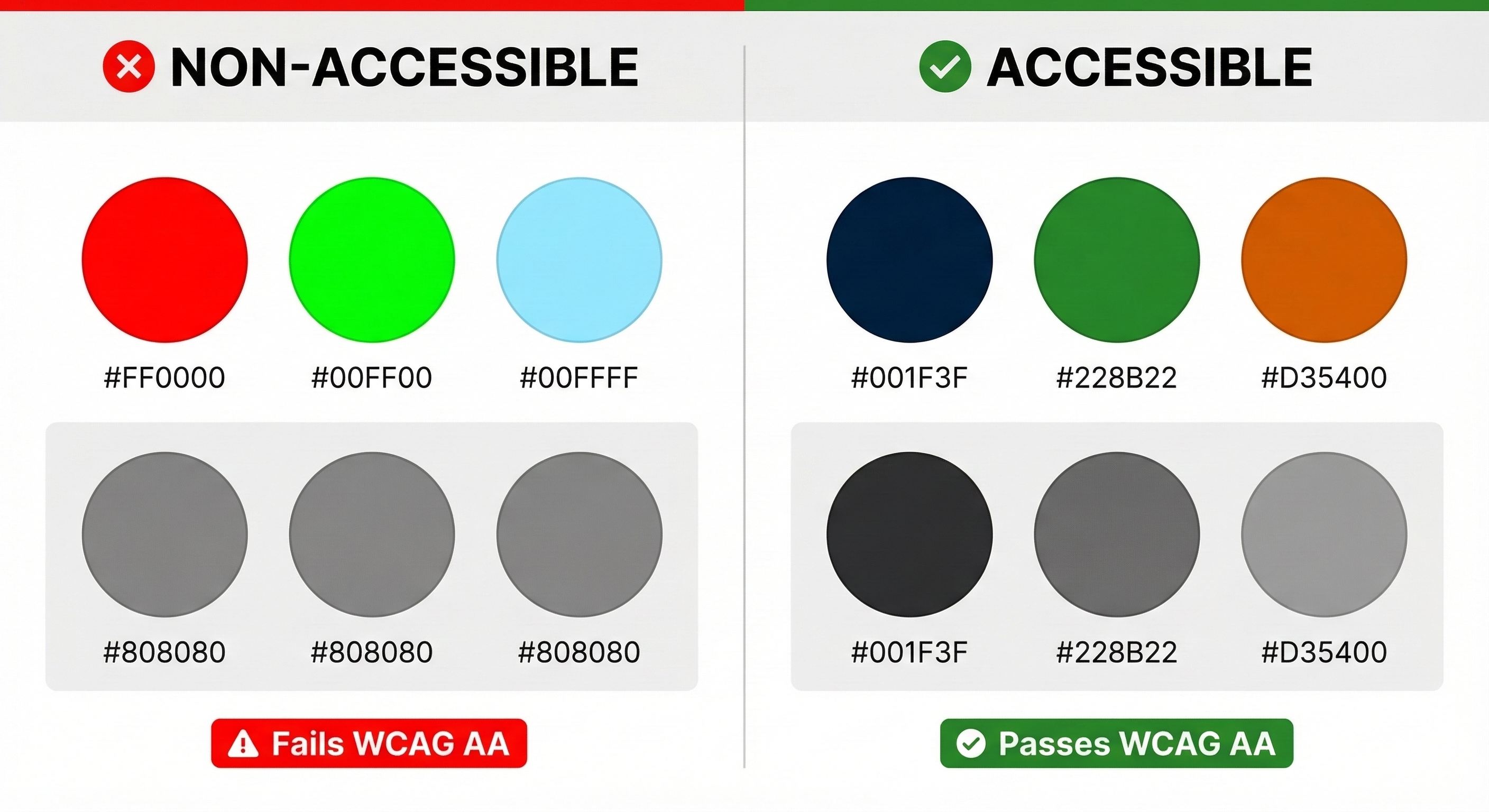
Image: Nanobanana
A Common Scenario: “That’s Our Brand Color”#
Working with designers, you’ll eventually run into this moment.
“That color comes from our logo, so it’s hard to change. It’s already in the brand guide, and we’ve aligned it with the marketing team.”
That’s a reply you might get after raising a color contrast issue. Sound familiar?
Brand colors are often the result of a long decision-making process. From a designer’s perspective, “let’s change this for accessibility” can feel less like a simple fix and more like a challenge to the brand’s identity.
Let’s Look at a Concrete Scenario#
The button text color is the brand blue #4B9DFF, and the background is white (#FFFFFF).
Background: #FFFFFF (white)
Text:       #4B9DFF (light blue)
Contrast:   ~3.0:1 → AA fail (requires 4.5:1 for normal text)
Saying “this color doesn’t work” tends to shut down the conversation. Instead, this step-by-step approach works much better.
Step 1: Look at the data together
Open WebAIM Contrast Checker or Chrome DevTools with the designer and check the actual numbers together. An approach like “I’m not raising this because of a rule — could we take a look at how this color appears to users with low vision?” tends to land much better.
Step 2: Offer alternatives
“This color won’t work” closes doors. “Here’s how we can keep the brand feel and still meet the requirement” opens them.
/* Current brand color — AA fail */
.btn {
  color: #4B9DFF;  /* contrast: ~3.0:1 ❌ */
  background: #FFFFFF;
}

/* Option 1: Same hue, darker shade */
.btn {
  color: #0062D1;  /* contrast: ~5.1:1 ✅ */
  background: #FFFFFF;
}

/* Option 2: Invert background and text */
.btn {
  color: #FFFFFF;
  background: #0062D1;  /* contrast: ~5.1:1 ✅ */
}
Adjusting saturation and lightness within the same blue family often lets you meet WCAG AA without significantly compromising brand identity.
Step 3: Document the agreement
Whatever you agree on, it’s worth recording it in the design system or brand guide as “accessibility-aware color usage rules.” That way you don’t have to have the same conversation again next time.
Sometimes Persuasion Isn’t Easy#
Practical constraints can get in the way. “Changing the brand guidelines requires executive approval.” “This color has already gone to print.” Those situations exist.
When that happens, there are techniques practitioners commonly use — ways to improve readability while keeping the brand color intact.
Option 1: text-shadow for an outline effect (great for image or gradient backgrounds)
This is the most common approach when light-colored text sits on a complex background. You’ll see this pattern on map labels and hero section titles.
.hero-title {
  color: #4B9DFF; /* brand blue */
  /* dark outline to secure contrast against the background */
  text-shadow:
    -1px -1px 0 rgba(0, 30, 80, 0.85),
     1px -1px 0 rgba(0, 30, 80, 0.85),
    -1px  1px 0 rgba(0, 30, 80, 0.85),
     1px  1px 0 rgba(0, 30, 80, 0.85);
}
One caveat: text-shadow isn’t factored into WCAG luminance contrast calculations. Automated tools may still flag it as a failure, but actual readability for users improves significantly. It’s worth evaluating real-world usability alongside tool scores.
Option 2: text-stroke + paint-order (great for headings and display text)
Modern CSS lets you add a stroke to text. Using paint-order together ensures the stroke doesn’t bleed into the text fill.
.display-heading {
  color: #4B9DFF; /* brand blue */
  -webkit-text-stroke: 3px #003380; /* dark blue stroke */
  paint-order: stroke fill; /* render stroke beneath fill */
}
This works better at larger font sizes. It can look awkward on body text, so keep it for large headings and emphasis elements.
Option 3: Text background chip (great for UI components and badges)
Keep the brand color on decorative elements (borders, icons) and give the text its own background to ensure contrast. This is the most reliable approach and still meets WCAG requirements.
.tag {
  /* brand color kept as border */
  border: 2px solid #4B9DFF;
  border-radius: 4px;

  /* text with sufficient contrast */
  color: #003380;        /* dark blue: ~10:1 contrast on white ✅ */
  background: #FFFFFF;
  padding: 4px 10px;
}

/* or white text on brand color background */
.tag-filled {
  background: #4B9DFF;
  color: #FFFFFF;
  /* contrast: ~3.0:1 → meets large text threshold, not quite enough for body text */
  /* setting font to 14pt bold or larger passes AA */
  font-size: 1rem;
  font-weight: 700;
}
Option 4: Semi-transparent scrim (great for text over images)
When text sits on top of a photo or gradient background, add a semi-transparent layer between the background and the text.
.card-text-area {
  /* semi-transparent dark background behind text */
  background: linear-gradient(
    to top,
    rgba(0, 0, 0, 0.75) 0%,
    rgba(0, 0, 0, 0) 100%
  );
  padding: 24px 16px 16px;
}

.card-title {
  color: #FFFFFF; /* white text */
  /* sufficient contrast thanks to the scrim */
}
Whatever approach you use, it’s worth keeping one thing in mind: even if an automated tool flags something as a failure, if real users can read it comfortably, that’s still an improvement. Accessibility isn’t “perfect or nothing.” You start where you can.
In Practice: Dark Mode and Color#
Contrast Issues in Dark Mode#
/* ❌ Using light mode colors unchanged in dark mode */
@media (prefers-color-scheme: dark) {
  body {
    background: #1a1a1a;
    color: #0066cc; /* blue from light mode */
    /* contrast: ~3.1:1 — not enough for normal text */
  }
}

/* ✅ Adjusted for dark mode */
@media (prefers-color-scheme: dark) {
  body {
    background: #1a1a1a;
    color: #66b2ff; /* lighter blue */
    /* contrast: ~7.8:1 — sufficient */
  }
}
Managing Colors with Theme Variables#
:root {
  /* Light mode */
  --text-primary: #111827;
  --text-secondary: #6b7280;
  --background-primary: #ffffff;
  --background-secondary: #f3f4f6;

  --accent-primary: #0962db;
  --accent-danger: #7f1d1d;
}

@media (prefers-color-scheme: dark) {
  :root {
    /* Dark mode — adjusted for luminance */
    --text-primary: #f3f4f6;
    --text-secondary: #d1d5db;
    --background-primary: #1a1a1a;
    --background-secondary: #374151;

    --accent-primary: #66b2ff;
    --accent-danger: #fca5a5;
  }
}

body {
  color: var(--text-primary);
  background: var(--background-primary);
}

.button-primary {
  color: white;
  background: var(--accent-primary);
}
Testing and Auditing#
Manual Audit Checklist#
## Color Accessibility Checklist

### Luminance Contrast
- [ ] Is text-to-background contrast 4.5:1 or higher?
- [ ] Is large text (18pt+) at least 3:1?
- [ ] Have you checked button-to-background contrast too?

### Color Dependency
- [ ] Is information conveyed without relying on color alone?
- [ ] Can elements be distinguished by shape, pattern, or text?
- [ ] Are error messages expressed with both color and text?

### Color Blindness Testing
- [ ] Have you run the page through a color blindness simulator?
- [ ] Does any key information rely on distinguishing red from green?
- [ ] Have you tested other color combinations too?

### Dark Mode
- [ ] Is contrast still sufficient in dark mode?
- [ ] Are colors adjusted automatically?
Automated Tools#
// axe DevTools audit (browser extension)
// https://www.deque.com/axe/devtools/

// or programmatically
async function checkContrast() {
  const { axe } = window;
  const results = await axe.run({
    rules: ['color-contrast']
  });

  results.violations.forEach(violation => {
    console.log('Color contrast issue:', violation);
  });
}
Recommended Tools#
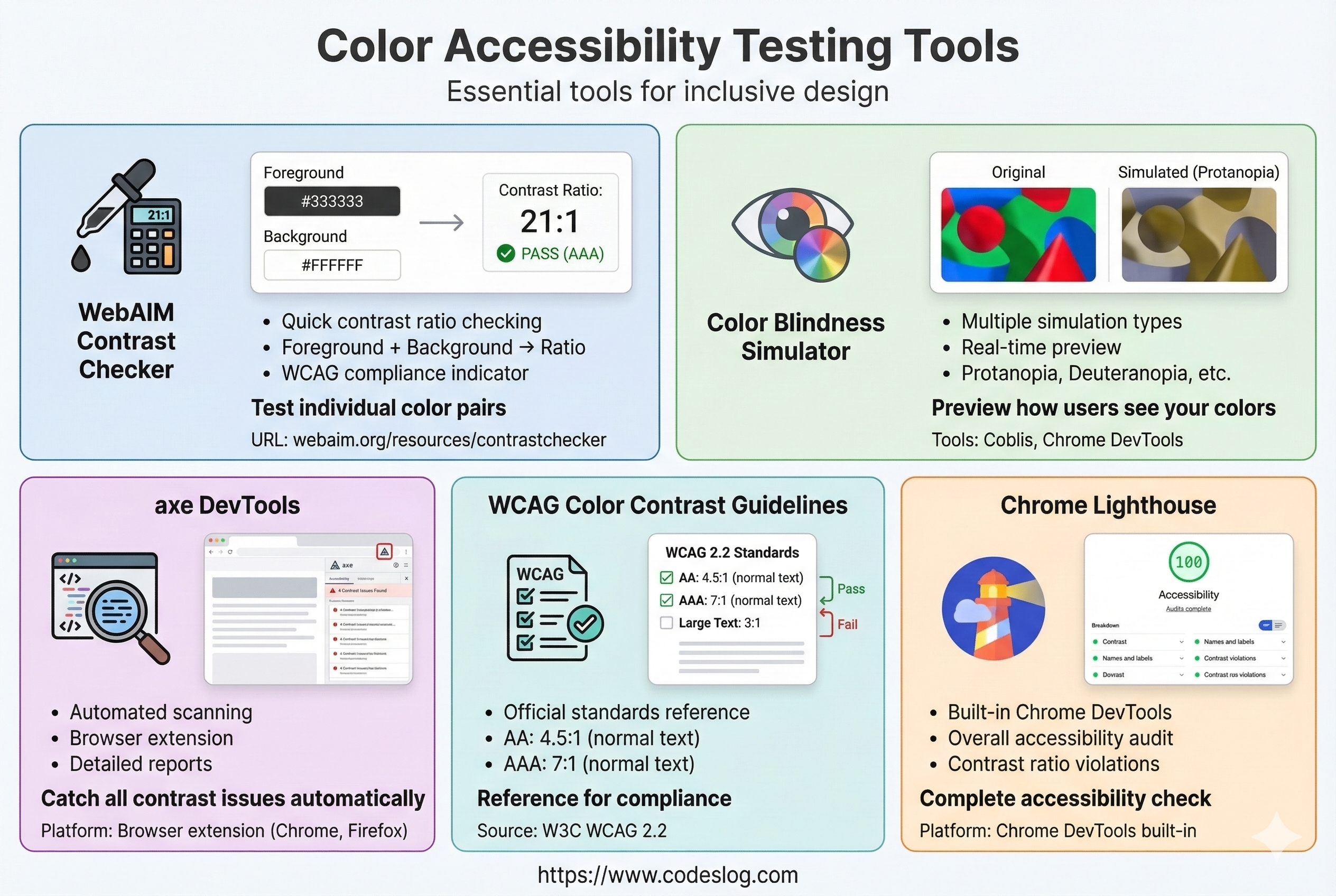
Image: Nanobanana
- WebAIM Contrast Checker: Check contrast between two colors
- Color Blindness Simulator: Simulate color vision deficiency
- axe DevTools: Automated accessibility auditing
- Lighthouse: Built into Chrome DevTools
We’ll cover how to use these tools in detail in a future post.
Common Mistakes#
Mistake 1: Using Gray Text for Secondary Information#
/* ❌ Gray text may be unreadable for users with low vision */
.secondary-text {
  color: #999999; /* gray */
  background: #ffffff;
  /* contrast: ~2.85:1 — below AA */
}

/* ✅ Use darker gray */
.secondary-text {
  color: #666666; /* dark gray */
  background: #ffffff;
  /* contrast: ~5.74:1 — passes AA */
}
Mistake 2: Focus Style That’s Too Subtle#
/* ❌ Focus outline is too faint */
button:focus {
  outline: 1px solid #cccccc;
  outline-offset: 1px;
}

/* ✅ Clear, visible focus style */
button:focus-visible {
  outline: 3px solid #0962db;
  outline-offset: 2px;
}
Mistake 3: Using the Same Color in Both Light and Dark Mode#
/* ❌ Using #0066cc in both modes */
.primary-color {
  color: #0066cc;
}

/* ✅ Adjust per mode */
:root {
  --primary: #0066cc;
}

@media (prefers-color-scheme: dark) {
  :root {
    --primary: #66b2ff;
  }
}

.primary-color {
  color: var(--primary);
}
Wrapping Up#
Color accessibility is a fundamental principle every designer and developer should know. And as we’ve seen through the collaboration scenarios, it’s not something one person solves alone — it’s a quality the whole team builds together.
Here’s a summary checklist:
- ✅ Check luminance contrast (4.5:1 or higher)
- ✅ Never convey information through color alone
- ✅ Test with a color blindness simulator
- ✅ Verify contrast in dark mode too
- ✅ Make sure focus styles are clearly visible
- ✅ Run automated accessibility checks
Working through these one by one doesn’t just help users with color vision deficiency — it creates a web that’s easier to use for people with low vision, older users, and everyday users alike. A single color choice can change someone’s experience. It’s worth keeping that in mind.