I turned on dark mode and my eyes hurt more.
The background was black but the text was a heavy gray, so the contrast was far too low; links were still the default blue (#0000ff), which stung. Images blazed alone against the dark screen. One button was the same color as its background, so it was simply invisible.
It said “dark mode supported.” But it was dark mode by color inversion, nothing more.
Dark text on a dark background. That’s not dark mode — it’s a mystery theme.
Photo: Shiona Das / Unsplash
Dark mode isn’t a matter of taste#
It’s easy to write dark mode off as “a theme that’s easier on the eyes at night,” but for some people it’s a necessity. For migraine and light-sensitivity users who can’t look at bright screens for long, and for anyone squinting at a display in a dim room, a dark screen takes real strain off the eyes. On OLED screens it saves battery, too. So dark mode isn’t a nice-to-have decoration — it’s a second, full-fledged design that deserves as much care as light mode. That’s exactly where this article meets accessibility.
We’ll build that “proper dark mode” from start to finish. The rough order:
- Tokenize colors with CSS variables to lay the foundation for switching modes
- Respect the system setting (
prefers-color-scheme) - Add a toggle the user controls directly
- Re-grade the color contrast for dark, too
- Kill the first-load flash (FOUC)
Follow it through and you’ll have a real dark mode — not a color-inverted “mystery theme,” but one where every character speaks clearly even in the dark. Let’s take it one step at a time.
Dark mode is not color inversion#
The most common mistake is reaching for filter: invert(1) or just swapping the background and text colors.
/* ❌ Don't do this */
@media (prefers-color-scheme: dark) {
  body {
    background-color: #000;
    color: #fff;
  }
}
Colors you chose carefully for light mode land in a completely different context under dark mode. Accents, warnings, success colors — each has to keep its meaning while staying readable against a dark background.
A proper dark mode starts with design tokens. A design token means giving a design value — a color, a spacing — a name like --color-bg and managing it in one place. Instead of scattering “white” all over your code, you attach a label like “background color”; when the mode changes, you only swap the value that label points to.
Designing tokens with CSS variables#
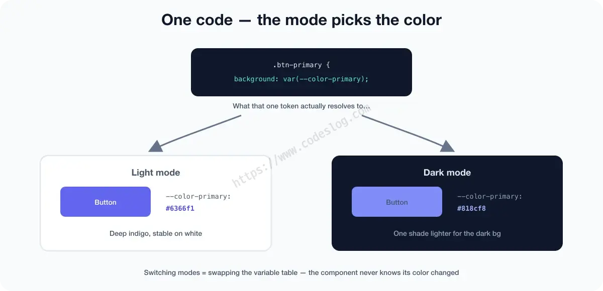
CSS variables (custom properties) are the container for these tokens. Reference colors through variables instead of writing them directly, and switching modes is just a matter of replacing the values.
/* Light mode defaults */
:root {
  /* Background */
  --color-bg: #ffffff;
  --color-bg-subtle: #f8f9fa;
  --color-surface: #ffffff;
  --color-surface-raised: #f1f3f5;

  /* Text */
  --color-text: #1a1a2e;
  --color-text-subtle: #6c757d;
  --color-text-on-primary: #ffffff;

  /* Accent */
  --color-primary: #6366f1;       /* indigo */
  --color-primary-hover: #4f46e5;

  /* Semantic colors */
  --color-success: #22c55e;
  --color-warning: #f59e0b;
  --color-error: #ef4444;

  /* Border */
  --color-border: #dee2e6;
  --color-border-subtle: #f1f3f5;
}

/* Dark mode */
@media (prefers-color-scheme: dark) {
  :root {
    --color-bg: #0f172a;
    --color-bg-subtle: #1e293b;
    --color-surface: #1e293b;
    --color-surface-raised: #334155;

    --color-text: #e2e8f0;
    --color-text-subtle: #94a3b8;
    --color-text-on-primary: #ffffff;

    /* Brighten the accent for dark mode */
    --color-primary: #818cf8;       /* lighter indigo */
    --color-primary-hover: #a5b4fc;

    /* Tune semantic colors to the background too */
    --color-success: #4ade80;
    --color-warning: #fcd34d;
    --color-error: #f87171;

    --color-border: #334155;
    --color-border-subtle: #1e293b;
  }
}
Now your components just reference the variables.
/* No raw color values */
body {
  background-color: var(--color-bg);
  color: var(--color-text);
}

.card {
  background-color: var(--color-surface);
  border: 1px solid var(--color-border);
}

.btn-primary {
  background-color: var(--color-primary);
  color: var(--color-text-on-primary);
}
In light or dark, the component code never changes.
prefers-color-scheme: respecting the system setting#
If the system is in dark mode, showing the site in dark mode is the sensible default. The prefers-color-scheme media query detects the system setting.
/* CSS alone can respond to the system setting */
@media (prefers-color-scheme: dark) {
  :root { /* dark mode variables */ }
}
Add one more line and the polish jumps — the color-scheme property.
:root {
  color-scheme: light dark;   /* tell the browser this page supports both modes */
}
This one line brings the UI the browser draws itself in line with the current mode: scrollbars, default form inputs, checkboxes, the text caret. Without it you easily get an awkward combination — a dark body with a jarringly white scrollbar. It hands the parts you can’t paint over to the browser.
To detect it in JavaScript:
const prefersDark = window.matchMedia('(prefers-color-scheme: dark)');

// current setting
console.log(prefersDark.matches); // true | false

// react to changes
prefersDark.addEventListener('change', (e) => {
  console.log(e.matches ? 'switched to dark' : 'switched to light');
});
Building a user toggle#
Following only the system setting leaves the user no choice. It’s better to let them switch modes directly with a toggle button.
We manage three states: system (follow the system), light, and dark.
const STORAGE_KEY = 'color-scheme';

function getStoredScheme() {
  return localStorage.getItem(STORAGE_KEY) || 'system';
}

function applyScheme(scheme) {
  const isDark =
    scheme === 'dark' ||
    (scheme === 'system' && window.matchMedia('(prefers-color-scheme: dark)').matches);

  document.documentElement.setAttribute('data-color-scheme', isDark ? 'dark' : 'light');
}

function setScheme(scheme) {
  localStorage.setItem(STORAGE_KEY, scheme);
  applyScheme(scheme);
  updateToggleUI(scheme);
}

// apply on page load (sync the button state to the current mode, too)
const initial = getStoredScheme();
applyScheme(initial);
updateToggleUI(initial);

// clicking the button flips light <-> dark
document.getElementById('theme-toggle').addEventListener('click', () => {
  const current = getStoredScheme();
  const isDark = current === 'dark' ||
    (current === 'system' && window.matchMedia('(prefers-color-scheme: dark)').matches);
  setScheme(isDark ? 'light' : 'dark');   // if dark now, go light; otherwise go dark
});
But here we have to fix the token CSS from earlier. We defined the dark tokens only inside @media (prefers-color-scheme: dark), and a media query looks only at the system setting. If a user on a light system flips the toggle to dark, the media query is still false, so the dark values never apply. The toggle looks broken.
So we line up the selectors to apply the dark tokens through both entrances.
/* 1. System is dark AND the user hasn't turned it off to light */
@media (prefers-color-scheme: dark) {
  :root:not([data-color-scheme="light"]) {
    --color-bg: #0f172a;
    --color-text: #e2e8f0;
    /* …the rest of the dark tokens defined earlier… */
  }
}

/* 2. The user explicitly turned dark on (regardless of system) */
[data-color-scheme="dark"] {
  --color-bg: #0f172a;
  --color-text: #e2e8f0;
  /* …the rest of the dark tokens defined earlier… */
}
The values in the two rules are identical. What differs is the condition.
- Rule 1’s
:not([data-color-scheme="light"])means “the system is dark, but only if the user hasn’t turned it off to light” — the device that lets an explicit user choice beat the system default. - Rule 2 is dark whenever the user picked dark, no matter the system.
- Light needs no rule of its own. The default
:rootis already light.
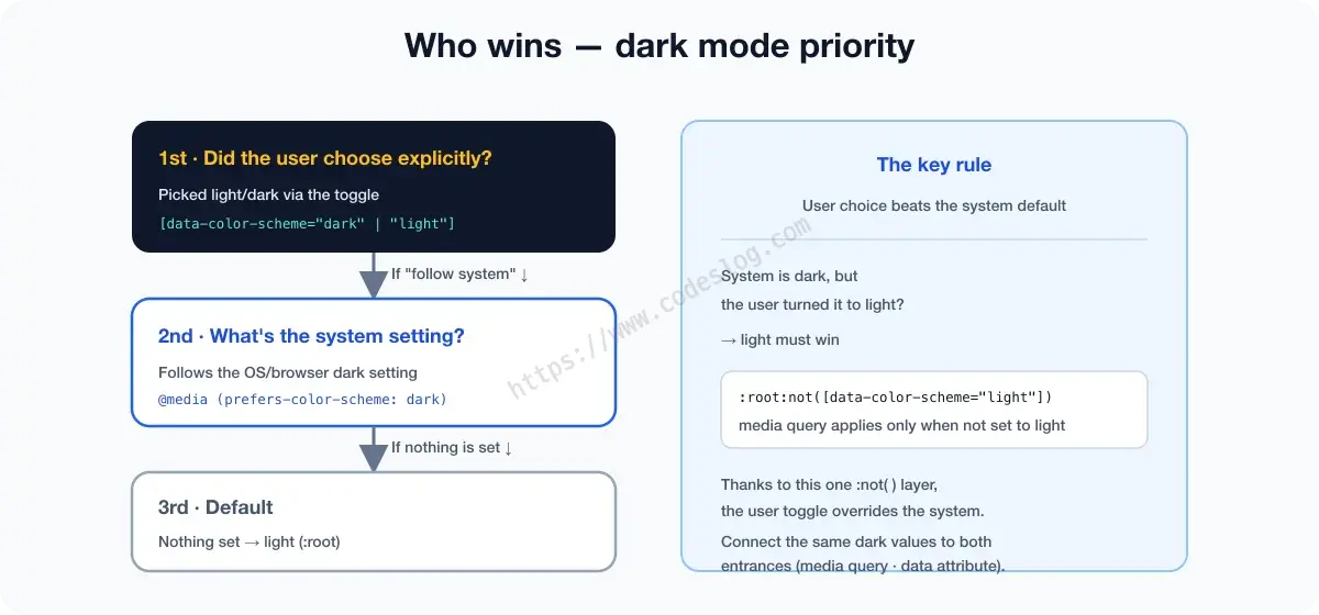
If writing the values twice is a chore, define the dark tokens once with a tool like SCSS and spray them onto both selectors. The principle is the same — connect the same dark values to both entrances (the system default and the user choice).
Toggle button accessibility#
A toggle button has to communicate its current state clearly.
<button
  id="theme-toggle"
  aria-label="Turn on dark mode"
  aria-pressed="false"
>
  🌙
</button>function updateToggleUI(scheme) {
const btn = document.getElementById('theme-toggle');
const isDark = scheme === 'dark' ||
(scheme === 'system' && window.matchMedia('(prefers-color-scheme: dark)').matches);
btn.setAttribute('aria-pressed', isDark ? 'true' : 'false');
btn.setAttribute('aria-label', isDark ? 'Switch to light mode' : 'Switch to dark mode');
}aria-pressed conveys the toggle’s on/off state to screen readers. And if the button is icon-only, don’t forget to describe what it does with aria-label.
Checking color contrast in dark mode#
This is where a lot of dark mode implementations fail.
One quick term first. Contrast ratio is a number for the brightness difference between text and its background. 1:1 means the two colors are identical (invisible), and 21:1 is the maximum, black on white. The web accessibility standard WCAG (Web Content Accessibility Guidelines) requires a minimum of 4.5:1 (level AA) for body text — the floor at which low-vision users can still read.
The problem is that meeting this in light mode doesn’t guarantee it in dark mode. Accents are the usual culprit. A color with plenty of contrast on a light background can turn glaring on a dark one, or, the other way, drop below the bar.
Ways to check for yourself:
- Browser DevTools: Chrome DevTools’ color picker shows the contrast ratio right there
- WebAIM Contrast Checker: https://webaim.org/resources/contrastchecker/
- Polypane, Stark plugins: check light and dark side by side
General principles:
- For text on a dark background, use a bright, low-saturation color (like
#e2e8f0) - Brighten accents on a dark background compared to light mode
- Slightly below pure white (
#e2e8f0rather than#ffffff) is easier on the eyes - Avoid a pure black (
#000000) background too. A dark navy like#0f172ais kinder to the eyes
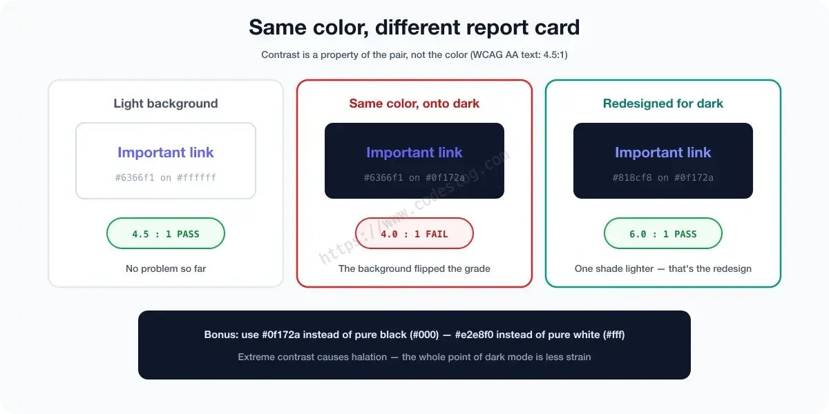
Same color, but the grade flips when the background changes — because contrast is a property of the pair, not of the color. So dark mode contrast has to be graded separately.
Dark mode is not high-contrast mode#
Let me cut off a common misconception here. “If I build dark mode well, that’ll solve the contrast problem for low-vision users too” — sadly, no. Dark mode is about you choosing a palette, whereas high-contrast mode is about the user (well, the OS) forcing the colors. When Windows High Contrast turns on, a switch called forced-colors flips, and at that point the OS overrides even the dark tokens you labored over. The direction is reversed. How to respond to forced-colors, and why I built an in-app high-contrast toggle and then paused it, I’ll unpack separately in a later article.
Handling images and media#
In dark mode, images can suddenly look too bright. A little brightness/contrast adjustment helps.
/* Dim images slightly in dark mode */
@media (prefers-color-scheme: dark) {
  img:not([src$=".svg"]) {
    filter: brightness(0.9) contrast(1.05);
  }
}

/* data-color-scheme version */
[data-color-scheme="dark"] img:not([src$=".svg"]) {
  filter: brightness(0.9) contrast(1.05);
}
SVGs are excluded since you can control their colors with CSS.
For logos and brand images, providing a dark-only version is the cleanest approach.
<picture>
  <source
    srcset="logo-dark.svg"
    media="(prefers-color-scheme: dark)"
  />
  <img src="logo-light.svg" alt="Company logo" />
</picture>
Preventing FOUC: a flash-free init#
To prevent the flash where the page briefly shows light mode before switching to dark on load (Flash of Unstyled Content, FOUC), you have to run a script inside <head>.
<head>
  <!-- runs before the CSS loads -->
  <script>
    (function() {
      const scheme = localStorage.getItem('color-scheme') || 'system';
      const prefersDark = window.matchMedia('(prefers-color-scheme: dark)').matches;
      const isDark = scheme === 'dark' || (scheme === 'system' && prefersDark);
      if (isDark) {
        document.documentElement.setAttribute('data-color-scheme', 'dark');
      }
    })();
  </script>
  <link rel="stylesheet" href="styles.css" />
</head>
This script runs before the CSS loads, so the page renders in the correct mode from the start.
Wrapping up#
Dark mode isn’t simply “a dark screen.” It’s a separate design that conveys every piece of information clearly in a dark environment too.
To recap the essentials:
- Design tokens with CSS variables: reference colors through variables, not directly
- Define dark-only values: a redesign, not an inversion
- Respect the system setting: set the default with
prefers-color-scheme - Give users a choice: save it to localStorage, handle toggle-button accessibility
- Re-check contrast: verify the light-mode ratios still hold in dark
- Prevent FOUC: initialize with an inline script in
<head>
You put care into light mode, so dark mode deserves the same. If doing the work twice feels unfair… design with tokens from the start. At the very least, maintenance gets a lot easier.
And that “mystery theme” — once it’s been through a token redesign and a contrast re-grade, it becomes a real dark mode where every character speaks clearly, even in the dark.
질문으로 다시 보기#
Can't I just invert the colors for dark mode?
Why does the screen flash on first load in dark mode?
More in this series#
Browse the full Frontend × Accessibility series — from SPA focus management to form UX and modals, a series that “connects an accessibility lens to everyday frontend topics.”