There’s a month that doesn’t show up on most calendars, yet is observed all over the world.
July — Disability Pride Month.
The pairing of “disability” and “pride” can feel unfamiliar at first. The emotional register we’re used to around disability observances tends to be “consideration” or “overcoming.” Pride Month tells a different story: disability isn’t something to overcome or to hide — it’s a natural part of who a person is.
This July in particular has given me a lot to chew on, so I wanted to sort through it from a developer’s seat.
Why July?#
On July 26, 1990, the Americans with Disabilities Act (ADA) was signed into law in the United States — a landmark civil rights law prohibiting discrimination on the basis of disability. The first Disability Pride march was held in Boston that same year, and July has since become the month when the disability community celebrates its history, culture, and existence. This July 26, just days ago, marked the 36th anniversary.
The key is the direction of the word “pride.” It isn’t a request for sympathy — it’s a declaration of self-respect, exactly as one is. It’s also a movement to shift how society sees disability: from “a problem to fix” to “an identity we live alongside.”
Korea has its own Disability Day on April 20. As it happens, I received a small commendation on that day this year, which got me comparing the texture of April and July. If April is closer to a day when society speaks to people with disabilities, July is the month when people with disabilities speak to society. Both are needed — but the microphone points the other way.
The Story Folded Into a Flag#
Disability Pride Month has its own flag, designed by Ann Magill, a writer with cerebral palsy. There are two layers of story folded into it, and both get better the longer you sit with them.
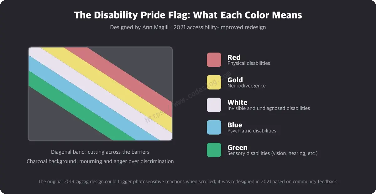
The first layer is what the colors mean.
- Red: physical disabilities
- Gold: neurodivergence
- White: invisible and undiagnosed disabilities
- Blue: psychiatric disabilities
- Green: sensory disabilities (vision, hearing, and others)
- Charcoal background: mourning and anger for those lost to discrimination and eugenics
- Diagonal band: cutting across the barriers placed in front of disabled people
The second layer is why I love this flag. The original design used vivid colors in a zigzag (lightning-bolt) pattern — and community feedback pointed out that scrolling past it on a screen created a strobe-like flicker, potentially dangerous for people with migraines or photosensitive epilepsy. In 2021, Magill released the current design: muted hues, gentler angles, and a color arrangement adjusted for people with color blindness.
The flag that symbolizes disability was itself redesigned based on accessibility feedback. Written as release notes, it might read: “Fixed flicker bug, improved color contrast.” A community improving even its own symbol through user feedback — to me, that’s the most compressed version of what Pride Month is trying to say. Things get better not because they’re perfect, but because someone listens and fixes them.
This Year’s Theme: The World Works Better With Us#
Each Pride Month carries a theme. The 2026 theme was chosen by the National Council of Self-Advocates — a disabled-led council within The Arc, a US disability rights organization:
“The World Works Better With Us”
It matters that people with disabilities chose this sentence themselves. It isn’t “please help us.” It’s “the world runs better when we’re in it.”
Sounds like an overstatement? Developers ship the evidence every day. Captions were built for deaf users; now everyone watching videos on the subway uses them. Curb cuts were built for wheelchairs; now strollers and suitcases roll through them all day. Voice input, autocomplete, dark mode, keyboard shortcuts — design for disabled users becoming convenience for everyone is so common it has a name: the curb-cut effect.
Inclusion isn’t a cost. It’s quality. This year’s theme says exactly that, in the community’s own words.
The Scenes That Happen to Overlap This July#
The contrast this Pride Month is unusually sharp, because the past few months brought big news to the accessibility world.
The courts moved forward. In June, a French court ordered the retail giant Carrefour to make its website and app fully accessible within six months — the first enforcement ruling under the European Accessibility Act (EAA), and one that answered the defense of “71% compliant” with “somewhat accessible is not enough.” Two months earlier, in April, South Korea’s Supreme Court confirmed that an online mall’s failure to provide alt text constitutes discrimination under Korean law. I covered the details in my analysis of the Carrefour ruling.
Reality moved backward. The WebAIM Million 2026 report, which scans the top one million websites, found average accessibility errors per page rose from 51 to 56.1 — the first regression in years. That story is in my report breakdown.
Rights are hardening into case law, while the web we build grows rougher. That gap is why Pride Month remains a movement, not just a celebration.
From a Developer’s Seat#
Marching in a parade isn’t the only form of solidarity. People who sit at keyboards have a share of the work that can be done right there.
- Write meaningful alt text for the images you post today
- Take your new component for a lap using only the Tab key
- Make sure video content ships with captions
- Check color contrast when picking colors
- And when you can, bring feedback from colleagues and users with disabilities into the design stage
The beauty is that none of this is grandiose. Like Ann Magill fixing the flag — listen to feedback, fix one thing at a time.
Wrapping Up#
If I translated “The World Works Better With Us” into developer language, it would come out something like this:
“An accessible product is a better product.”
The sentence holds year-round, but July is the month we say it out loud. If someone is hitting a wall somewhere in the screens we build, tearing down one of those walls seems like a fine way to celebrate.
This July, draw a diagonal stripe through your code too — in the direction that cuts across barriers.
References#
- Disability Pride Month: Theme, History, How to Celebrate (The Arc)
- Disability Pride Month: Identity, Culture, and Belonging (Disability Belongs)
- Why Digital Accessibility Matters This Disability Pride Month (Centre For Accessibility Australia)
- History of the Disability Pride Flag (Weinberg Family Cerebral Palsy Center, Columbia University)
- Disability Flag (Wikipedia)
Leave a comment