I was building a signup form. The moment I focused the email field, an error popped up: “Invalid email format.” I hadn’t typed a single character yet.
The password confirmation field was the opposite. I typed the whole password, submitted the form, and only then did it say “Passwords don’t match” — after I’d already finished typing.
Then I hit submit, and seven error messages showed up all at once.
Validation timing, where messages appear, and screen reader support — a form only really works when all three line up.
This post focuses on just one of those three: when and how to tell the user something’s wrong.
When Should You Validate? Timing Is Everything#
Form validation timing is trickier than it looks. Too early, and errors show up before the user has finished typing. Too late, and mistakes don’t get caught in time.
Here’s a timing strategy that holds up in practice:
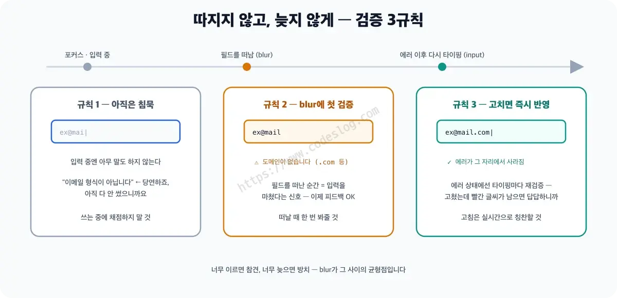
Rule 1: Don’t Validate on First Focus#
Don’t run any validation when a field is first focused — the user hasn’t even started typing yet. Flash an error here and you’ve built a form that criticizes before it says hello.
Rule 2: Start Validating After Blur#
Once the user leaves the field (the blur event), that’s when live validation kicks in. They’ve already made one attempt at the input, so feedback is fair game now.
Rule 3: Once an Error Shows, Re-Validate on Every Keystroke#
Once an error is showing and the user starts fixing it, validate on every keystroke from that point on. Note this uses the input event, not change. change only fires when the field loses focus, which means the error would stay stuck on screen while the user is actively correcting it — and nothing is more frustrating than fixing a mistake and watching the error just sit there.
rules here is an array of objects, each pairing a check function with the message to show on failure. If your rules aren’t shaped this way, the code below will fail silently with no error at all — so let’s line that up first.
const emailRules = [
  { test: v => v.trim() !== '',            message: 'Please enter your email' },
  { test: v => /^\S+@\S+\.\S+$/.test(v), message: 'Invalid email format' },
];class FieldValidator {
constructor(input, rules) {
this.input = input;
this.rules = rules;
this.hasBeenBlurred = false;
this.hasError = false;
// Where the error gets rendered — aria-describedby can hold multiple ids, so we take the first
const describedBy = (input.getAttribute('aria-describedby') || '').split(/\s+/)[0];
this.errorEl = document.getElementById(describedBy);
if (!this.errorEl) {
throw new Error(`${input.id}: connect an error message element with aria-describedby first`);
}
input.addEventListener('blur', () => {
this.hasBeenBlurred = true;
this.validate();
});
input.addEventListener('input', () => {
// Only validate live after the first blur (even while an error is showing)
if (this.hasBeenBlurred) {
this.validate();
}
});
}
validate() {
const value = this.input.value;
const error = this.rules.find(rule => !rule.test(value))?.message;
if (error) {
this.showError(error);
this.hasError = true;
} else {
this.clearError();
this.hasError = false;
}
}
// showError/clearError are covered in more depth in the "Wiring" section below.
// Here's the minimal working version.
showError(message) {
this.errorEl.textContent = message;
this.input.setAttribute('aria-invalid', 'true');
}
clearError() {
this.errorEl.textContent = '';
this.input.setAttribute('aria-invalid', 'false');
}
}Three rules — sounds like a lot for something this small. But put yourself in the user’s shoes and it makes sense. Nobody wants to use a form that opens with “why haven’t you filled this in yet?” before it’s even said hello.
Timing differences are easy to nod along to on paper. You only really feel them with your own fingers. I’ve put a bad version and a good version side by side in this form validation UX demo. Just click into the name field on the left, then do the same thing on the right. The demo’s interface is in Korean, but the controls are simple enough to follow along.
One thing before you look at the log under each form: it isn’t real screen reader output. It’s a simulation I typed out by hand, showing what would get announced in each situation. For the real verdict, turn on a screen reader and try it yourself.
Where Should the Error Message Go?#
The basics of form accessibility — connecting labels, identifying errors — are covered separately in Form Accessibility Mastery. This post only adds what sits on top of that.
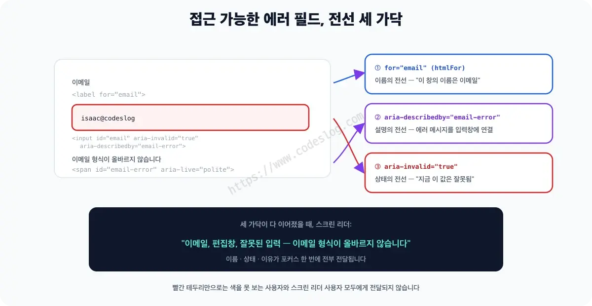
Directly below the input is the right place. Nothing else is as unambiguous.
<div class="field">
  <label for="email">Email</label>
  <input
    type="email"
    id="email"
    name="email"
    aria-describedby="email-error"
    aria-invalid="false"
  />
  <span
    id="email-error"
    class="error-message"
    aria-live="polite"
  ></span>
</div>
Leaving out role="alert" here is intentional. That role interrupts whatever the screen reader is currently reading, and if it fires on every keystroke, it gets in the way instead of helping. I get into why in the “role="alert" vs. aria-live="polite"” section below.
Two attributes matter most here:
aria-describedby#
aria-describedby,aria-invalid, and ARIA attributes in general get a fuller treatment in the ARIA Practical Guide.
aria-describedby="email-error" tells the screen reader “this input’s description lives in the email-error element.”
When the user focuses the input, the screen reader reads the label along with the description — something like “Email, editable, please enter in email format.” If an error occurs, that message gets read along with it too.
aria-invalid#
This conveys the error state semantically. Flip it to "true" and the screen reader announces “invalid entry.”
function showError(input, errorEl, message) {
  input.setAttribute('aria-invalid', 'true');
  errorEl.textContent = message;
  errorEl.classList.add('is-error');      // touch styling only through the class
}

function clearError(input, errorEl) {
  input.setAttribute('aria-invalid', 'false');
  errorEl.textContent = '';
  errorEl.classList.remove('is-error');
}
To put the wiring together — htmlFor carries the name, aria-describedby carries the description (the error), and aria-invalid carries the state. All three wires need to be connected for a screen reader to get the full picture of a field.
role="alert" vs. aria-live="polite": Which One in a Form?#
role="alert" is equivalent to aria-live="assertive". It interrupts whatever’s being read and cuts in immediately. If that fires on every keystroke, typing gets interrupted constantly. So the split is: polite for live validation, alert for something that needs one loud announcement, like a failed submit.
<!-- Live, per-field validation -->
<span aria-live="polite" id="email-error"></span>

<!-- A one-shot notice like a failed submit -->
<div role="alert" id="form-submit-error"></div>
I go deeper into how live regions actually work — the difference between the two roles, when each gets announced and when it doesn’t, and why the element needs to exist empty ahead of time — in Why Your Live Region Isn’t Being Announced. It’s a tool that comes up outside forms too, so I covered it there at length.
Handling Errors on Submit#
When the submit button is pressed and several fields have errors, just displaying the errors isn’t enough. Focus needs to move to the first field with an error.
Let’s say validateAllFields() collects the FieldValidator set up for each field and returns only the failures as { input, label, message } objects. getErrorEl() and submitForm() are placeholders to fill in for your own app.
function handleSubmit(event) {
  event.preventDefault();

  const errors = validateAllFields();   // [{ input, label, message }, ...]

  if (errors.length > 0) {
    // Show the error messages
    errors.forEach(({ input, message }) => {
      showError(input, getErrorEl(input), message);
    });

    // Move focus to the first field with an error
    errors[0].input.focus();
    return;
  }

  // Handle success
  submitForm();
}
A keyboard user sitting on the submit button can get disoriented if focus suddenly jumps somewhere near the error message. Move it to the first field with an error instead, and they immediately know “okay, this is where I start fixing things.”
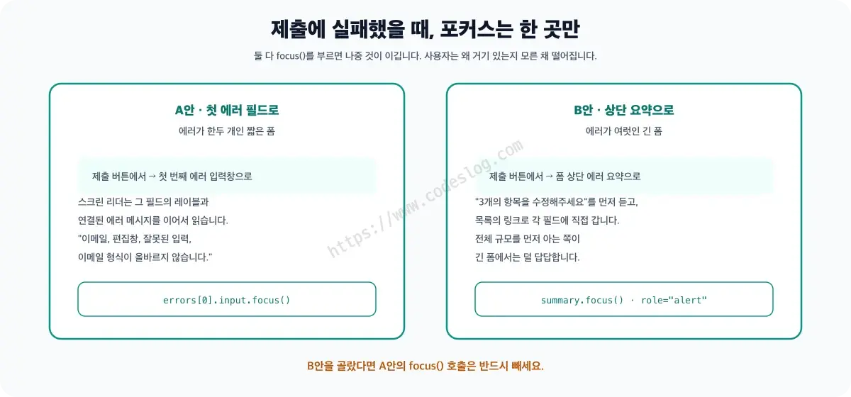
If there are several errors, another option is a summary message at the top of the form.
Either way, only one thing should receive focus. If both the summary and the first field call focus(), whichever runs last wins, and the user lands somewhere without knowing why.
If you go with a summary, remove the errors[0].input.focus() line from handleSubmit above. The summary takes that spot instead, and the links inside it carry the user to each field.
<!-- Error summary region at the top of the form -->
<div id="form-error-summary" role="alert" tabindex="-1"></div>
role="alert" already implies aria-live="assertive" on its own. There’s no need to add both.
function showErrorSummary(errors) {
  const summary = document.getElementById('form-error-summary');
  summary.textContent = '';                 // clear previous content

  const heading = document.createElement('p');
  const strong = document.createElement('strong');
  strong.textContent = `Please fix ${errors.length} item(s).`;
  heading.append(strong);

  const list = document.createElement('ul');
  errors.forEach(({ input, label, message }) => {
    const item = document.createElement('li');
    const link = document.createElement('a');
    link.href = `#${input.id}`;
    link.textContent = `${label}: ${message}`;   // safe even when user input gets mixed in
    item.append(link);
    list.append(item);
  });

  summary.append(heading, list);
  summary.focus();
}
There’s a reason this builds the content with textContent instead of pushing a string through innerHTML. Error messages often include a value the user typed — an email address, say — and if that value happens to contain a tag, innerHTML would interpret it as real markup.
Clicking a link in the error summary jumps straight to that field. It’s useful for both screen reader users and keyboard users.
Don’t Forget Success Feedback#
A lot of forms announce errors and ignore success entirely. But confirming “I entered this correctly” matters to the user too.
It’s easy to miss aria-live="polite" here. aria-describedby only gets read once, at the moment the input receives focus — it doesn’t get re-read just because the text inside changed. If focus stays put and you only swap the content, nothing happens for a user who can’t see the screen.
<div class="field">
  <label for="username">Username</label>
  <input type="text" id="username" aria-describedby="username-feedback" />
  <span id="username-feedback" class="feedback" aria-live="polite"></span>
</div>// Handle success and failure in one function, flipping between the two. Split
// them into separate functions and one can forget to undo the other's class,
// leaving an error message stuck in green success styling.
function setFeedback(input, feedbackEl, { ok, message }) {
input.setAttribute('aria-invalid', ok ? 'false' : 'true');
feedbackEl.textContent = message;
feedbackEl.classList.toggle('is-success', ok);
feedbackEl.classList.toggle('is-error', !ok);
}const usernameInput = document.getElementById('username');
const feedbackEl = document.getElementById('username-feedback');
setFeedback(usernameInput, feedbackEl, { ok: true, message: 'This name is available' });
setFeedback(usernameInput, feedbackEl, { ok: false, message: 'This name is already taken' });If you want to use a check-mark icon, keep the icon decorative and let the text carry the state. Dropping an emoji straight into the message string looks like a shortcut, but screen readers read it out by its literal name. A ✅ is announced as “check mark button,” and a ✔ as “check mark,” per the English CLDR names — and having that read out before every field gets old fast.
<span class="feedback-icon" aria-hidden="true"></span>
<span id="username-feedback" class="feedback" aria-live="polite"></span>
Put the icon in a separate element hidden with aria-hidden="true", and swapping the message with textContent won’t wipe the icon out. Put them in the same element and the icon disappears on the very first update. That said, the icon still needs to flip along with the state — a green checkmark sitting next to a red error message is more confusing, not less. Drive the icon’s content off the .feedback-icon::before rule using the same is-success/is-error classes, and the single setFeedback call above updates both together.
Go the other way — draw the icon purely with CSS ::before and drop the text — and a user who can’t see the screen gets no message at all. The icon is a supporting player; the text always has to carry the meaning.
What It Actually Looks Like — Same Screen, Different Wiring#
Side by side, the two forms look almost identical. So instead of trusting my eyes, I looked at the DOM. Going back to the comparison demo from earlier, I clicked and typed through both forms and read the state at each step. This was measured on September 15, 2026, on Chrome 152.
“Live region” in the table below refers to the aria-live region covered earlier. Where aria-describedby lists two ids, that’s because the error message and the success message are each connected separately.
| Step | Bad Form | Good Form |
|---|---|---|
| Click into an empty field (focus only) | “Name must be at least 2 characters” shows immediately · no aria-invalid · no aria-describedby · not a live region | No error · aria-invalid="false" |
| Type one character (“J”) and leave | — | Error shows · aria-invalid="true" · aria-describedby="good-name-err good-name-ok" · aria-live="polite" |
| Keep typing while an error is showing | — | Error clears, “Valid” shows · aria-invalid="false" |
| Submit with only the name field filled in | Focus stays on the submit button | Focus moves to the first error field — the email field, in this case |
The first row alone shows the whole point of this post. The bad form shows an error before you’ve even typed anything. But that error only exists on screen. No aria-invalid, no aria-describedby, and no live region on that error element. Which means it isn’t read out at all when the input gets focused. It scolds you in red text while leaving the person who can’t see that red text completely in the dark.
The last row stings a bit. On the bad form, focus stays on the submit button after you click it. A screen reader user hears only “there’s an error” and has to comb back through the entire form to find which field is the problem.
That last row is the result of submitting with the name field already filled in correctly. Submit with nothing filled in at all, and the first error is naturally the name field, so that’s where focus lands instead. Which field counts as “first” depends entirely on the state at that moment.
These numbers came from a single pass on Chrome 152. Safari and Firefox may behave differently, and I didn’t measure actual screen reader narration — only the DOM wiring itself. I read the attributes directly from the console.
One more thing: the “bad form” on the left is a control group I built on purpose, based on common mistakes. Of course it produced bad values — that was the point. Think of this table less as a verdict and more as a concrete picture of “here’s what it looks like when you get this wrong.”
Three Things Forms Often Miss: Duplicate Fields, Password Strength, Character Counts#
Not asking for the same information twice, when the user already gave it earlier, is also part of a form’s job. WCAG 2.2 added exactly this as 3.3.7 Redundant Entry.
Password strength meters: a UI that shows strength while the user types a password looks great visually, but a screen reader user might get nothing out of it at all.
<input type="password" id="password" aria-describedby="password-strength" />
<div id="password-strength" aria-live="polite">
  <!-- Must include the text "Weak", "Fair", or "Strong" -->
  <span class="strength-bar" aria-hidden="true"></span>
  <span class="strength-text">Please enter a password</span>
</div>
Character counters: a textarea capped at 140 characters showing the current count also needs aria-live. But announcing it on every single keystroke gets annoying fast, so add a bit of debouncing.
The trick is keeping the visible counter and the announced counter separate.
<textarea id="bio" aria-describedby="bio-count"></textarea>
<span id="bio-visual" aria-hidden="true"></span>
<span id="bio-count" class="sr-only" aria-live="polite"></span>const textarea = document.getElementById('bio');
const counter = document.getElementById('bio-count');
const visualCounter = document.getElementById('bio-visual');
let announceTimer;
textarea.addEventListener('input', () => {
const remaining = 140 - textarea.value.length;
clearTimeout(announceTimer);
// Announce 1 second after typing stops
announceTimer = setTimeout(() => {
counter.textContent = `${remaining} characters remaining`;
}, 1000);
// Update the visual counter immediately
visualCounter.textContent = `${remaining}/140`;
});Wrapping Up#
Good form UX means helping users avoid mistakes, and helping them fix mistakes quickly when they happen. Error messages that look good visually matter, but screen reader users need access to that same information.
The essentials:
- Validation timing: silence on first focus, validate from blur, re-validate on every
inputonce an error shows - Error placement: directly below the input
- aria-describedby: connects the input to its error message
- aria-invalid: conveys the error state semantically
- Focus after submit: move to the first field with an error
- Success feedback: announce success, not just errors
A form is usually the first real exchange a user has with a service. If one person gets nothing but criticism in that first exchange and another gets no feedback at all, everything built after it starts from an already-broken foundation.
Six rules for fixing one form might sound like a lot. But in practice, it comes down to two events (blur and input) and two attributes (aria-describedby and aria-invalid). Check just those four spots in the form you’re building right now.
질문으로 다시 보기#
When should form validation actually run?
How do you get error messages to screen reader users?
Other Posts in This Series#
- Focus Management in SPAs — fixing the silent screen when routes change without a reload
- The Color Is Right but the Contrast Is Wrong — why a disabled field doesn’t get read
Browse the full Frontend × Accessibility series — connecting an accessibility lens to everyday frontend topics.