This is Part 10 of the “Frontend Testing, Done Right” series. Browse the full series · Glossary
What comes to mind when you hear “accessibility testing”? Hiring a consultant, adopting a dedicated audit tool, working through checklists hundreds of items long… it’s easy to picture something big. Surprisingly, though, half of accessibility verification comes free just from writing component tests well. This article is that principle plus the practice — flushing out div buttons, naming icon buttons, and guarding focus that vanishes into thin air.
If you’ve been following the series, this is where this blog’s colors show most strongly. Coming from a search? You only need four pieces of background:
- Screen reader: assistive technology that reads the screen out loud. Blind users navigate the web by this sound instead of the display
- Query: in test code, a “function that finds elements on screen.”
getByRole('button')means “find me the element with the button role” (the fundamentals live in the philosophy part) - The stage: this article’s example is a “user search screen” (
UserSearch) — type a name, the list filters, an ✕ button clears it. A very ordinary UI. (Its UI strings are Korean:검색is the “Search” label,검색어 지우기means “Clear search”) - The environment: the code runs as component tests on Vitest + React Testing Library (straight from the setup part)
Hold on to these four, and today’s article stands complete on its own.
Practice code: this installment’s state lives in the
step-10tag (the code matches last time’s — this part rereads code that was already there through the eyes of the accessibility contract). You can also open it in StackBlitz.
After this article#
- Role and accessible name as an accessibility contract
- How tests catch accessibility regressions
- Filtering out anti-patterns like div buttons with tests
First time? Here’s how tests run#
If you’ve never actually run test code, take just this picture with you. (Already have? Feel free to skip to the next section.)
A test is a file. It sits right next to the component — a file like UserSearch.test.tsx — holding “this screen must behave like this” as a checklist written in code.
Running it is one line. Type npm test in the terminal and Vitest finds every test file and runs them all. Keep npm run test:watch running and it re-runs automatically every time you save — no one has to ask twice.
The result looks like this. Here’s the actual output from running the tests for this article’s search screen:
 ✓ UserSearch > loads and shows the user list
 ✓ UserSearch > filters the list by search term
 ✓ UserSearch > announces server errors with role="alert"
 ✓ UserSearch > the clear button is a button with an accessible name

 Test Files  1 passed (1)
      Tests  4 passed (4)
   Duration  520ms
Half a second. Checking the same four things by eye takes minutes — and even then, it only counts for today. A test repeats that check every time the code changes: six months from now, when someone refactors this component, all four promises get re-verified in half a second. That’s the real payoff of testing: a check you write once, repeated automatically forever.
And look at the fourth line — “the clear button is a button with an accessible name.” Today’s article is the story of why that one line is an accessibility check, and of what surfaces the moment that green light turns red. (We stage the red-light scene ourselves in the final section, “Let’s break it on purpose.”)
getByRole is an accessibility contract#
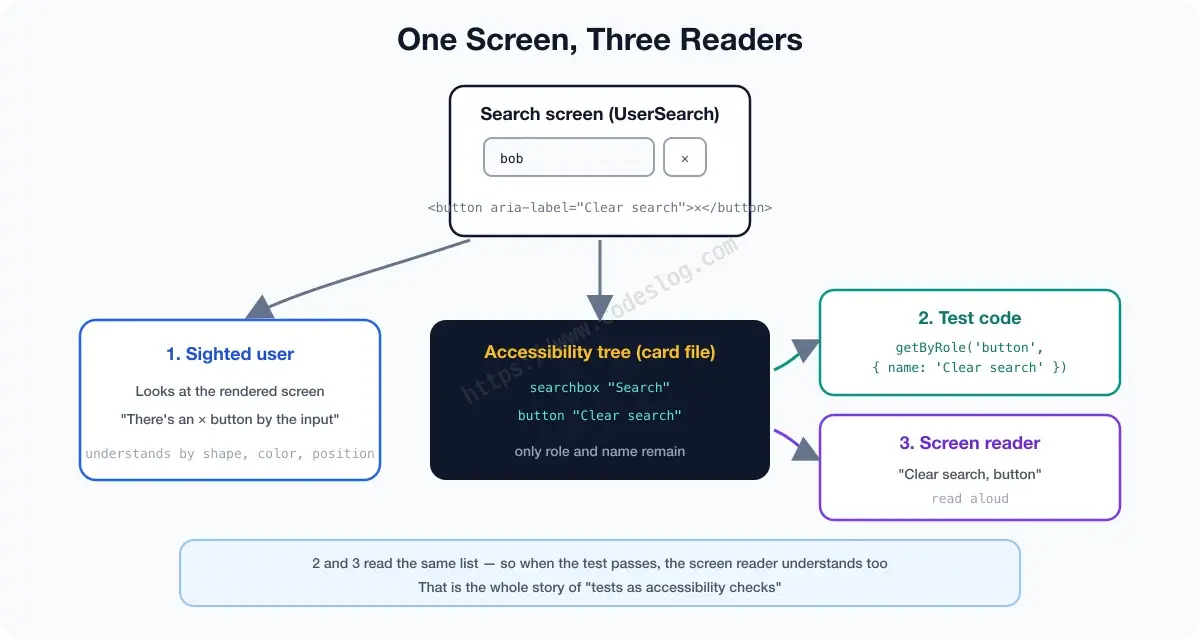
While drawing the screen, the browser builds one more data structure — the accessibility tree. It strips the visual decoration from the DOM and keeps only “what is this element (role) and what is it called (name)”: the source a screen reader reads from. Think of it as the elements’ business card file. Each card carries a job title (role: button, heading, searchbox) and a name (‘Clear search’).
The job title (role) isn’t something you pin on by hand — it comes from the HTML automatically. <button> is button, <h2> is heading, <input type="search"> is searchbox — use the right tag and the card is already filed. (You can assign one directly, like role="alert", and we’ll meet that use case in a moment.)
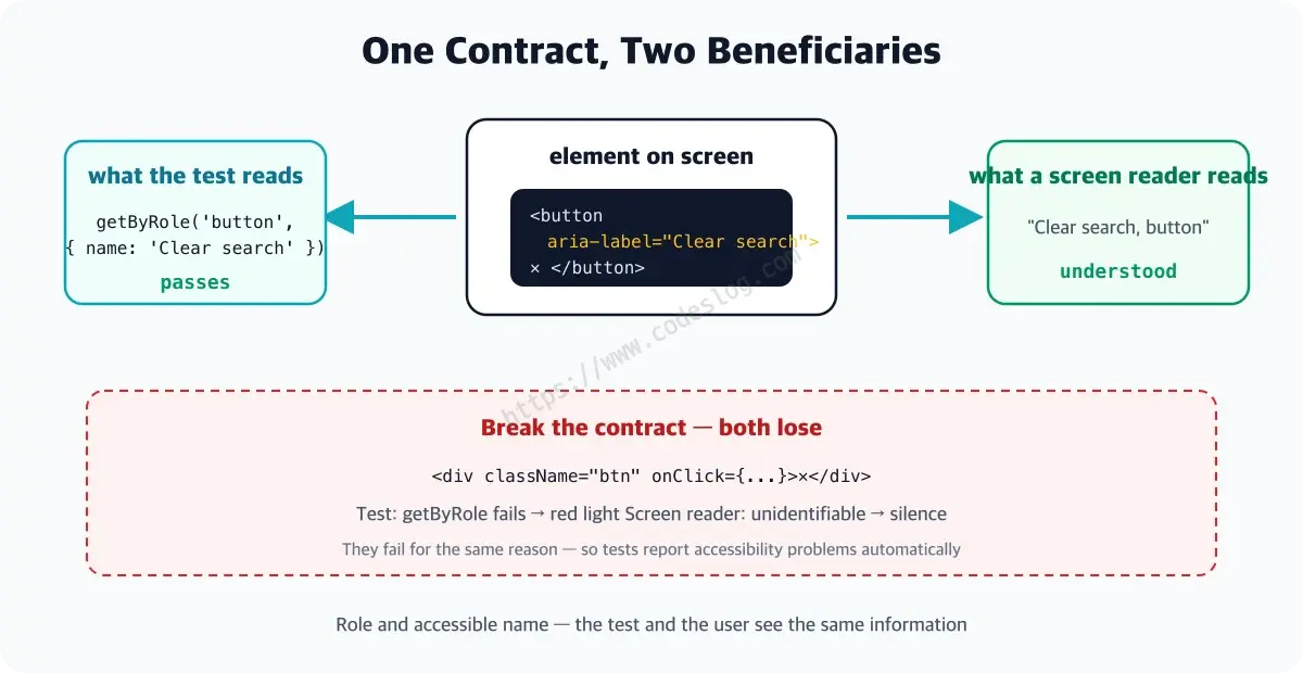
Now look at the test query through this lens. For getByRole('button', { name: '검색어 지우기' }) to pass, that element’s card must actually carry the button title and that exact name. The query demands precisely the information a screen reader announces (“Clear search, button”). So this isn’t mere “element finding” — it’s a contract: “this screen reads this way to assistive-technology users.” A green test means the contract is being honored.
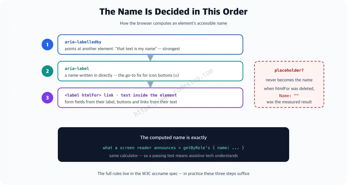
How is the name decided, then? The browser follows a priority order.
aria-labelledby— points at another element: “that one is my name tag”aria-label— a name written in directly- A linked
<label>(form fields) or the element’s own text (buttons, links) - And placeholder? — it never becomes the name. When we deleted htmlFor in the philosophy part, the name became an empty string — that was the measured proof
Catching the div button#
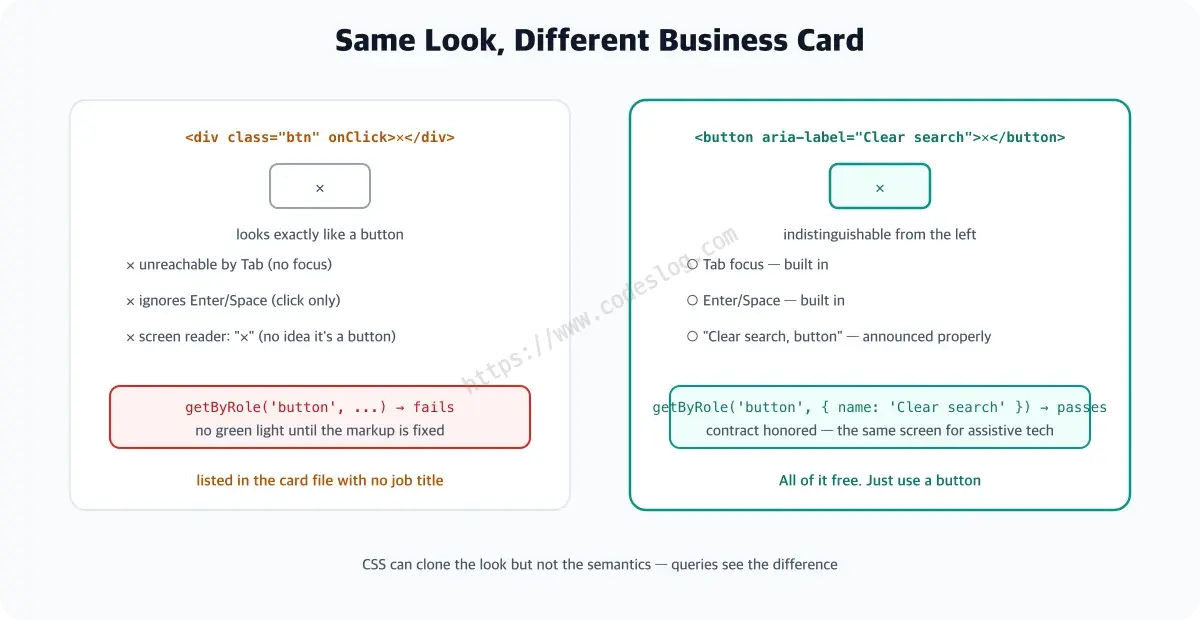
A <div onClick> styled like a button is indistinguishable on screen. But it enters the card file with no job title — and loses three things.
- Unreachable by Tab (no focus — to keyboard users, the button doesn’t exist)
- Won’t respond to Enter/Space (onClick only hears mouse clicks)
- Screen readers won’t say “button” (just “✕, text”)
With <button>, all three come free. And role-based queries don’t let this anti-pattern slide.
// write this
<div className="btn" onClick={onClear}>✕</div>
// and getByRole('button', ...) fails → the test reports the accessibility problem
The moment the test turns red, the accessibility problem surfaces with it. No green light until the markup is fixed.
In practice: naming an icon button#
Our stage, the search screen, has an ✕ button that clears the search term in one go. If you came through the series, it’s the code from the interaction part — there we looked at it through “how do I test a click”; today, the same code through the eyes of the accessibility contract.
Here’s the problem with an icon-only button. The only thing priority #3 (the element’s own text) can pick up is the single character ✕ — so “✕” goes on the card as the name. A screen reader user hears something like “multiplication sign, button” — no way to tell whether it clears, closes, or does something else entirely. Add aria-label (priority #2, so it beats the ✕) and a proper name goes on the card — and the test can now find the button by that name. Two birds. (actual repo code + test)
// src/components/UserSearch.tsx
{query && (   // show the button only when there is a query
  <button type="button" aria-label="검색어 지우기" onClick={clearQuery}>
    ✕
  </button>
)}
And the test that nails it down. Three ingredients worth a one-line introduction each if they’re new — render draws the component onto a test-only fake screen, screen is the counter where you look elements up, and userEvent replays typing and clicking the way a real user would (they star in the philosophy part and the interaction part respectively).
it('the clear button is a button with an accessible name', async () => {
  const user = userEvent.setup()
  render(<UserSearch />)
  await screen.findByText('Alice Kim')   // wait for server loading
  await user.type(screen.getByLabelText('검색'), 'bob')

  // find the button by the name aria-label gave it — no name, and this line fails
  await user.click(screen.getByRole('button', { name: '검색어 지우기' }))

  expect(screen.getByLabelText('검색')).toHaveValue('')
})
Error notices work on the same principle. There’s just no HTML tag that means “urgent announcement” — which is where the directly assigned role from earlier steps in. Put role="alert" on the error message and a screen reader announces it immediately, wherever it sits on screen — the non-visual version of “show it in red.” And the test verifies the notice exists with findByRole('alert'). (The MSW part’s server-error test verified exactly this.)
When you clear it, where does focus go?#
One step further. Click the clear button and the query empties — and the button itself disappears. So where’s the focus that was just on it? Dropped into thin air. Mouse users never notice; keyboard users are lost.
The answer: return focus to the input.
const inputRef = useRef<HTMLInputElement>(null)

const clearQuery = () => {
  setQuery('')
  // the button disappears, so send focus back to the input (for keyboard users)
  inputRef.current?.focus()
}
And nail that consideration down with a test.
await user.click(screen.getByRole('button', { name: '검색어 지우기' }))

expect(screen.getByLabelText('검색')).toHaveValue('')
// the button is gone, so focus must return to the input
expect(screen.getByLabelText('검색')).toHaveFocus()
That one toHaveFocus() line stops a future refactorer from deleting the focus handling. The test guards the consideration against regressing.
Let’s break it on purpose#
This part’s alarm check. Delete the aria-label from the button.
<button type="button" onClick={clearQuery}>   {/* aria-label deleted! */}
  ✕
</button>
On screen, nothing happens. The ✕ button sits right where it was and clicks just fine. But the test goes straight to red.
 × the clear button is a button with an accessible name
   TestingLibraryElementError: Unable to find an accessible element
   with the role "button" and name "검색어 지우기"
Below the failure, the current card file gets printed in full — and the button in question shows up as button: Name "✕". The name didn’t vanish; "✕" became the name. A change you could stare at a hundred times without seeing, and for a screen reader user it’s an accident: “Clear search, button” just turned into “multiplication sign, button.” And that accident was caught not by some separate accessibility audit, but by an ordinary component test. Restore the aria-label, save, and it’s green again.
Combine this with the next chapter’s axe scans and we get two layers of accessibility safety net: query-level contracts + page-level automated scans.
One-page summary#
- A test is a
.test.tsxfile next to the component plus onenpm test— a check written once, repeated automatically every time the code changes getByRole('button', { name: '...' })= an accessibility contract — its passing conditions equal what a screen reader announces- Div buttons and unlabeled inputs fail queries and get reported automatically — the test doubles as an accessibility nag
- Without
aria-label, an icon button’s name becomes a symbol like “✕” — give it a real name witharia-label, and userole="alert"for error messages - Return the focus that sat on a disappearing element — one
toHaveFocus()guards that consideration from regressing - Layer the axe scan (page level) over this query contract (element level) for a double net — completed next chapter
Wrapping up#
That closes the component chapter. Next chapter, a real browser — Playwright and the world of E2E.
Code that postponed accessibility “for later” usually gets unmasked the moment you write tests. And the good news — nothing new was installed today. We used yesterday’s queries as-is, and accessibility verification came bundled.
Level up: you’ve become that rare developer whose tests catch accessibility regressions too.
Next up: Playwright E2E — the first scenario
Bumped into an unfamiliar term? The glossary has them all, one line each.
Leave a comment