This is Part 8 of the “Frontend Testing, Done Right” series. Browse the full series · Glossary
A button isn’t really tested until you press it; an input, until you type into it. user-event is the member of the Testing Library family in charge of reproducing interaction — even a single click walks through focus changes and key-event order just like a real browser, closing the gap where “it works when a user does it, but not in the test.” In this article we build typing and clicking tests from scratch.
If you’re following the series, the search component from last time is today’s stage — and we’ll even upgrade it to a version that loads real data. Landed here from a search? No problem. The code flow reads within this article; for Testing Library basics see the philosophy part, and for environment setup the setup part.
Practice code: this installment’s exact state lives in the
step-08tag.git checkout step-08to follow along, diff it against step-07 to see just what this part added, or open it in StackBlitz with one click.
Our hands are busy today. Three things to take away.
- Reproducing typing and clicking with user-event
- Verifying one flow all the way: input → state → screen
- Why user-event instead of fireEvent
First, give the component real data#
Last time’s UserSearch searched a fixed array. Let’s raise it to something app-like that loads the list from a server. We have fetchUsers and the MSW mock from the async part, so there’s no server to worry about. (MSW is a tool that intercepts network requests during tests and returns fake responses — the setup was done back in the async part, and we’ll cover the mechanics properly next time. For now, “a fake server is on standby” is all you need to know.)
The key changes come in two chunks. First the data — from a server instead of a fixed array:
// src/components/UserSearch.tsx — upgrade point (1): data
const [users, setUsers] = useState<User[]>([])
const [status, setStatus] = useState<'loading' | 'error' | 'ready'>('loading')

useEffect(() => {
  fetchUsers()
    .then((data) => { setUsers(data); setStatus('ready') })
    .catch(() => setStatus('error'))
}, [])
And the markup — per-status display, plus a new clear button we’ll test in a moment:
// upgrade point (2): markup (below the input)
const clearQuery = () => {
  setQuery('')
  inputRef.current?.focus()  // the button vanishes, so send focus back to the input (explained soon)
}

{query && (
  <button type="button" aria-label="검색어 지우기" onClick={clearQuery}>
    ✕
  </button>
)}

{status === 'loading' && <p>불러오는 중…</p>}
{status === 'error' && <p role="alert">사용자를 불러오지 못했습니다.</p>}
{status === 'ready' && /* the existing list rendering, unchanged */}(inputRef is a reference made with useRef and wired to the input via ref={inputRef}. The UI strings stay Korean — the demo app’s language — so 검색어 지우기 is the “Clear search” label the button carries.)
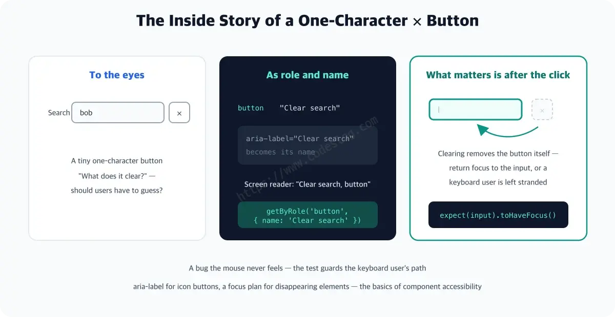
The button’s body is a single ✕ character, but thanks to aria-label it gets a name: “검색어 지우기” (Clear search) — a screen reader announces this name, and in a moment the test finds the button by this same name. It’s exactly the “role and name” idea from last time. (Full code is in the repo.)
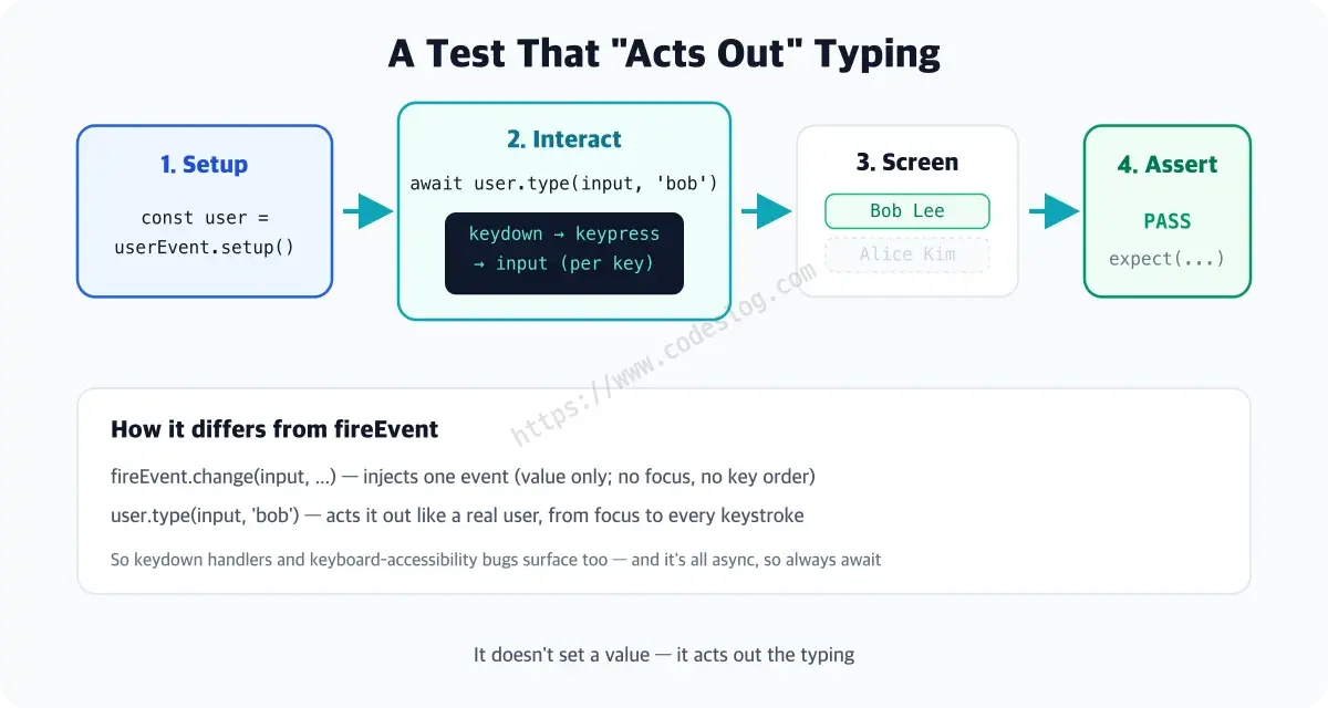
And the instant you save — last time’s test goes red.
 × UserSearch › shows the heading, search box, and full list
   Unable to find an accessible element with the role "listitem"
Of course. The list is now drawn only after the server response arrives, but the test looked for it right after render. Of the trio from the philosophy part, findBy (waits until it appears) is exactly the answer here.
// right after render → wait for loading to finish, then begin
await screen.findByText('Alice Kim')
The moment the UI turned async, the red light itself taught us how the test has to follow along.
The whole search flow#
Now today’s main event: interaction. We verify the entire flow where typing filters the list. (src/components/UserSearch.test.tsx)
import { render, screen } from '@testing-library/react'
import userEvent from '@testing-library/user-event'
import { UserSearch } from './UserSearch'

it('filters the list by query', async () => {
  const user = userEvent.setup()
  render(<UserSearch />)
  await screen.findByText('Alice Kim')      // wait for async loading to finish

  await user.type(screen.getByLabelText('검색'), 'bob')

  expect(screen.getByText('Bob Lee')).toBeInTheDocument()
  expect(screen.queryByText('Alice Kim')).not.toBeInTheDocument()
})
Let’s point out the new faces.
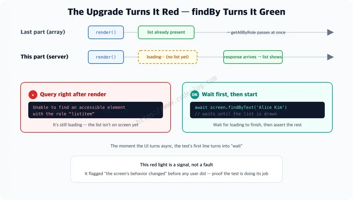
userEvent.setup()— creates an interaction session. Once at the top of each test, then use it asuser.something().user.type(element, 'bob')— for each character it fires keydown → keypress → input just like the real thing. It doesn’t quietly swap the value; it acts out the typing. Not a rough imitation, but method acting — pressing each key, fully immersed in the role.- Wait for loading with
findByTextbefore starting, and check “it’s gone” withqueryBy— every tool from earlier parts works right where it belongs.
“Wait, you just said to wait — so why grab getByText('Bob Lee') directly here?” — great question. Loading the list is async (a round trip to the server), but filtering the loaded list is synchronous logic that finishes right there, no server involved. The sense for telling where a wait is needed (findBy) from where it isn’t (getBy) is this chapter’s fine motor skill.
Down to the clear button#
Clicking the clear button after input to reset — again, the user flow as-is.
it('resets the search with the clear button', async () => {
  const user = userEvent.setup()
  render(<UserSearch />)
  await screen.findByText('Alice Kim')
  await user.type(screen.getByLabelText('검색'), 'bob')

  await user.click(screen.getByRole('button', { name: '검색어 지우기' }))

  expect(screen.getByLabelText('검색')).toHaveValue('')
  expect(screen.getByText('Alice Kim')).toBeInTheDocument()
  // the button is gone, so focus should return to the input
  expect(screen.getByLabelText('검색')).toHaveFocus()
})
The last line is the highlight of this test. When you clear the query, the button itself disappears (its condition is query && ...), and at that instant the keyboard user’s focus loses its home. So the repo’s implementation sends focus back to the input right after clearing, and the test nails it down with toHaveFocus(). A problem the mouse can never feel, guarded by the test.
By the way, why didn’t we test the error state (role="alert") shown in the markup above? You’d have to make the server fail on purpose, and that’s the specialty of the next part, which bends the network to its will. Not homework left behind — we handle it the moment the tool is ready.
Why not fireEvent#
fireEvent is Testing Library’s low-level event-dispatching tool (the generation before user-event). fireEvent.change ‘injects’ a single event, whereas user-event reproduces focus changes and key-input order like a real browser. That’s why keydown handlers and keyboard-accessibility problems surface alongside. And since it’s all async, always await.
Skip the
awaitonuser.clickand the test fails now and then, like a ghost. user-event is all async. Alwaysawait!
One-page summary#
- user-event = a tool that reproduces interaction like a real user (fireEvent, which injects a single event, is the older generation)
- Start each test with
const user = userEvent.setup(), and alwaysawaitevery action - When the UI goes async, the test starts by waiting for loading with
findBy - Type with
user.type, click withuser.click— assert on visible results (toHaveValue,toBeInTheDocument) - The red light your existing test throws when you make a component async is a sign the test is doing its job
Before moving on#
We’ve reproduced interaction, all the way down. But what about when an API call is in the mix? The next part is MSW, which isolates the network.
Level up: you can write tests that reproduce real interactions like typing and clicking.
Next up: mocking the network with MSW — isolating the API
Bumped into an unfamiliar term? The glossary has them all, one line each.
Leave a comment