Image: AI-generated
Google takes accessibility seriously.
Android’s TalkBack, Chrome’s accessibility developer tools, Lighthouse’s accessibility audits… Google-built tools are used by developers worldwide every day. The same goes for Microsoft — Accessibility Insights, Narrator, Windows high-contrast mode. When it comes to accessibility tooling, these two companies are in a league of their own.
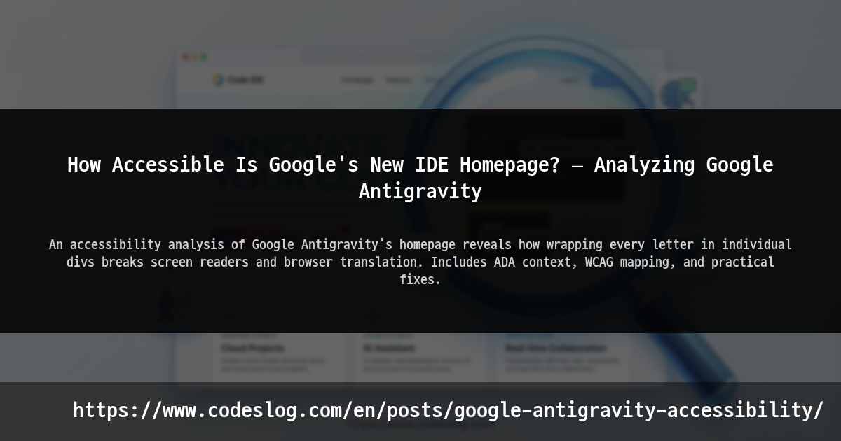
So I was surprised to find accessibility issues on the homepage of Google Antigravity, their recently announced next-generation AI IDE. And not minor ones either.
Let’s take a closer look.
Google and Microsoft: The A11y Honor Students#
Before diving in, let’s give credit where it’s due.
Google and Microsoft have done an enormous amount of work in accessibility.
Image: AI-generated
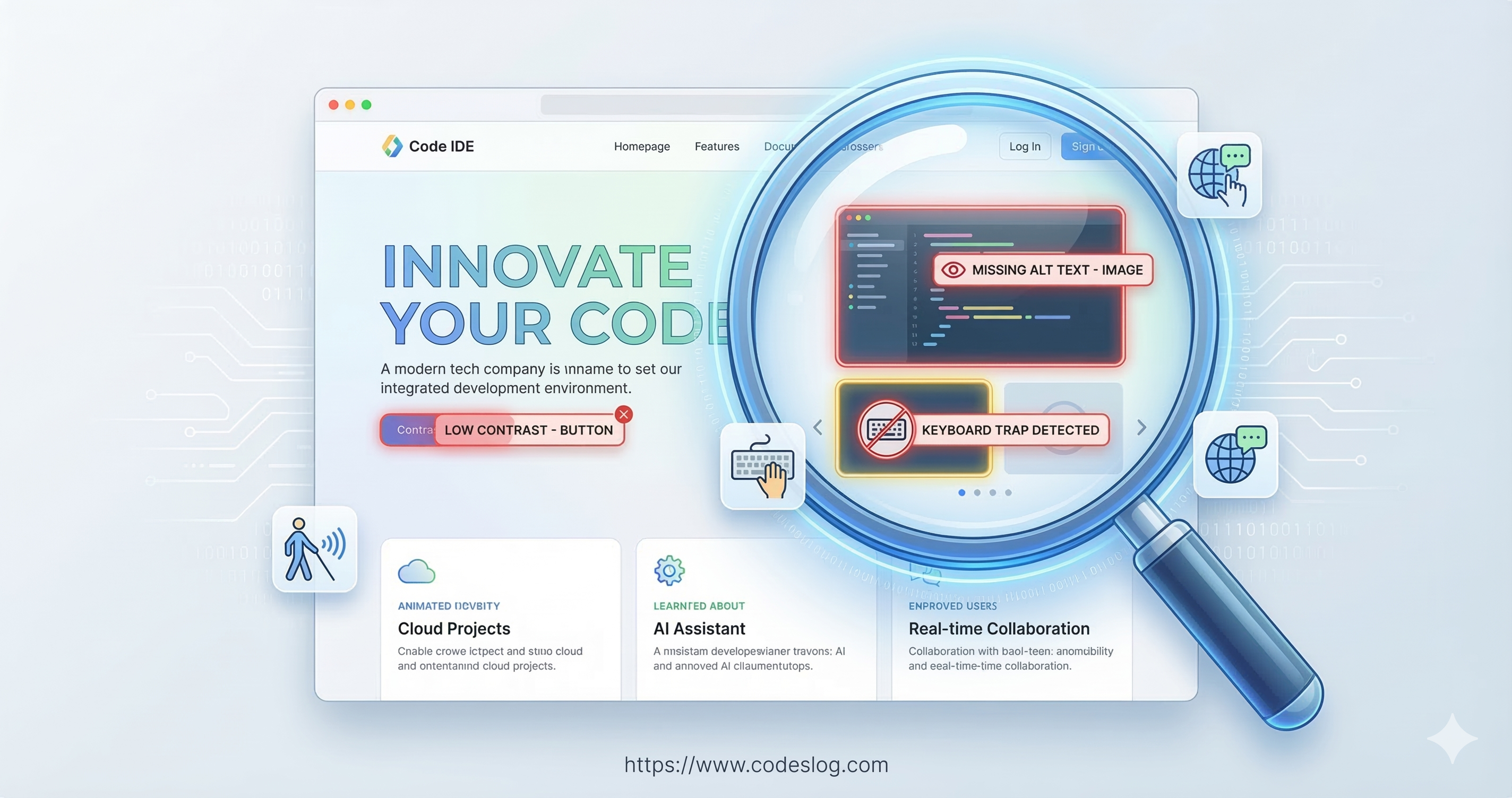
Google’s accessibility contributions:
- Lighthouse — the de facto standard for web accessibility auditing
- TalkBack — Android screen reader
- Chrome DevTools accessibility panel
- Public accessibility guidelines
Microsoft’s accessibility contributions:
- Accessibility Insights — free accessibility testing tool
- Narrator — Windows built-in screen reader
- Inclusive Design Toolkit
- Xbox Adaptive Controller — pioneering gaming accessibility
Both companies treat accessibility as a must-have, not a nice-to-have. They run internal accessibility training, and they’ve built review processes into their product release cycles.
But here’s the reality: when you operate hundreds of products and services, maintaining perfect accessibility across every page and every newly launched service is genuinely hard. Especially for fast-shipping marketing pages and landing pages, accessibility can slip down the priority list.
That’s understandable. The bigger the organization, the harder consistency becomes.
Still, the basics matter. Here’s why.
Issues Found#
1. One <div> Per Letter — A Screen Reader Nightmare#
This is the most critical issue from this analysis.
The hero section of Google Antigravity’s homepage features a heading:
“Experience liftoff with the next-generation IDE”
Visually, it’s a beautiful typographic animation — letters appearing one by one. To achieve this effect, the site wraps each individual character in its own <div>.
Google Antigravity homepage hero section (March 2026)
<!-- Estimated DOM structure -->
<div class="hero-heading">
  <div class="char">E</div>
  <div class="char">x</div>
  <div class="char">p</div>
  <div class="char">e</div>
  <div class="char">r</div>
  <div class="char">i</div>
  <div class="char">e</div>
  <div class="char">n</div>
  <div class="char">c</div>
  <div class="char">e</div>
  <div class="char"> </div>
  <div class="char">l</div>
  <div class="char">i</div>
  <div class="char">f</div>
  <div class="char">t</div>
  <!-- ... continues -->
</div>
This causes two major problems.
Screen Readers Spell Out Every Letter#
When a screen reader (VoiceOver, NVDA, etc.) hits this structure:
“E”, “x”, “p”, “e”, “r”, “i”, “e”, “n”, “c”, “e”, " “, “l”, “i”, “f”, “t”, “o”, “f”, “f”…
Each letter is read individually. To understand “Experience liftoff with the next-generation IDE,” a user would need to listen to over 40 separate elements one by one. The most important message on the page becomes completely unintelligible.
This isn’t a minor inconvenience — it violates WCAG 2.2 Success Criterion 1.3.1 (Info and Relationships). Content that’s visually a single sentence is programmatically fragmented into dozens of independent elements.
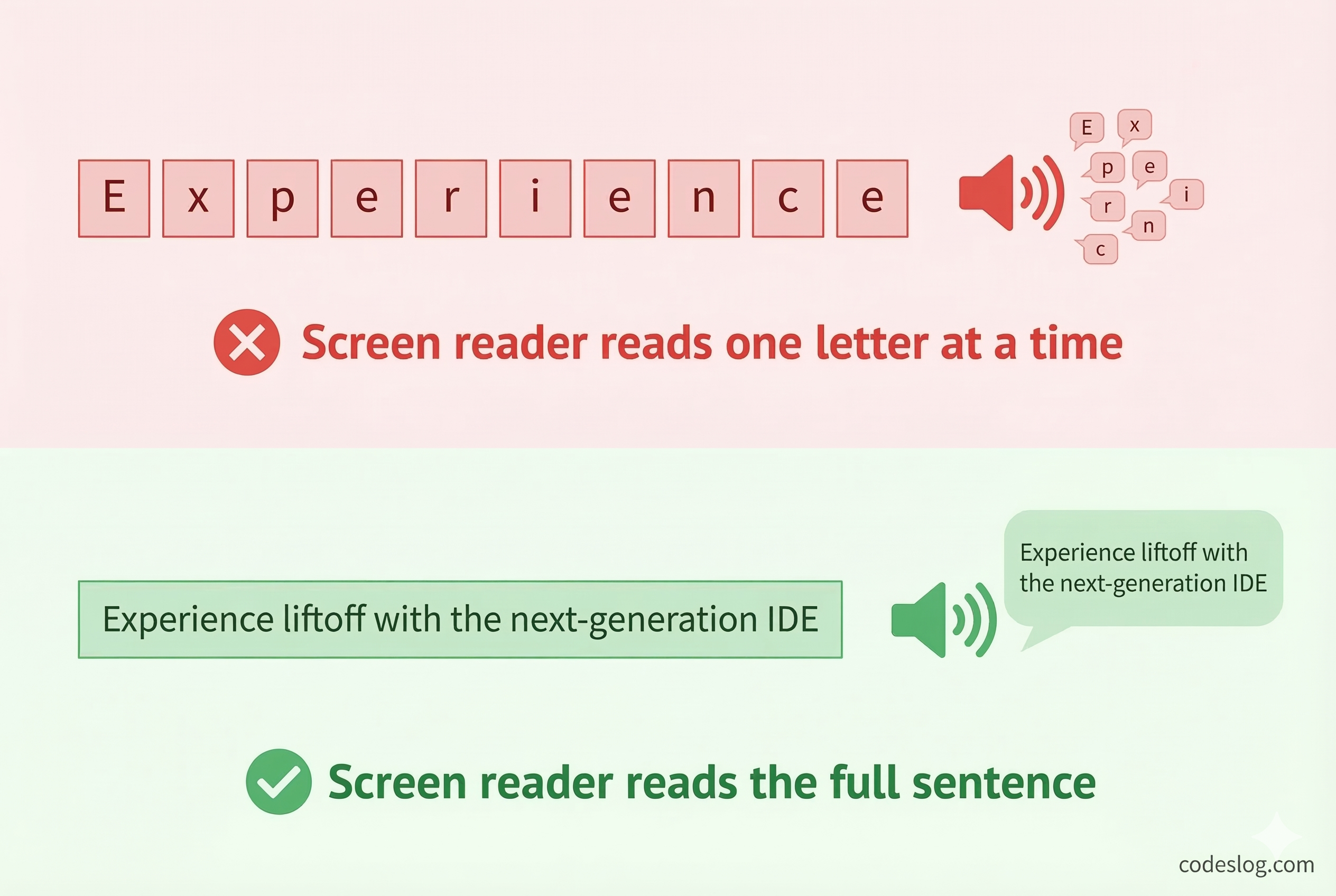
Image: AI-generated
Browser Translation Completely Breaks#
This extends beyond screen readers. Browser built-in translation is severely impacted too.
Chrome and Edge translation engines extract text per DOM element. When each character sits in its own <div>, the translation engine treats “E”, “x”, “p”… as independent words.
Translated to Korean, the result looks like this:
“이자형엑스피이자형아르 자형”
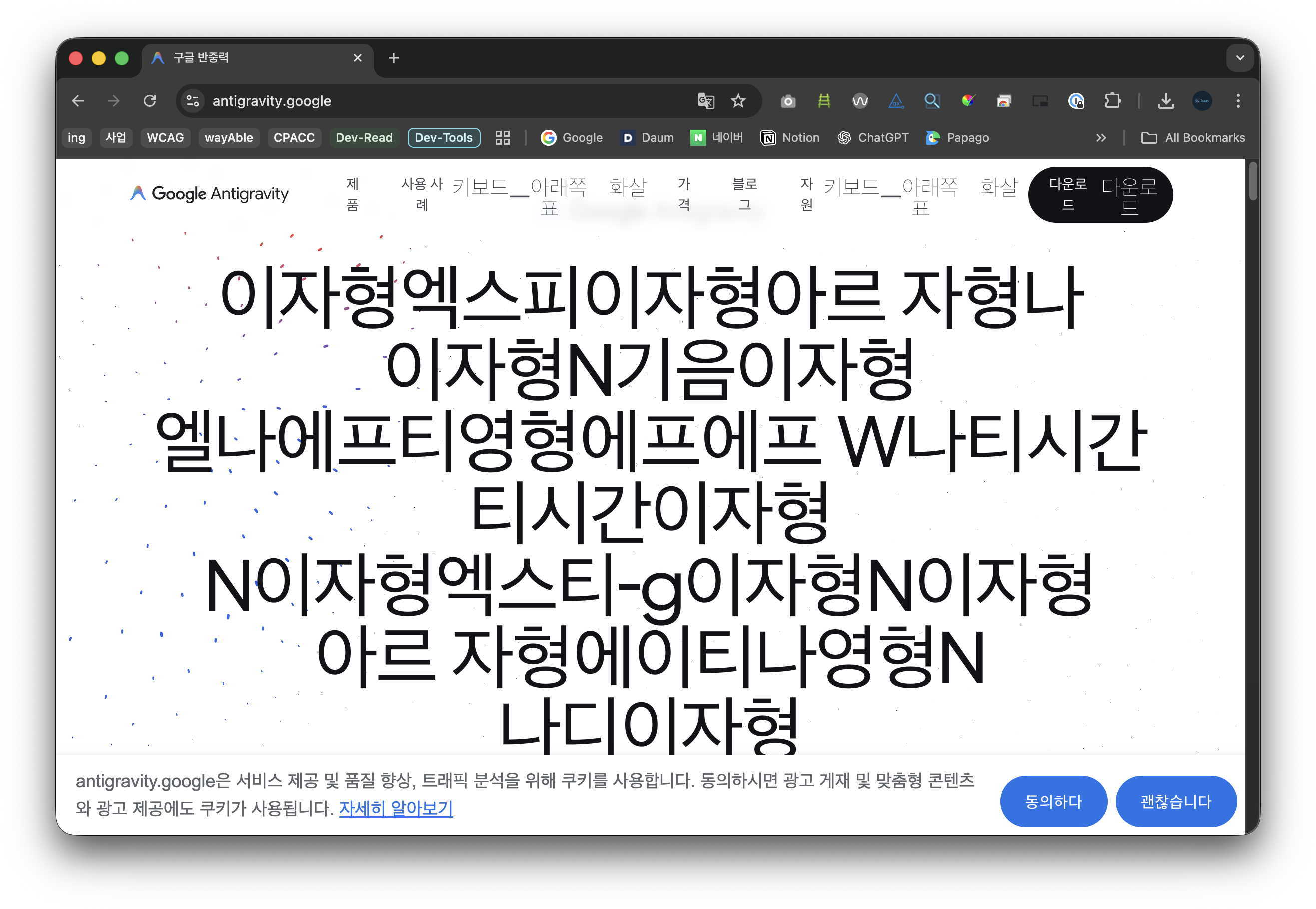
Chrome translation result: not a sentence, but an alphabet spelling exercise
Each letter becomes its Korean phonetic name. “Experience liftoff” turns into a sequence of individual alphabet readings. This isn’t translation — it’s an alphabet drill.
This affects every language, not just Korean. For billions of non-English speakers worldwide, the site’s core message is lost.
2. Custom Components and Accessibility#
Google Antigravity’s homepage is an Angular SPA using custom elements like <antigravity-logo> and <app-button>.
Some navigation buttons include aria-label attributes, providing basic screen reader support. However, some custom elements lack proper roles or alternative text.
<!-- Custom element needing accessibility info -->
<antigravity-logo></antigravity-logo>

<!-- Improved -->
<antigravity-logo role="img" aria-label="Google Antigravity logo"></antigravity-logo>
3. Text Splitting Across Every Section#
The character-level splitting isn’t limited to the hero section. The same pattern repeats throughout the page — every animated heading uses the same per-letter <div> structure. Secondary headings like “Built for developers for the agent-first era” have the same problem.
Every key message on the site reaches screen readers and translation tools as a meaningless sequence of individual characters.
Why Does This Happen?#
Visual Effects vs. Accessibility#
This isn’t intentionally harmful. To animate individual letters sequentially, you need to wrap them in separate elements. CSS and JavaScript animations work on a per-element basis.
The problem: the accessibility impact wasn’t considered during visual implementation.
The Irony of Making Tools You Don’t Use#
Google created Lighthouse and built accessibility panels into Chrome DevTools. Yet running these tools on their own product homepage reveals issues.
Making tools and actually using them are different things.
ADA Title II — What Changes in April 2026#
There’s an important legal context here.
The ADA (Americans with Disabilities Act) Title II rule takes effect on April 24, 2026. It requires state and local government websites and mobile apps to meet WCAG 2.1 AA standards.
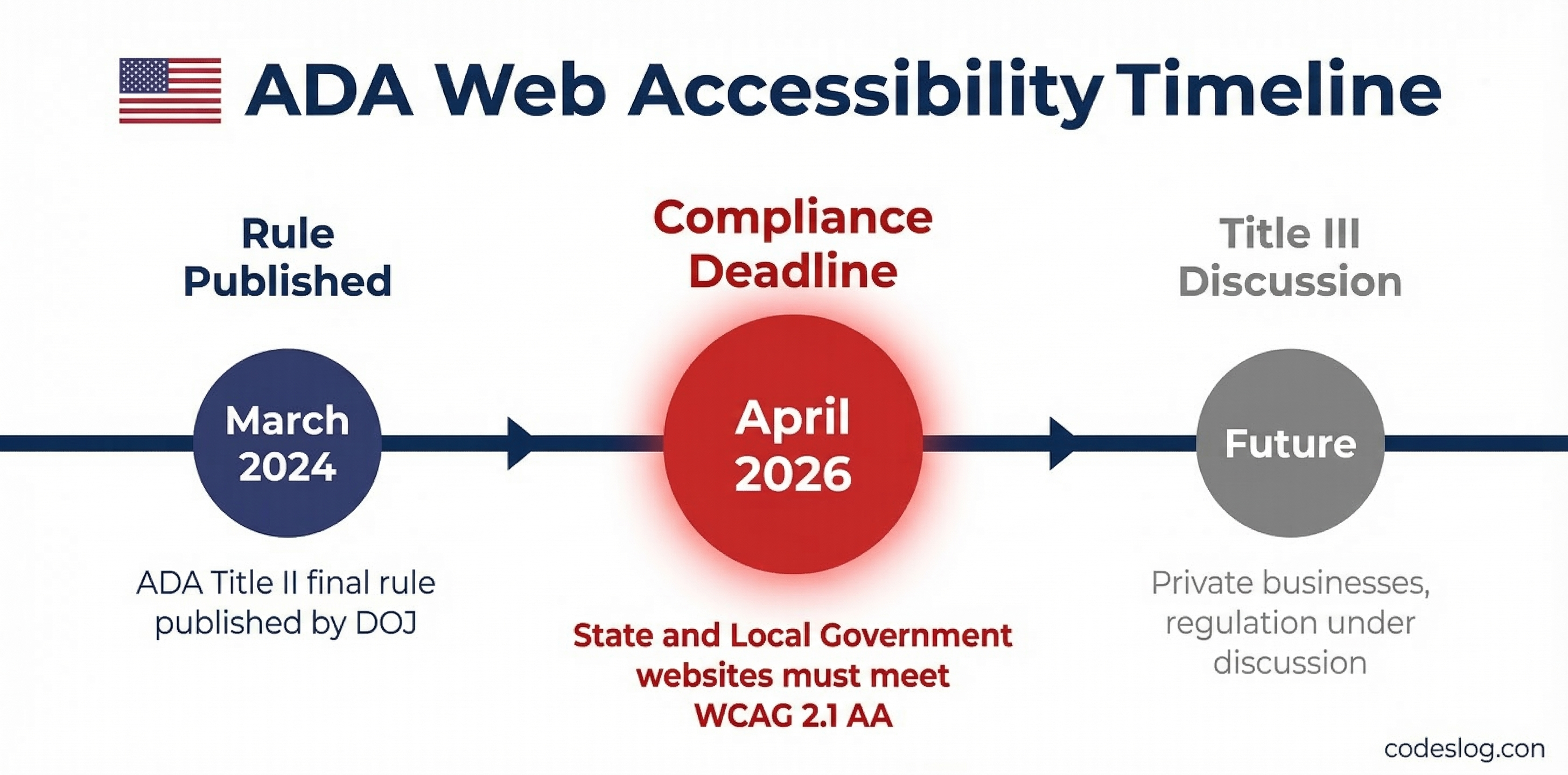
Image: AI-generated
“That’s only for government agencies, right?” True for now. But Title III (covering private businesses) regulations are already under discussion, and ADA-related lawsuits against private companies increase every year. Over 4,600 web accessibility lawsuits were filed in 2023 alone.
For global companies like Google and Microsoft, this is directly relevant. Their services’ accessibility levels directly correlate with legal risk.
In Korea, the Digital Inclusion Act took effect in January 2026, and accessibility standards continue to rise. Today it’s an animation on a marketing page, but these details will fall under scrutiny sooner rather than later.
Fixing It: Screen Reader Support#
aria-hidden + Visually Hidden Text#
The most common solution:
<h1>
  <!-- For screen readers: complete sentence -->
  <span class="sr-only">
    Experience liftoff with the next-generation IDE
  </span>

  <!-- For visual animation: hidden from screen readers -->
  <span aria-hidden="true">
    <span class="char">E</span>
    <span class="char">x</span>
    <span class="char">p</span>
    <!-- ... -->
  </span>
</h1>.sr-only {
position: absolute;
width: 1px;
height: 1px;
padding: 0;
margin: -1px;
overflow: hidden;
clip: rect(0, 0, 0, 0);
white-space: nowrap;
border-width: 0;
}Using aria-label#
A more concise approach:
<h1 aria-label="Experience liftoff with the next-generation IDE">
  <span aria-hidden="true">
    <span class="char">E</span>
    <span class="char">x</span>
    <span class="char">p</span>
    <!-- ... -->
  </span>
</h1>
These two approaches solve the screen reader problem. But what about translation?
Neither aria-hidden nor aria-label helps browser translation engines, which work from visible DOM text, not ARIA attributes. The per-<div> characters remain independent words to translation engines.
To address both screen readers and translation simultaneously, we need a fundamental structural fix.
The Real Fix: Preserving Text Integrity#
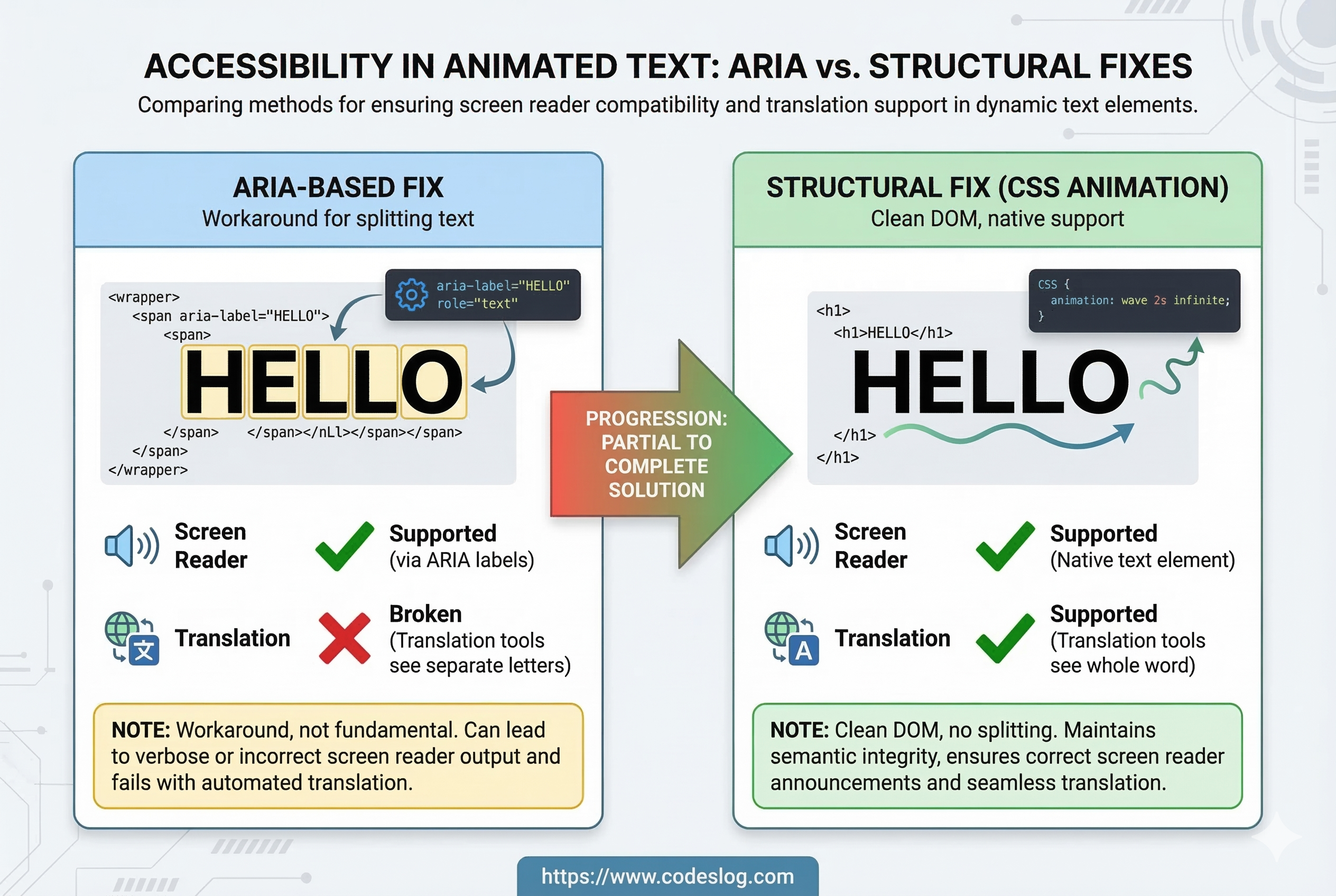
Image: AI-generated
CSS Animation Alternative#
Letter reveal effects don’t require splitting text into individual elements.
<h1 class="animate-text">
  Experience liftoff with the next-generation IDE
</h1>.animate-text {
background: linear-gradient(90deg, #000 50%, transparent 50%);
background-size: 200% 100%;
-webkit-background-clip: text;
background-clip: text;
animation: reveal 2s ease-out forwards;
}
@keyframes reveal {
from { background-position: 100% 0; }
to { background-position: 0 0; }
}Since text remains intact in the DOM:
- ✅ Screen readers read the complete sentence
- ✅ Browser translation works correctly
- ✅ Search engines can index the content
With @property and clip-path, even per-character sequential animation is possible with pure CSS — without touching the DOM.
When Splitting Is Truly Necessary: ARIA + Hidden Text + translate=“no”#
If per-character physics effects (3D rotation, individual delays, etc.) are absolutely required, combine the patterns:
<h1>
  <!-- For both translation engines and screen readers -->
  <span class="sr-only">
    Experience liftoff with the next-generation IDE
  </span>

  <!-- Visual animation only -->
  <span aria-hidden="true" translate="no">
    <span class="char">E</span>
    <span class="char">x</span>
    <span class="char">p</span>
    <!-- ... -->
  </span>
</h1>
The translate="no" attribute tells translation engines to skip that region. The .sr-only text gets translated instead, giving users a proper result.
This is a workaround, though. When possible, the CSS animation approach is far cleaner.
Respect prefers-reduced-motion#
Regardless of approach, respect users who prefer reduced motion.
@media (prefers-reduced-motion: reduce) {
  .animate-text,
  .char {
    animation: none !important;
    opacity: 1 !important;
    transform: none !important;
  }
}
For users with vestibular disorders, excessive animations can cause dizziness or nausea. This single media query makes a real difference.
Potentially Violated WCAG Criteria#
| WCAG Criterion | Level | Description |
|---|---|---|
| 1.3.1 Info and Relationships | A | Text split into individual divs fails to convey meaning programmatically |
| 1.3.2 Meaningful Sequence | A | Character-level splitting may not preserve logical reading order |
| 2.3.1 Three Flashes | A | Sequential letter animation could be excessive in edge cases |
| 3.1.1 Language of Page | A | lang="en" is properly set, but translation cannot recognize content |
Wrapping Up#
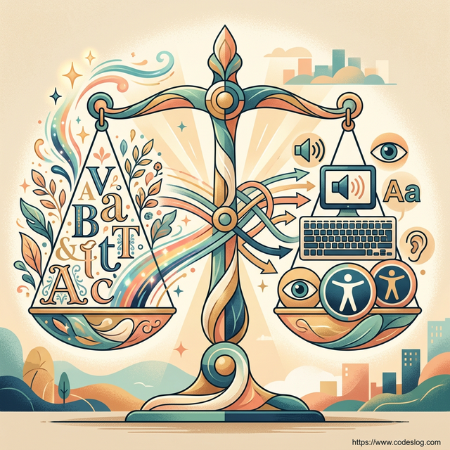
Image: AI-generated
This post isn’t meant to bash Google. Both Google and Microsoft have made enormous contributions to accessibility, and that’s undeniable.
But this case illustrates something important.
Accessibility can be overlooked by anyone, regardless of organization size or technical expertise. When you’re shipping fast and focusing on visual polish for a marketing page, it’s easy to miss the basics.
But the basics aren’t hard to fix:
- Adding
aria-hiddenand.sr-onlytakes 30 minutes - Switching to CSS animation cleans up the DOM entirely
- A single
translate="no"attribute mitigates the translation issue
ADA Title II takes effect in one month. Korea’s Digital Inclusion Act is already in force. Accessibility isn’t optional anymore — it’s required.
I hope the Google Antigravity team becomes aware of these issues and addresses them. And I hope we all take a moment to check our own projects for similar patterns.
A web that works for everyone starts with getting the basics right.
Bonus: This Post Actually Started With a Login Error#
Honestly, this whole analysis came from a pretty mundane problem.
I was trying to install Antigravity on my work PC and sign in, when this error appeared:
Antigravity there was an unexpected issue setting up your account. Failed to exchange authorization code for token.
My personal Google account works just fine, but every attempt with my work account hits this same wall. I’ve searched around and tried various things, but haven’t been able to solve it.
While hunting for a fix, I naturally started poking around the site — and when I opened DevTools, that’s when I spotted the <div> structure. One bug led me to another.
Has anyone else run into this? Specifically the case where a personal Google account works fine but a Google Workspace account fails to log in. If you know the solution, I’d be really grateful if you could share it in the comments.