Some people set their screen to maximum contrast. Yellow text on black, white text on blue, that sort of thing. For low-vision users this is the difference between being able to read the text and not; people with migraines or light sensitivity go the other way, using a muted, low-contrast palette. They have one thing in common — the user decides the colors. And the moment they do, a good chunk of the colors we wrote in CSS get ignored.
This article is about that “moment of being ignored” — how to keep the screen from falling apart in high contrast mode, where the OS paints over the colors you chose. If you’ve done dark mode, you’ll use familiar tools (media queries, CSS variables), but the mindset flips completely. In fact this is a follow-up to Dark Mode Done Right — it properly unpacks the thing that post hinted at near the end, that “the OS overrides even your dark tokens.” You don’t need to have read the dark mode piece, though — I’ll cover the background you need right here.
High contrast isn’t something I paint#
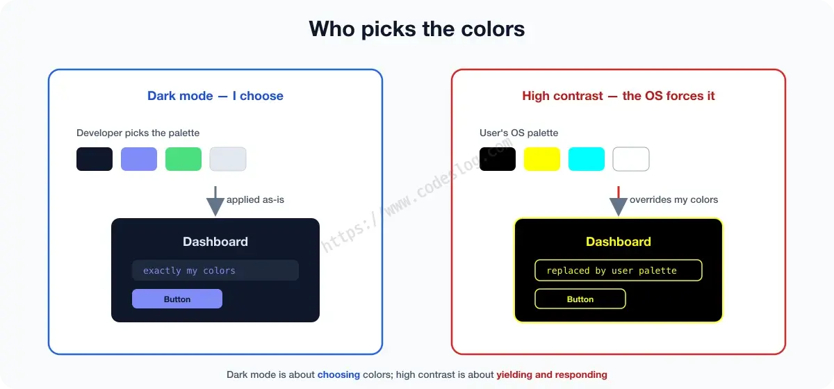
When we built dark mode, we chose the colors. We agonized over which accent suited a dark background, designed tokens, matched contrast ratios. The developer held the wheel.
High contrast mode is the opposite. When a user turns on high contrast in their OS, the browser repaints the screen with the palette they chose. The background, text, and border colors you set get force-swapped for a handful of colors from that palette. It’s like painting a wall carefully, then the building manager showing up and repainting it in the regulation colors. This is called forced-colors mode — most notably, Windows’ high-contrast setting (in Windows 11, “Contrast themes”) turns it on.
So no matter how pretty your dark tokens are, once forced-colors is on, most of those colors don’t apply. Supporting dark mode and supporting high contrast are separate jobs. By the end of this article you’ll know what gets overridden and what doesn’t when forced-colors is on, keep boundaries, states, and focus from vanishing, respond when a user wants more contrast (prefers-contrast), and be able to test all of it yourself.
Three terms first#
Let me line up the three things you’ll see, one line each.
- forced-colors mode: the state where the OS force-swaps colors with the user’s palette. Detected with
@media (forced-colors: active). - System color keywords: names like
Canvas(background),CanvasText(body text),LinkText(links) that point to a color in the current user palette. Use these names inside forced-colors and you follow exactly the colors the user chose. - prefers-contrast: the user’s preference for more or less contrast. Detected with
@media (prefers-contrast: more). Unlike forced-colors, here you still control the colors — you just serve a stronger-contrast variant.
forced-colors and prefers-contrast are easy to confuse, but the line is clear. forced-colors is the OS forcing it (your colors get overridden); prefers-contrast is you responding to a preference (you push your colors harder). It’s good to handle both.
Responding to forced-colors#
When forced-colors turns on, the browser does a lot for you. Background, text, and border colors get swapped for the user palette, and semantic <button>, links, and form elements map to appropriate system colors. So a page built well with semantic HTML mostly just works. Trouble shows up where we’ve loaded meaning into color.
Let’s get a feel for what gets overridden and what doesn’t.
- Overridden:
color,background-color,border-color→ swapped for system colors.box-shadow,text-shadow→ removed entirely. - Not overridden:
<img>photos, and elements you explicitly opt out withforced-color-adjust: none.
Here’s where the most common accident happens — a boundary made from background color alone. If you distinguished cards or buttons only by background color, forced-colors turns all those backgrounds into the same system color and the boundaries evaporate. A card floated with a shadow flattens out too, since the shadow is gone.
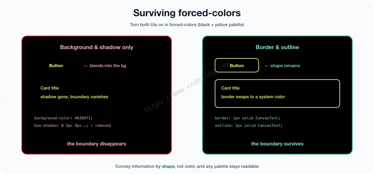
The fix is to convey the boundary by shape, not color. Use a border and its color swaps to a system color, so the boundary survives.
@media (forced-colors: active) {
  .card {
    /* make the boundary with a border, not a background — forced-colors overrides custom backgrounds */
    border: 1px solid CanvasText;
  }
}
Buttons are the same. If you dressed up a <div> as a button with background color only, it just melts into the background in forced-colors. Use a semantic <button> and the browser applies button system colors for you; for a custom button, spell out the shape with a border.
@media (forced-colors: active) {
  .btn-custom {
    border: 1px solid ButtonText;   /* convey "this is a button" with a border, not color */
  }
}
Be careful with focus indicators too. If you drew the focus ring with box-shadow, it disappears in forced-colors, and keyboard users can’t tell where they are. outline gets swapped and survives, so drawing focus with an outline is the safe bet.
:focus-visible {
  /* box-shadow is removed in forced-colors, so draw with outline */
  outline: 2px solid CanvasText;
  outline-offset: 2px;
}
Use forced-color-adjust sparingly#
Sometimes the color itself is the information — a color palette swatch, a badge whose state is shown by color, a brand logo swatch. If these get overridden by system colors too, the information is lost. Only in those cases, use forced-color-adjust: none to exempt that element from color forcing.
.color-swatch {
  forced-color-adjust: none;   /* only for elements where the color itself is the information */
}
The caveat: don’t slap this on body or globally to neutralize forced-colors itself. That’s a developer switching off an accessibility feature the user deliberately turned on — and for low-vision users, the screen becomes unreadable again. Use it only on the individual elements that truly need it, sparingly.
prefers-contrast: when the user wants it stronger#
If forced-colors is “the OS forcing colors,” prefers-contrast: more is a gentler signal that “the user wants more contrast.” Here your colors aren’t taken away — you just prepare and serve a stronger-contrast version. It’s the same move as swapping tokens in dark mode.
@media (prefers-contrast: more) {
  :root {
    --color-text-subtle: #1a1a2e;   /* darken faint gray secondary text */
    --color-border: #000000;         /* sharpen light borders */
  }
}
Faint secondary text, light dividers, subtle placeholders — these low-contrast touches that usually read as “refined” are the first things to vanish for a user who wants contrast. Lift just those in prefers-contrast: more, and you give the right contrast to the people who need it without hurting the design.
The high-contrast toggle I built, and why I stopped#
An honest story. This blog once had a high-contrast toggle button in the header — click it and the whole site switched to its own high-contrast theme, a cousin of the dark toggle. It’s turned off now.
Here’s why. A custom high-contrast theme means matching the contrast of every component by hand. Not just the body, but cards, the table of contents, tags, categories, pagination, the related-posts list — miss one spot and contrast breaks there. When you’re spending time getting the contrast of a single pagination number right, you start to wonder. And you also have to sort out which color should win when the dark toggle and the high-contrast toggle are both on.
Then it hit me: forced-colors and prefers-contrast mean the browser and OS already do that heavy lifting for you. If I just leave the boundaries clean with system color keywords, the user palette applies consistently across everything without me hand-tuning every component. So my conclusion these days is this — a custom high-contrast toggle is something you add later; the foundation is respecting forced-colors. Get the order backwards and you’ll pull an all-nighter. How do I know? …I’d honestly rather not have found out.
Hard, yes — and worth doing anyway#
This isn’t just me whining. At a web accessibility event, Kim Hye-il, Kakao’s digital accessibility lead, once said something that stuck with me — high contrast mode is even harder than dark mode. Exactly what we’ve been seeing all article. Unlike dark mode, where you pick the colors freely, high contrast is about keeping the screen from falling apart inside rules the user and the OS have set.
But there was an important second half to that remark — and yet Kakao pours effort into high contrast mode for its users. “Hard” isn’t an excuse to skip it; it also means it’s an area where doing it right genuinely shows. Why would a service used by millions spend resources on this “hard thing”? Simple: beyond that screen are real users who literally can’t read the text without high contrast.
So our job isn’t to shoulder all that difficulty at once — it’s to build up one layer at a time, starting from respecting forced-colors. That’s the first step toward making the “hard thing” sustainable.
How to test#
Without checking it with your own eyes, high-contrast support is only half done. Two ways.
- Real OS setting: turn on Windows’ “Contrast themes” (Settings → Accessibility → Contrast themes) and look at the site. Most accurate.
- Browser emulation: in Chrome/Edge DevTools’ Rendering tab, set
Emulate CSS media feature forced-colorstoactiveand you can see the forced-colors screen without touching your OS setting.prefers-contrastis emulated in the same tab.
I’d sweep quickly with emulation, then confirm once more with the real Contrast theme before shipping.
One-page summary#
- High contrast mode (forced-colors) is separate from dark mode — dark is you choosing colors, high contrast is the OS overriding yours. Well-built dark tokens don’t apply under forced-colors
- Detect with
@media (forced-colors: active), follow the user palette with system color keywords (Canvas·CanvasText·ButtonText…) - Overridden: background, text, border colors (swapped), shadows (removed) / a boundary made from background color alone disappears → convey shape with border·outline
- Draw focus with
outline, notbox-shadow(shadows are removed). Useforced-color-adjust: noneonly on elements where color is the information, sparingly prefers-contrast: moreis a user-preference signal — lift only faint secondary text and light dividers to respond. Test with DevTools emulation + a real Contrast theme
Wrapping up#
High-contrast support boils down to a single mindset — don’t collapse when the color is taken away. If shape (border, outline, semantic structure) remains after the color is gone, the screen stays readable no matter which palette the user forces. And that’s really a by-product of good markup. The habit of conveying meaning through structure rather than leaning on color builds a sturdier screen for everyone, not just high-contrast users.
If dark mode let you enjoy choosing colors, high contrast is practice in gladly letting them go. Do both, and whether it’s bright, dark, or a moment that needs maximum contrast — nobody gets pushed off the screen.
질문으로 다시 보기#
If I support dark mode, do I get high contrast mode too?
Why does my button disappear in forced-colors mode?
More in this series#
Browse the full Frontend × Accessibility series — from dark mode to SPA focus management, form UX, and modals, a series that “connects an accessibility lens to everyday frontend topics.”