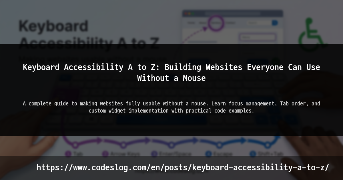
Introduction#
Have you ever tried using the internet without a mouse? Most people take their mouse for granted. But there are many people who can’t use one.
- People with physical disabilities who can’t operate a mouse
- People with repetitive strain injuries like carpal tunnel syndrome
- People with temporary arm injuries
- Power users who simply find keyboards more efficient
For these users, the question “Can I use this site with just a keyboard?” is crucial.
Keyboard accessibility isn’t just about pressing the Tab key to move around. It encompasses focus management, keyboard shortcuts, alternatives to drag-and-drop, modal navigation, and so much more.
In this article, we’ll cover keyboard accessibility from A to Z. While we’ll touch on theoretical background, our focus will be on practical code examples you can apply immediately.
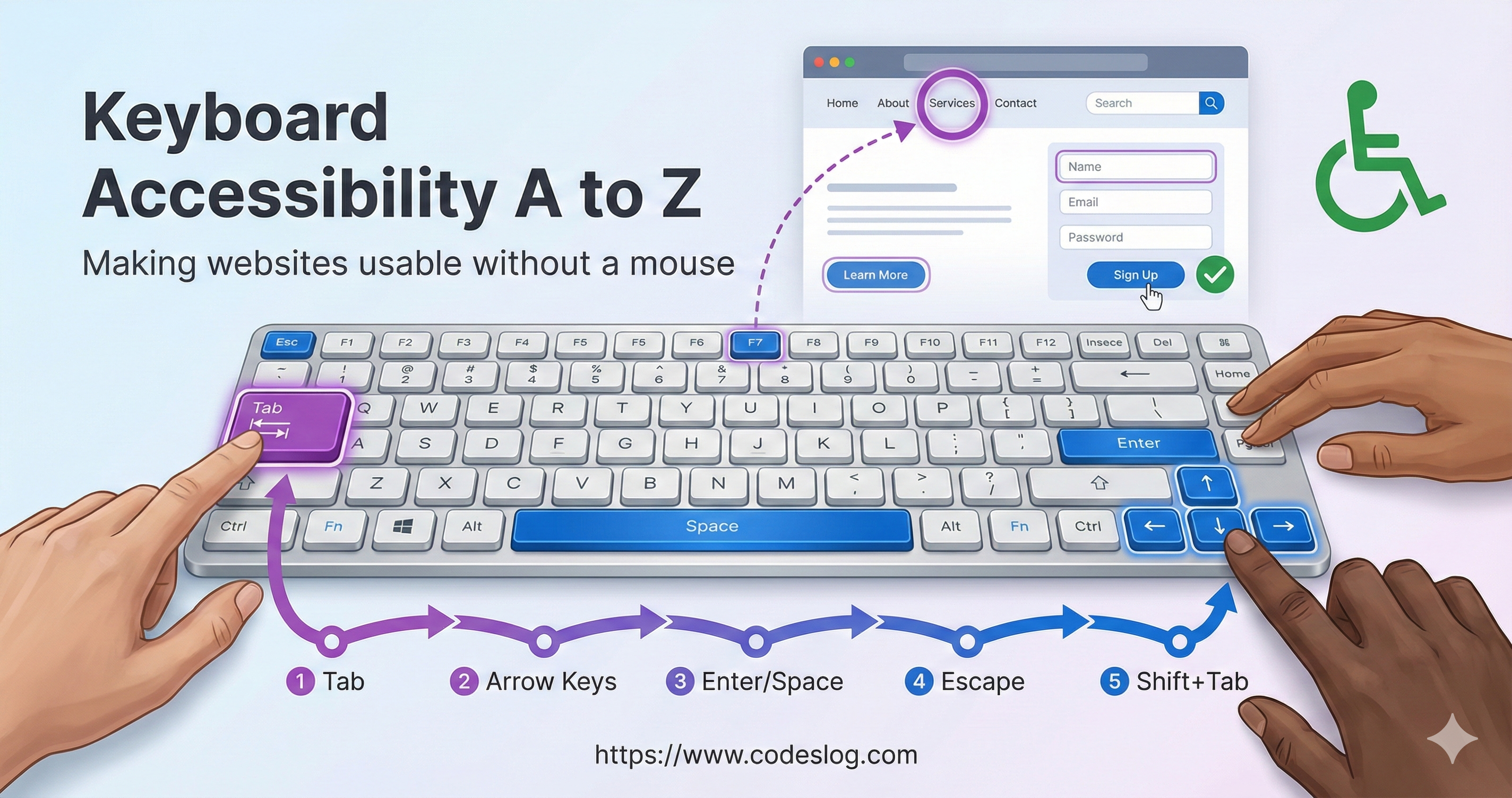
Image: Generated with Nanobanana AI
Why Keyboard Accessibility Matters#
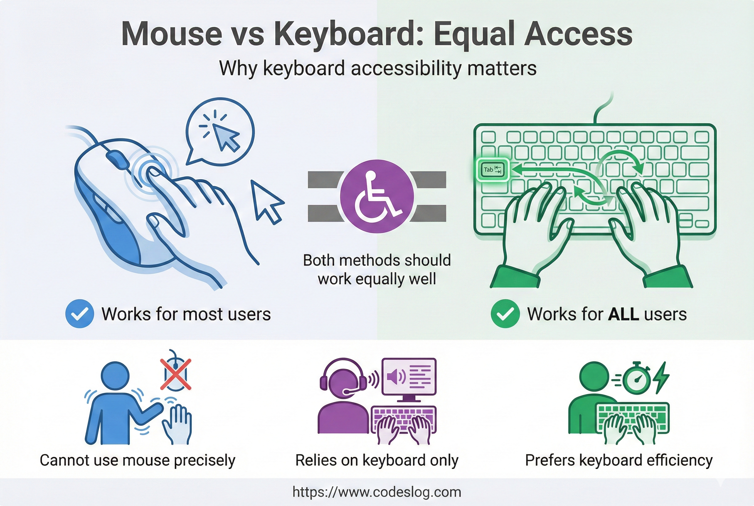
Image: Generated with Nanobanana AI
Standards and Requirements#
Many accessibility standards treat keyboard accessibility as a core requirement. WCAG 2.2’s Keyboard Accessible success criteria makes it clear: “All functionality must be available using only a keyboard.”
User Demand#
How many people actually navigate the web with a keyboard?
- Users with motor disabilities who find mouse use difficult
- Users with temporary injuries or fatigue making mouse use uncomfortable
- Power users who prefer keyboards for efficiency
Co-benefits#
Keyboard accessibility is like building ramps in architecture.
At first, you might think “That’s just for wheelchair users, right?” But in reality, parents with strollers, delivery workers with heavy loads, and elderly people who struggle with stairs all benefit. Keyboard accessibility works the same way.
Interestingly, improving keyboard accessibility improves other forms of accessibility too:
- Screen readers: Good keyboard accessibility automatically means good screen reader support
- Voice control: If keyboard navigation works, voice control works too
- Mobile: Touch interactions are essentially focus-based navigation
- Development quality: Clear focus management improves code quality
Core Concepts: Focus and Tab Order#
What is Focus?#
Focus refers to the element currently ready to receive keyboard input.
<!-- Focusable elements -->
<button>Click me</button>
<a href="#">Link</a>
<input type="text">
<select>
  <option>Select</option>
</select>
These elements are focusable by default. However, elements like <div> and <span> are not focusable by default.
The Importance of Tab Order#
When users press the Tab key, the website moves focus through elements in sequence. This order must be logical.
Good example:
[1] Search input
    ↓
[2] Search button
    ↓
[3] First search result
    ↓
[4] Second search result
Bad example:
[1] Footer link
    ↓
[2] Left sidebar
    ↓
[3] Main content
    ↓
[4] Header
This kind of order confuses users.
The tabindex Attribute#
You can change the default tab order or make non-focusable elements focusable:
<!-- Priority based on tabindex value -->
<!-- Values from 1 to 32767 (lower = higher priority) -->
<button tabindex="1">First</button>
<button tabindex="2">Second</button>

<!-- 0: Include in automatic order (recommended) -->
<div tabindex="0" role="button">Focusable div</div>

<!-- -1: Exclude from automatic order but allow programmatic focus -->
<div tabindex="-1" id="modal-content">Modal content</div>
Important rules:
- Using tabindex values of 1 or higher should be avoided (though there may be rare cases where it’s truly necessary)
- Always use 0 or -1, and manage tab order through DOM order
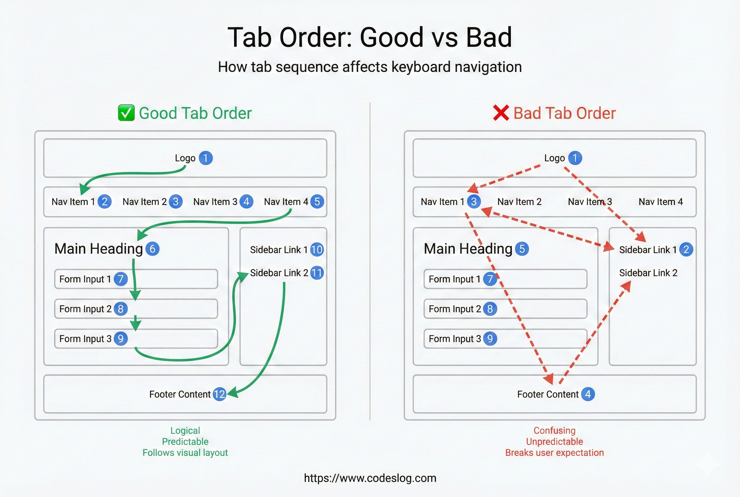
Image: Generated with Nanobanana AI
Skip Links and Focus Restoration#
<!-- Place at top of document: caught on first Tab -->
<a class="skip-link" href="#main">Skip to main content</a>

<main id="main" tabindex="-1">
  ...
</main>

<style>
.skip-link {
  position: absolute;
  left: -999px;
}
.skip-link:focus {
  left: 1rem;
  top: 1rem;
  background: #fff;
  outline: 3px solid #4A90E2;
}
</style>- When closing modals or dropdowns, returning focus to the trigger button is best practice. This helps keyboard users maintain context and keeps the focus order stable.
WCAG 2.2#
- SC 2.5.7 Dragging Movements: If there’s a drag operation, users must be able to perform the same function with a single pointer without dragging. (Exceptions for essential dragging)
- SC 2.5.8 Target Size (Minimum): Design interactive targets to be at least 24px (or ensure a minimum 24×24 area).
Key Handling: Events and Shortcuts#
Key Event Basics#
// Basic key event handling
element.addEventListener('keydown', (event) => {
  console.log('Key code:', event.code);
  console.log('Key value:', event.key);

  // Check for specific key
  if (event.key === 'Enter') {
    // Handle Enter
  }
});Note: keyCode is deprecated. Use key or code instead.
Key Roles#
| Key | Purpose | Example |
|---|---|---|
Tab | Move to next focus | Automatic for all elements |
Shift+Tab | Move to previous focus | Automatic for all elements |
Enter | Click buttons, submit forms | <button>, <a> |
Space | Activate buttons, toggle checkboxes | <button>, <input type="checkbox"> |
Escape | Close modals, close menus | Custom implementation needed |
Arrow Keys | List navigation, radio button selection | Custom widgets |
Preventing Default Behavior and Key Handling#
// Proper key handling example
button.addEventListener('keydown', (event) => {
  // Prevent default only when necessary
  if (event.key === 'Enter' || event.key === ' ') {
    event.preventDefault();
    handleButtonClick();
  }
});Important: When using standard HTML elements (<button>, <a>), browsers handle key events automatically. You only need to handle keys for custom elements.
Focus Management: When and Where to Move#
Automatic vs Manual Focus#
// ❌ Bad: Arbitrary automatic focus
input.addEventListener('blur', () => {
  // Unintended focus movement
  someOtherElement.focus();
});

// ✅ Good: Focus movement based on user intent
button.addEventListener('click', () => {
  // Move to first focusable element after modal opens
  modal.showModal();
  modal.querySelector('input').focus();
});
Implementing Focus Traps#
Focus traps should only be used in UI that blocks interaction with the background, like modal dialogs. Regular panels or dropdowns should allow users to navigate freely.
function createFocusTrap(modalElement) {
  const focusableElements = modalElement.querySelectorAll(
    'button, [href], input, select, textarea, [tabindex]:not([tabindex="-1"])'
  );

  const firstElement = focusableElements[0];
  const lastElement = focusableElements[focusableElements.length - 1];

  modalElement.addEventListener('keydown', (event) => {
    if (event.key !== 'Tab') return;

    if (event.shiftKey) {
      // Shift+Tab: Move backward
      if (document.activeElement === firstElement) {
        event.preventDefault();
        lastElement.focus();
      }
    } else {
      // Tab: Move forward
      if (document.activeElement === lastElement) {
        event.preventDefault();
        firstElement.focus();
      }
    }
  });
}
Focus Restoration#
When dialogs or overlays close, focus must return to its original position:
class Modal {
  constructor(element) {
    this.element = element;
    this.previouslyFocusedElement = null;
  }

  open() {
    // Save current focus before opening
    this.previouslyFocusedElement = document.activeElement;

    this.element.showModal();
    this.element.querySelector('input').focus();
  }

  close() {
    this.element.close();

    // Restore original focus
    if (this.previouslyFocusedElement && this.previouslyFocusedElement.focus) {
      this.previouslyFocusedElement.focus();
    }
  }
}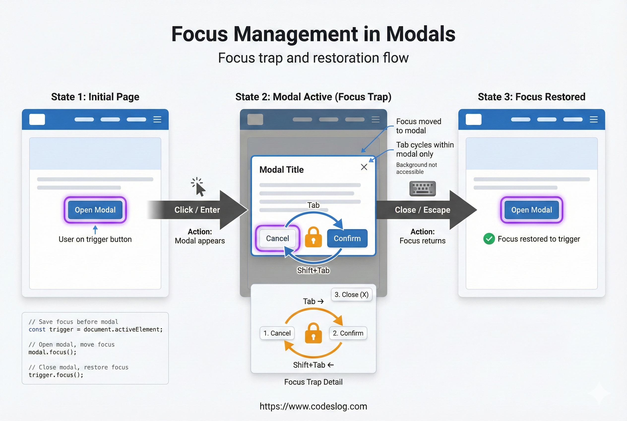
Image: Generated with Nanobanana AI
Custom Widgets: Keyboard Handling Without Standards#
Many developers ignore standard HTML elements and create custom widgets. In these cases, you must implement all key handling yourself.
Dropdown Menu#
class Dropdown {
  constructor(triggerButton, menu) {
    this.trigger = triggerButton;
    this.menu = menu;
    this.items = menu.querySelectorAll('[role="menuitem"]');
    this.currentIndex = -1;

    this.setupListeners();
  }

  setupListeners() {
    // Trigger key handling
    this.trigger.addEventListener('keydown', (event) => {
      if (event.key === 'Enter' || event.key === ' ' || event.key === 'ArrowDown') {
        event.preventDefault();
        this.open();
        this.focusItem(0);
      }
    });

    // Menu key handling
    this.menu.addEventListener('keydown', (event) => {
      switch (event.key) {
        case 'ArrowDown':
          event.preventDefault();
          this.focusNext();
          break;
        case 'ArrowUp':
          event.preventDefault();
          this.focusPrev();
          break;
        case 'Home':
          event.preventDefault();
          this.focusItem(0);
          break;
        case 'End':
          event.preventDefault();
          this.focusItem(this.items.length - 1);
          break;
        case 'Enter':
          event.preventDefault();
          this.selectCurrent();
          break;
        case 'Escape':
          event.preventDefault();
          this.close();
          this.trigger.focus();
          break;
      }
    });
  }

  focusItem(index) {
    if (index < 0 || index >= this.items.length) return;

    this.currentIndex = index;
    this.items[index].focus();

    // Visual highlight
    this.items.forEach((item, i) => {
      item.setAttribute('aria-selected', i === index);
    });
  }

  focusNext() {
    const nextIndex = this.currentIndex + 1;
    if (nextIndex < this.items.length) {
      this.focusItem(nextIndex);
    }
  }

  focusPrev() {
    const prevIndex = this.currentIndex - 1;
    if (prevIndex >= 0) {
      this.focusItem(prevIndex);
    }
  }

  open() {
    this.menu.classList.add('visible');
  }

  close() {
    this.menu.classList.remove('visible');
    this.currentIndex = -1;
  }

  selectCurrent() {
    if (this.currentIndex >= 0) {
      this.items[this.currentIndex].click();
    }
    this.close();
  }
}
Tree Widget#
For hierarchical structures like file explorers:
class TreeWidget {
  constructor(rootElement) {
    this.root = rootElement;
    this.setupListeners();
  }

  setupListeners() {
    this.root.addEventListener('keydown', (event) => {
      const item = event.target.closest('[role="treeitem"]');
      if (!item) return;

      switch (event.key) {
        case 'ArrowRight':
          event.preventDefault();
          this.expandItem(item);
          break;
        case 'ArrowLeft':
          event.preventDefault();
          this.collapseItem(item);
          break;
        case 'ArrowDown':
          event.preventDefault();
          this.focusNextItem(item);
          break;
        case 'ArrowUp':
          event.preventDefault();
          this.focusPrevItem(item);
          break;
        case 'Home':
          event.preventDefault();
          this.focusFirstItem();
          break;
        case 'End':
          event.preventDefault();
          this.focusLastItem();
          break;
        case '*': // Expand all items
          event.preventDefault();
          this.expandAll();
          break;
      }
    });
  }

  expandItem(item) {
    item.setAttribute('aria-expanded', 'true');
    const children = item.nextElementSibling;
    if (children) {
      children.style.display = 'block';
    }
  }

  collapseItem(item) {
    item.setAttribute('aria-expanded', 'false');
    const children = item.nextElementSibling;
    if (children) {
      children.style.display = 'none';
    }
  }

  // ... other methods
}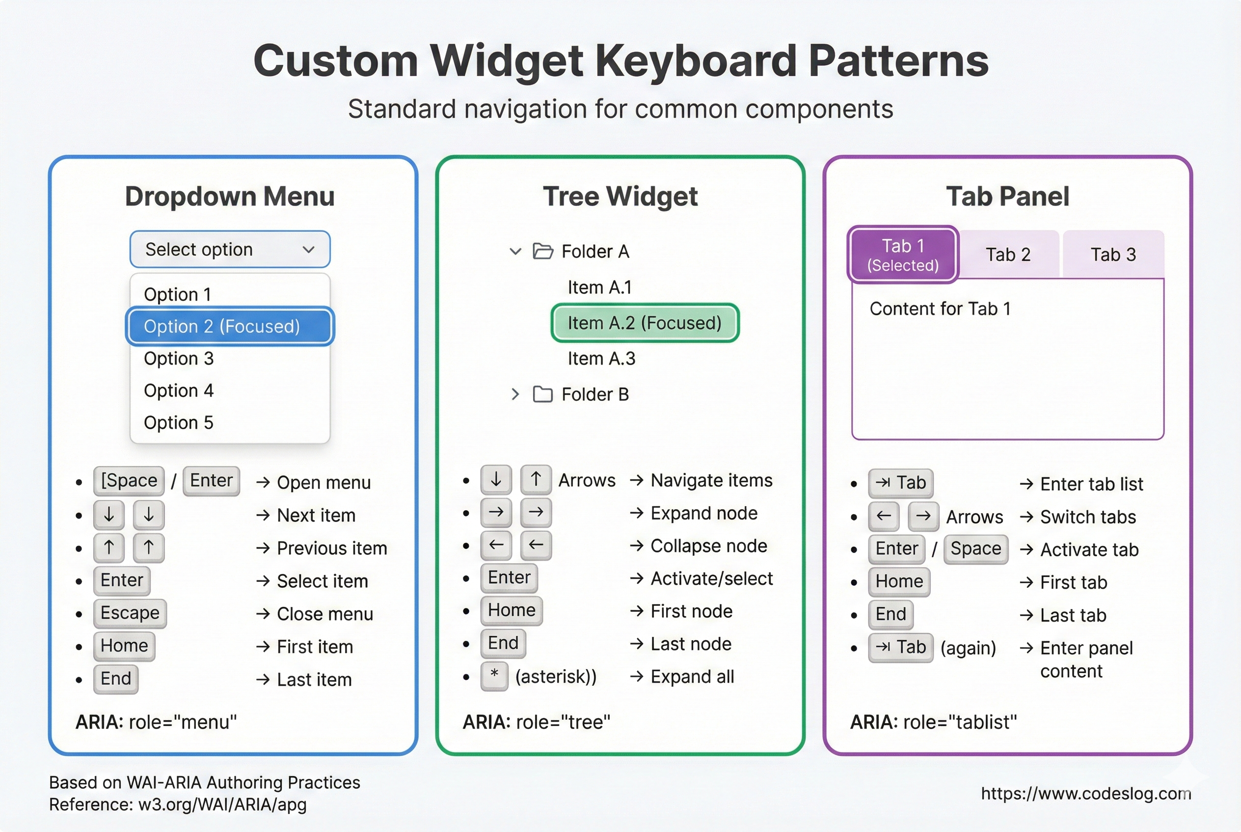
Image: Generated with Nanobanana AI
Focus Styles: If You Can’t See It, You Can’t Access It#
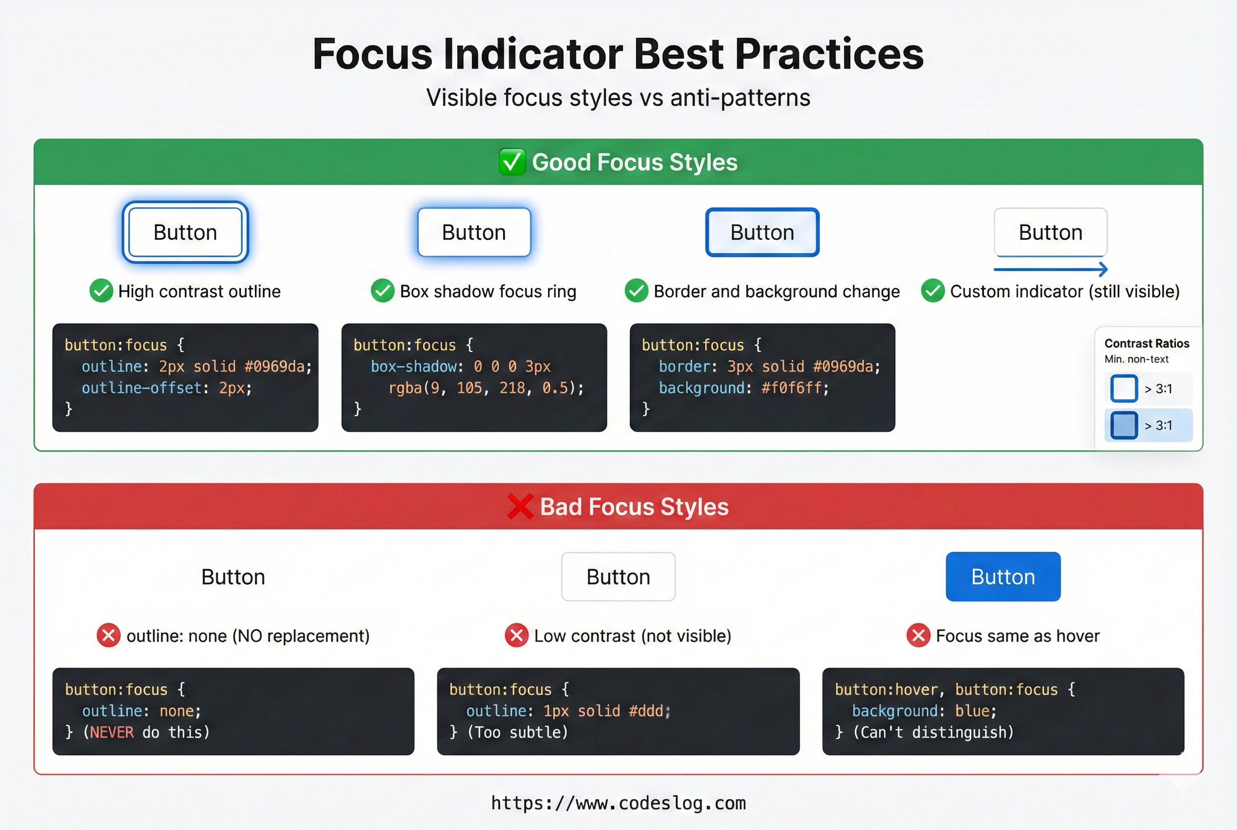
Image: Generated with Nanobanana AI
The Problem with Default Focus Styles#
Many developers remove the default focus style (blue outline) without providing an alternative. Sometimes it’s because of design requirements, sometimes it’s just convention. And sometimes… I’ve seen cases where developers remove it because they couldn’t handle the layout breaking from the outline or border… That’s not the right approach, is it?
/* ❌ Never do this: Remove focus outline without replacement */
button:focus {
  outline: none;
}

/* ✅ Recommended: Clear focus style */
button:focus {
  outline: 3px solid #4A90E2;
  outline-offset: 2px;
}
Characteristics of Good Focus Styles#
/* Comprehensive focus styles */
:focus-visible {
  outline: 3px solid var(--primary);
  outline-offset: 2px;
  border-radius: 3px;
}

/* Dark mode support */
@media (prefers-color-scheme: dark) {
  :focus-visible {
    outline-color: #58A6FF;
  }
}

/* High contrast mode support */
@media (prefers-contrast: more) {
  :focus-visible {
    outline-width: 4px;
    outline-offset: 3px;
  }
}
Key requirements for focus styles:
- ✅ Sufficient contrast against background (aim for 3:1 non-text contrast)
- ✅ Large enough area to be clearly visible even on small elements
- ✅ Applied consistently to all focusable elements
- ✅ Visible in both dark and light modes
:focus-visible vs :focus#
/* :focus - All focus states */
button:focus {
  background: blue;
}

/* :focus-visible - Keyboard focus only */
button:focus-visible {
  outline: 3px solid blue;
}

/* Result: Mouse click shows blue background only, keyboard Tab shows blue outline */
Drag and Drop Alternatives#
Drag and drop is a mouse-only interaction. Keyboard users need the same functionality.
Accessible Drag and Drop#
class AccessibleDragDrop {
  constructor(items, container) {
    this.items = items;
    this.container = container;
    this.selectedItem = null;
    this.sourceIndex = null;

    this.setupListeners();
  }

  setupListeners() {
    // Provide position change menu for each item
    this.items.forEach((item, index) => {
      item.setAttribute('draggable', 'true');
      item.setAttribute('role', 'button');
      item.setAttribute('tabindex', '0');

      // Mouse drag
      item.addEventListener('dragstart', (e) => {
        this.sourceIndex = index;
      });

      item.addEventListener('drop', (e) => {
        e.preventDefault();
        if (this.sourceIndex !== null) {
          this.moveItem(this.sourceIndex, index);
        }
      });

      // Keyboard navigation
      item.addEventListener('keydown', (e) => {
        const currentIndex = Array.from(this.items).indexOf(item);

        switch (e.key) {
          case 'ArrowUp':
          case 'ArrowLeft':
            if (currentIndex > 0) {
              e.preventDefault();
              this.moveItem(currentIndex, currentIndex - 1);
              this.items[currentIndex - 1].focus();
            }
            break;
          case 'ArrowDown':
          case 'ArrowRight':
            if (currentIndex < this.items.length - 1) {
              e.preventDefault();
              this.moveItem(currentIndex, currentIndex + 1);
              this.items[currentIndex + 1].focus();
            }
            break;
        }
      });
    });
  }

  moveItem(fromIndex, toIndex) {
    const items = Array.from(this.items);
    const [movedItem] = items.splice(fromIndex, 1);
    items.splice(toIndex, 0, movedItem);

    // DOM update
    this.container.innerHTML = '';
    items.forEach(item => this.container.appendChild(item));
    this.items = this.container.querySelectorAll('[draggable]');
    this.setupListeners();
  }
}
Simpler alternative:
<!-- Provide move buttons for each item -->
<div class="list-item">
  <span>Item 1</span>
  <button aria-label="Move up">▲</button>
  <button aria-label="Move down">▼</button>
</div>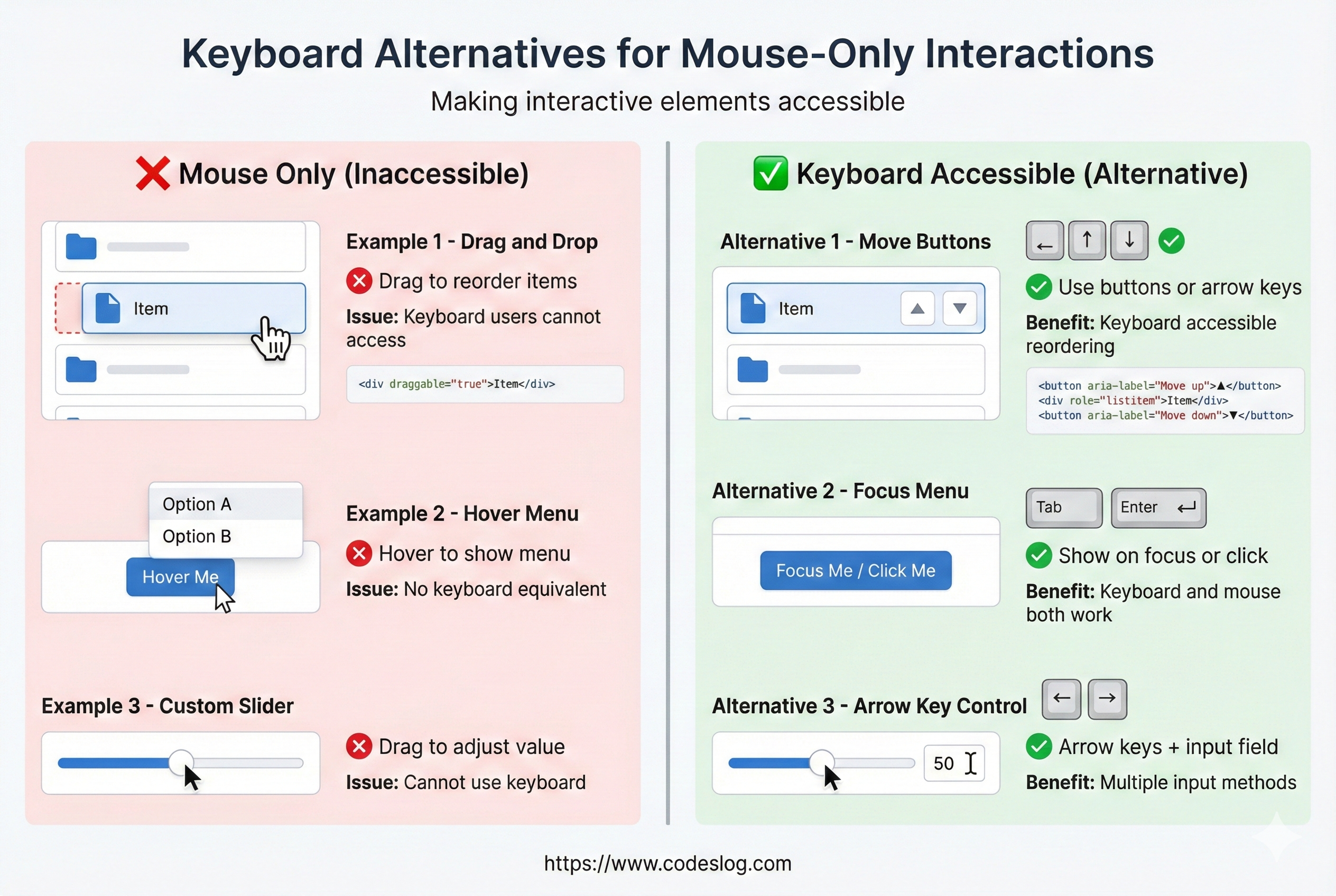
Image: Generated with Nanobanana AI
Common Mistakes#
“This’ll be a quick fix,” you said. Three hours later, you’re still wrestling with CSS focus styles… Congratulations, you’re not alone. 😅
Mistake 1: Removing Focus Styles#
Many developers think the default focus style (blue outline) looks “ugly.” So they add outline: none planning to create a replacement… and then forget. The result? Keyboard users have no idea where they are.
/* ❌ Never do this */
* {
  outline: none;
}

/* or */
button:focus {
  outline: 0;
}
Mistake 2: Click Events Without Keyboard Support#
// ❌ Problem: div with only click doesn't support keyboard
div.addEventListener('click', handleClick);

// ✅ Correct: Use button or handle keydown too
button.addEventListener('click', handleClick);
button.addEventListener('keydown', (e) => {
  if (e.key === 'Enter' || e.key === ' ') {
    handleClick();
  }
});
Mistake 3: Hiding Elements That Should Be Focusable#
/* ❌ Problem: display: none makes elements unfocusable */
.hidden {
  display: none;
}

/* ✅ Visually hidden but still focusable */
.sr-only {
  position: absolute;
  width: 1px;
  height: 1px;
  overflow: hidden;
  clip: rect(0, 0, 0, 0);
}
Mistake 4: Time-Limited Interactions#
// ❌ Problem: Timeout fires while user is slowly typing
const timeout = setTimeout(() => {
  closeForm();
}, 5000);

// ✅ Extend timeout while user is active
document.addEventListener('keydown', () => {
  clearTimeout(timeout);
  timeout = setTimeout(() => closeForm(), 5000);
});
Testing: Experience It Yourself#
Manual Testing (Most Important)#
1. Put your mouse away
2. Navigate the website using only the keyboard:
   - Can you access all features with Tab?
   - Is the focus position visible?
   - Is the tab order logical?
   - Does it work even with slow typing?
3. Try using it with a screen reader
Automated Testing#
// Use axe DevTools, WAVE, Lighthouse
// Or programmatic tests:

test('All buttons are keyboard activatable', () => {
  const buttons = document.querySelectorAll('button');
  buttons.forEach(button => {
    const keyboardActivated = new KeyboardEvent('keydown', {
      key: 'Enter'
    });
    button.dispatchEvent(keyboardActivated);
    // Verify activation
  });
});
Browser-Specific Checkpoints#
| Browser | What to Check |
|---|---|
| Chrome | Focus order, outline rendering |
| Safari | Mac keyboard navigation (enable Full Keyboard Access) |
| Firefox | ARIA compliance |
| Edge | Windows High Contrast mode |
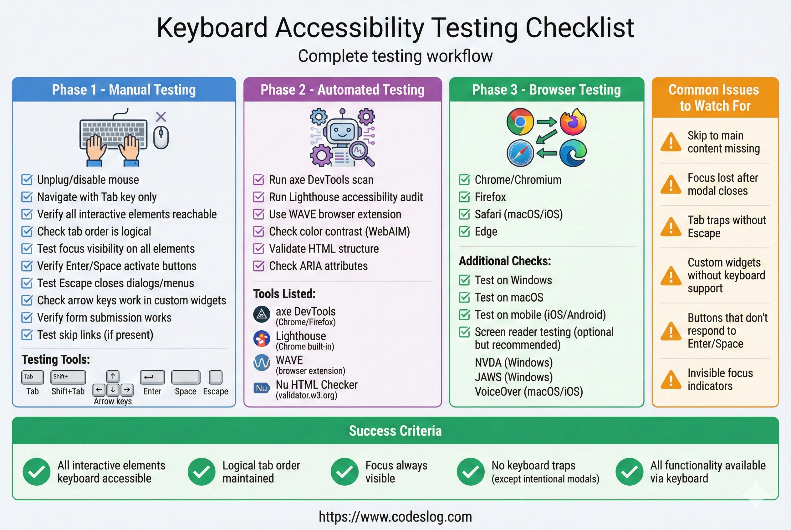
Image: Generated with Nanobanana AI
Wrapping Up#
As I was writing this post, I wonder if I included too many code examples. This wasn’t what I had in mind when I started writing on this topic… How was it for you? Was it too code-heavy and hard to follow?
Anyway, keyboard accessibility is not just a technical requirement—it determines the quality of user experience.
Checklist:
- ✅ All features accessible via Tab
- ✅ Logical focus order
- ✅ Clear focus styles (3px minimum, sufficient color contrast)
- ✅ Focus trap implemented in modals/popups
- ✅ Can close with Escape
- ✅ Keyboard alternatives for drag-and-drop
- ✅ Custom widgets follow WAI-ARIA patterns
- ✅ Manual testing completed
All of these may seem “obvious,” but they’re frequently missed in practice. Check them off one by one, and you’ll build much more inclusive websites.