I had clearly written a dark gray into my CSS. color: #595959. On a white background that color has a contrast of 6.4:1, which comfortably clears the accessibility bar of 4.5:1. Pass.
Then I ran an accessibility checker, and a red line appeared.
This text has a contrast of 4.04:1, which is insufficient. Expected ratio: 4.5:1.
I put in a color that measures 6.4:1, so why is it calling it 4:1? Was the checker wrong?
It wasn’t. I was — and the culprit was a single line sitting quietly two rows away: opacity: 0.8.
What was contrast ratio again#
Let me pin down a term first. Contrast ratio is a number from 1:1 to 21:1 that expresses how far apart the brightness of your text color and background color are. Black text on a white background is the maximum, 21:1; the same color against itself is 1:1.
WCAG (Web Content Accessibility Guidelines) requires at least 4.5:1 for normal-size body text. Large text (24px and up, or bold 18.7px and up) only needs 3:1. The reason for the bar is simple: a low-vision reader, or someone squinting at a screen in bright sunlight, has to be able to read the letters.
So 6.4:1 is a reassuring number. The trouble was that the color actually painted to the screen was not the 6.4:1 one.
opacity isn’t “transparency,” it’s “color mixing”#
We usually understand opacity like this: “it makes an element a little faded.” Fade-ins, a disabled feel, subtle secondary text. To the eye it just gets lighter.
But to the browser, opacity: 0.8 is a command to “mix this element with the background at 80:20.” It’s like adding water to paint. The ink (your text color) itself is unchanged, but as the water (background color) blends in, it gets lighter. If the paper is white it turns pale; if the paper is gray it gets pulled toward gray.
Written as a formula, it looks like this. This is called alpha compositing — computing a final color by laying a translucent color over a background.
composited color = textColor × α + background × (1 − α)α (alpha) is the opacity, the opacity value. Let me plug in my case. The text color #595959 is (89, 89, 89) in RGB, the background is #f5f5f3 = (245, 245, 243), and opacity was 0.8.
R: 89 × 0.8 + 245 × 0.2 = 71.2 + 49.0 = 120.2 ≈ 120
G: 89 × 0.8 + 245 × 0.2 = 120.2 ≈ 120
B: 89 × 0.8 + 243 × 0.2 = 119.8 ≈ 120
→ composited color = (120, 120, 120) = #787878#787878. The exact color the checker printed in its report. It matched down to the last digit. And when you take that color and compute contrast against the #f5f5f3 background again, you get 4.04:1 — the number the checker named.
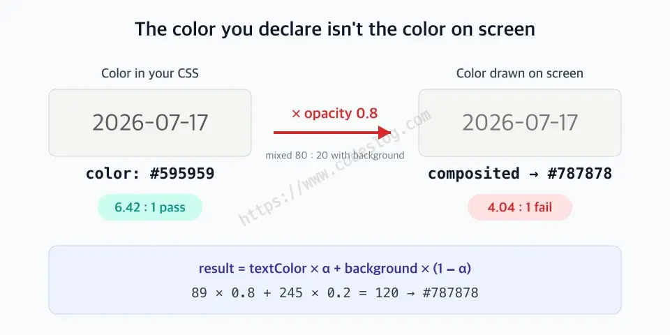
The color you write in CSS and the color that actually gets drawn can differ. opacity slips in between them.
Here’s the crux. Whatever value you put in color, what gets drawn to the screen is the result after opacity is mixed in. Contrast is judged not on the color you wrote in code, but on the color that actually reaches the user’s eye. It sounds obvious, but when you’re reading code it’s all too easy to see the single line color: #595959 and think “6.4:1, we’re good” and move on.
The trap comes with three faces#
The same principle hides in slightly different shapes. Keep three in mind and you’ll catch most of them.
1. opacity on the element itself#
This was my case. The opacity sits directly on the text element.
.post-date {
  color: #595959; /* look only here and it seems like 6.4:1, a pass */
  opacity: 0.8;   /* but this line drags the real color down to #787878 */
}
Because the color and the opacity are side by side in the same rule, this one is relatively easy to find. The next two are the problem.
2. opacity on an ancestor — and it multiplies#
opacity applies not to one element but to its entire subtree. Put opacity: 0.9 on a parent and every piece of text inside is drawn at 90%. And if a child has its own opacity too, the two values multiply.
.card       { opacity: 0.9; }        /* dim the whole card slightly */
.card .date { color: #595959;
              opacity: 0.8; }         /* dim the date once more */
/* effective alpha = 0.9 × 0.8 = 0.72 */
0.9 × 0.8 = 0.72. Compute with that final alpha and #595959 becomes #858584, and the contrast falls all the way to 3.38:1. Yet open the .date rule alone and it says opacity 0.8, so from the code you have no idea why it’s this faint. The culprit is hiding two files over, up in an ancestor.
3. The alpha in rgba / hsla — the same trap by another name#
Don’t relax just because you didn’t use opacity. Putting alpha into the color itself with rgba() or hsla() does exactly the same thing.
.muted { color: rgba(0, 0, 0, 0.5); } /* "translucent black" */“50% black” sounds dark, but on a white background this becomes #808080 and the contrast is 3.95:1. A fail. rgba(0,0,0,0.6) barely passes as #666 (5.7:1), but the moment you put it on a gray card instead of white it gets shaky again. The point: a color with alpha only tells you its contrast once you know the background.
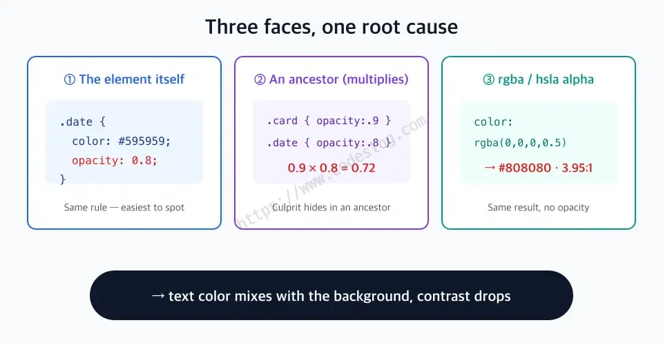
Three faces, but one root: the text color blends into the background.
Why the eye can’t catch it#
At this point you might think: “So just check the color with dev tools, right?”
That’s another trap. The contrast number the browser’s color picker shows usually gets computed from the declared color value and the immediately adjacent background only. In many cases it doesn’t account for opacity on the element or an ancestor. So dev tools flash a green “6.4:1, pass ✓,” while axe-core reports “4.04:1, fail.” The mismatch is born right there.
When they disagree, the checker is usually the one that’s right. Tools like axe-core and Lighthouse actually render the element and then compute contrast from the result color with all the opacity composited in. They judge by the color a person actually sees. So when the two numbers diverge, trust the checker that looked at the composited color over the dev tools that only looked at the declared one.
Put simply:
- The dev tools color swatch: the color I wrote in code
- The accessibility checker: the color the user actually sees
opacity lives in the gap between those two.
How to catch it, and how to fix it#
Once you understand the principle, the response is actually simple.
Finding it. Search two ways.
- Automated: run axe-core, Lighthouse, or a browser-extension accessibility checker. They factor opacity in, so they’re the surest way to catch this trap.
- Manual: in your CSS, search text elements and their ancestors for
opacity:andrgba(·hsla(. Trace it: “how many times is alpha being multiplied over this text?”
Fixing it. There’s one principle.
If you want text to look faint, use the faint color itself — not opacity.
Think about it and it’s obvious. If the final look you want is that pale gray, put that color into color from the start and meet the contrast bar with it. There’s no reason to write a dark color and then shave it down with opacity. That’s exactly the fix I made: I removed opacity: 0.8 and left #595959 as-is, and the contrast came back to 6.4:1. On screen it looks nearly identical, but the checker flipped to green.
So when is it fine to use opacity? Transition states are fine. A mid-value of a fade-in/out animation, something that just flashes by, is not something WCAG takes issue with. WCAG looks at the contrast of the resting state, the one that sits still. Disabled elements are exempt too — a grayed-out button you can’t click is not held to the contrast bar (an explicit exception in WCAG 1.4.3).
Here’s the dividing line: is it “text meant to be read,” or not? If you dimmed information a user needs to read with opacity alone, that isn’t subtle design — it’s a quiet violation. For a low-vision reader, that 20% is the difference between “readable” and “not.”
The one-page recap#
opacity < 1doesn’t make text faint; it mixes the text color into the background color. The real contrast drops.- The formula is
composited = textColor × α + background × (1 − α). In my case#595959turned into#787878atopacity 0.8, plunging from 6.4:1 to 4.04:1. - Three faces to the trap: ① opacity on the element itself ② opacity on an ancestor (values multiply, 0.9×0.8=0.72) ③ the alpha in
rgba/hsla. - The dev tools swatch shows the declared color; the accessibility checker shows the composited color. When they disagree, trust the checker.
- To make text faint, use a verified color, not opacity. Save opacity for fleeting states like transition animations.
There’s no guarantee that the value you put in color is the color your user sees. If opacity is wedged in between, contrast gets recomputed on the screen, not in the code. Once you’ve picked a color, take a moment to check that the color reaches the screen intact.
Other posts in this series deal with color and contrast too. Implementing Dark Mode Properly covers token design that keeps contrast even in a dark palette, and Supporting High Contrast Mode Properly covers what happens when the OS forces the colors. You can keep reading in the full Frontend × Accessibility series.