This post is part of an ongoing effort to monitor public websites as a web accessibility professional. It is written with the goal of improving information accessibility and advancing technology — not as a political statement.
I only recently found out the Cheong Wa Dae website had been redesigned. Life gets busy, and I was a bit late to the news — but as soon as I heard, I was curious enough to check it out.
The website is, in a way, the public face of the nation, so a fresh redesign felt exciting. And viewing it through an accessibility lens has become pretty second nature to me at this point.
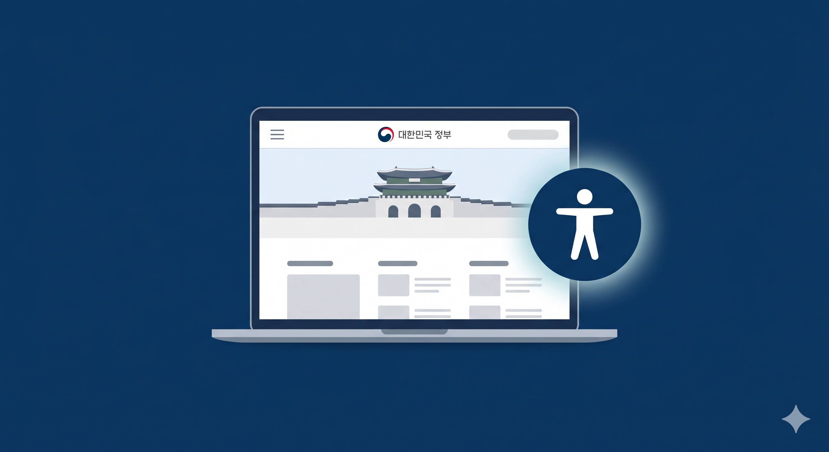
Image: Generated with Nanobanana AI
Earlier this year, I reviewed this site in my Lunar New Year post. This post is a follow-up. I want to look at what’s changed with the redesign — and what would take it to the next level.
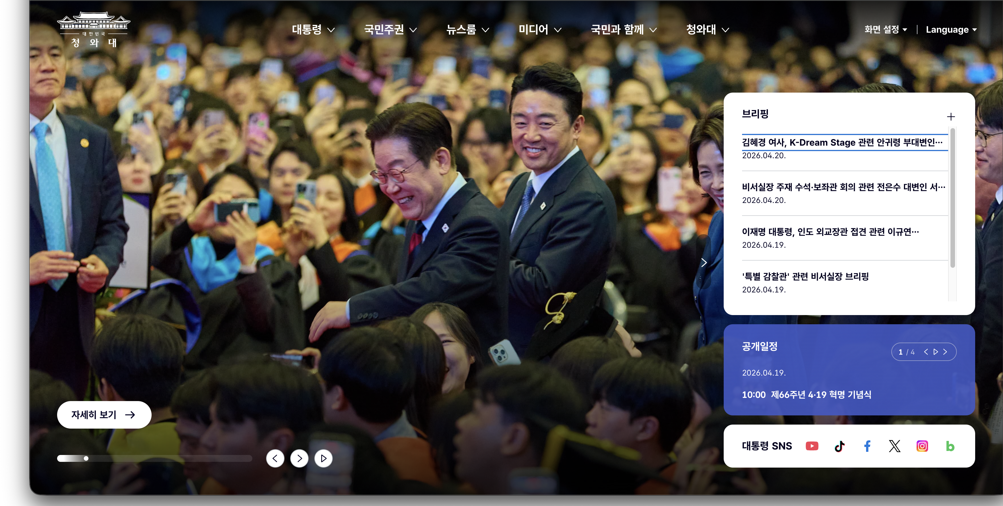
The redesigned Cheong Wa Dae website (as of April 2026)
1. First, the Good Stuff#
There were some genuinely positive accessibility changes in the redesigned site.
Compared to the previous temporary presidential website, the improvements were hard to miss. Let’s take a look at what stood out.
Skip Navigation#
Skip navigation links are implemented at the top of the page.
<a href="#containerArea">Skip to main content</a>
<a href="#headerArea">Skip to menu</a>
<a href="#footerArea">Skip to footer</a>
Skip navigation links that appear on Tab key press
For keyboard-only users and screen reader users, skip navigation is an essential tool for bypassing repetitive content. Having three distinct destinations is a nice touch.
KWCAG 2.2 Success Criterion 2.4.1 Bypass Blocks: “A mechanism shall be provided to bypass blocks of content that are repeated on multiple web pages.”
Display Settings (Dark Mode)#
The menu includes a “Dark mode” option. This is genuinely helpful for users with light sensitivity or low vision — it’s more than just a design trend.
Multilingual Support#
Korean (KOR) and English (ENG) switching is available. This is an important feature for foreign residents in South Korea and international visitors who need access to official government information.
Logo Alternative Text#
The logo image has alt="Republic of Korea Cheong Wa Dae" applied. It sounds basic, but it’s surprisingly easy to miss on public websites.
HTML Language Attribute#
<html lang="ko"> is correctly specified. This is the most fundamental signal a screen reader uses to determine which text-to-speech engine to apply. For a site with a language-switching feature, having this attribute set correctly is a meaningful detail.
KWCAG 2.2 Success Criterion 3.1.1 Language of Page: “The default human language of each web page can be programmatically determined.”
It’s also worth checking whether switching to English dynamically updates the attribute to lang="en". If so, that would be an even more exemplary implementation.
Clean Visual Design#
From a purely aesthetic standpoint, the redesigned website is clean and uncluttered — at least by my standards. The layout and visual elements are genuinely well done.
But, served with a side of things that still need work..
2. Areas That Could Go Further#
Alongside the positives, I also found things that need improvement. For each item, I’ll walk through current state → impact → suggested fix → how to verify.
🔴 ARIA Attributes Not Used#
Current State
Key regions like navigation, main content, and search don’t appear to have ARIA landmarks or state attributes applied.
<!-- Current (estimated) -->
<div class="nav-container">...</div>
<div class="main-content">...</div>
<button class="menu-btn">Menu</button>
Impact
Screen reader users rely on ARIA landmarks to jump directly to “navigation,” “main content,” and so on. Without them, they have to listen to every element from the header to the footer in order. Additionally, when a menu opens or closes, the state change isn’t communicated — leaving keyboard users confused about what just happened.
KWCAG 2.2 Success Criterion 4.1.2 Name, Role, Value: “For all user interface components, the name and role can be programmatically determined.”
Suggested Fix
This breaks down into two steps: assigning landmark roles, and expressing dynamic state. ① Use semantic HTML elements like <nav> and <main>, or add role attributes. ② Add aria-expanded to menu buttons to announce open/closed state.
💻 Code for developers
① Apply semantic elements or ARIA landmarks
<!-- Use semantic HTML elements instead of divs -->
<nav aria-label="Main menu">...</nav>
<main>...</main>
<aside aria-label="Related links">...</aside>
<footer>...</footer>

<!-- If the existing div structure must be kept, add role attributes -->
<div role="navigation" aria-label="Main menu">...</div>
<div role="main">...</div>
② Communicate menu open/closed state
<!-- Closed state -->
<button aria-expanded="false" aria-controls="nav-menu" aria-label="Open full menu">
  Menu
</button>
<ul id="nav-menu" hidden>...</ul>

<!-- Open state (toggled via JavaScript) -->
<button aria-expanded="true" aria-controls="nav-menu" aria-label="Close full menu">
  Menu
</button>
<ul id="nav-menu">...</ul>const menuBtn = document.querySelector('.menu-btn');
const navMenu = document.querySelector('#nav-menu');
menuBtn.addEventListener('click', () => {
const isExpanded = menuBtn.getAttribute('aria-expanded') === 'true';
menuBtn.setAttribute('aria-expanded', String(!isExpanded));
navMenu.hidden = isExpanded;
});How to Verify
Turn on NVDA (Windows) or VoiceOver (Mac) and try tabbing through the page — you’ll immediately see whether landmarks are recognized. In NVDA’s Browse Mode, press D (next landmark) and Shift + D (previous landmark) to navigate. You can also visualize landmarks using the WAVE Web Accessibility Evaluation Tool.
🟠 Non-Standard tabindex Usage#
Current State
Non-standard values like tabindex="#none" have been found.
<!-- Non-standard usage -->
<div tabindex="#none">...</div>
Impact
Valid tabindex values are integers. #none isn’t a valid value per the spec, so browsers handle it inconsistently. Some interpret it as 0 and include the element in the tab order unintentionally; others simply ignore it. This means keyboard-only users may encounter unpredictable behavior depending on their browser.
KWCAG 2.2 Success Criterion 4.1.1 Parsing: Using a non-integer string like
#noneas an attribute value constitutes an HTML parsing error. If a browser interprets it as0, it can lead to a violation of 2.1.1 Keyboard.
Suggested Fix
Replace with the correct integer values based on intent. Use -1 to remove an element from the tab order, and 0 to include it. Positive values (tabindex="1" or higher) force a specific tab order and should generally be avoided — aligning the DOM order with the visual order is a far better approach.
💻 Code for developers
<!-- Remove from tab order, but still focusable via JavaScript -->
<div tabindex="-1">...</div>

<!-- Include in natural tab order (when needed for a non-interactive div) -->
<div tabindex="0" role="button" aria-label="...">...</div>

<!-- If tabindex isn't needed at all, just remove it -->
<div>...</div>
How to Verify
You can query all elements with non-standard tabindex values in the browser console.
🔍 How to verify (for developers)
document.querySelectorAll('[tabindex]').forEach(el => {
  const val = el.getAttribute('tabindex');
  if (isNaN(Number(val))) {
    console.warn('Non-standard tabindex found:', el, 'Value:', val);
  }
});
🟠 Missing Image Alternative Text#
Current State
Some SVG images appear to have no alt attribute at all.
<!-- No alt attribute -->
<img src="/images/202511/1763535424915_0.svg">
Impact
When alt is missing, screen readers fall back to reading the filename. Users end up hearing something like “1763535424915_0.svg” — meaningless noise. It also becomes impossible to distinguish decorative images from informational ones, so screen readers attempt to announce every image equally.
KWCAG 2.2 Success Criterion 1.1.1 Non-text Content: “All non-text content that is presented to the user has a text alternative that serves the equivalent purpose.”
Suggested Fix
The approach depends on the image’s purpose. For decorative images, use alt="" (empty string) so screen readers skip over them. For informational images, provide a descriptive alt text. For inline SVGs, use a <title> element.
💻 Code for developers
<!-- ① Decorative image: empty alt so screen readers skip it -->
<img src="background-pattern.svg" alt="">

<!-- ② Informational image: descriptive alt text -->
<img src="policy-icon-economy.svg" alt="Policy icon: Economy">
<img src="press-release-photo.jpg" alt="President chairs cabinet meeting — April 20, 2026">
For inline SVGs:
<svg role="img" aria-labelledby="icon-title">
  <title id="icon-title">Policy icon: Economy</title>
  <!-- svg paths -->
</svg>
How to Verify
Query all images missing alt in the browser console, or use Lighthouse’s Accessibility audit (Image elements do not have [alt] attributes).
🔍 How to verify (for developers)
document.querySelectorAll('img:not([alt])').forEach(img => {
  console.warn('Missing alt:', img.src);
});
🟡 Form Labels Not Connected#
Current State
Form elements like the search input don’t appear to have an explicit <label> association.
<!-- Current (estimated) -->
<input type="search" placeholder="Enter search terms">
Impact
When focus moves to a form element, a screen reader announces the label first. Without one, all it can say is “edit field” or “search field” — the user has no idea what to type. placeholder text is not a substitute for a label. It disappears the moment you start typing, and some screen readers don’t read it at all.
KWCAG 2.2 Success Criterion 3.3.2 Labels or Instructions: “Labels or instructions are provided when content requires user input.”
Suggested Fix
Choose the right approach based on your situation. The most recommended method is an explicit <label for> association. If the label needs to be visually hidden, use a sr-only class. If changing the HTML structure isn’t feasible, aria-label works as a fallback.
💻 Code for developers
<!-- ① Most recommended: explicit label association -->
<label for="site-search">Search</label>
<input type="search" id="site-search" placeholder="Enter search terms">

<!-- ② Visually hidden label with sr-only class -->
<label for="site-search" class="sr-only">Site search</label>
<input type="search" id="site-search" placeholder="Enter search terms">

<!-- ③ When adding a label element isn't possible: aria-label -->
<input type="search" aria-label="Site search" placeholder="Enter search terms">
How to Verify
In Chrome DevTools, open the Accessibility tree (Elements panel → Accessibility tab) and select the input element. If the Name field is populated, the label is connected. If it’s empty, the label is missing.
🟡 No Screen Reader–Only Text Pattern#
Current State
There are links that make visual sense in context but are ambiguous to screen readers. When multiple “Read more” links appear, a screen reader user has no way to tell which section each one leads to.
<!-- Makes sense visually, but indistinguishable via screen reader -->
<a href="/news">Read more</a>
<a href="/policy">Read more</a>
<a href="/speech">Read more</a>
Impact
When a screen reader user opens the links list (via keyboard shortcut), they hear “Read more, Read more, Read more” — with no context for where each link goes or what “more” refers to.
KWCAG 2.2 Success Criterion 2.4.4 Link Purpose (In Context): “The purpose of each link can be determined from the link text alone.”
Suggested Fix
Add text that’s invisible on screen but readable by screen readers. A single sr-only CSS class lets you pass context like “Read more (Latest News)” or “Read more (Speeches)” without changing the visual design at all.
💻 Code for developers
<!-- Add context text with sr-only class -->
<a href="/news">Read more<span class="sr-only"> — Latest news</span></a>
<a href="/policy">Read more<span class="sr-only"> — Policy agenda</span></a>
<a href="/speech">Read more<span class="sr-only"> — Speeches</span></a>

<!-- Or replace the full link text with aria-label -->
<a href="/news" aria-label="Read more: Latest news">Read more</a>/* Visually hidden but readable by screen readers */
.sr-only {
position: absolute;
width: 1px;
height: 1px;
padding: 0;
margin: -1px;
overflow: hidden;
clip: rect(0, 0, 0, 0);
white-space: nowrap;
border: 0;
}How to Verify
In NVDA, press Insert + F7 to open the Elements List dialog, which lets you see how all links, headings, and landmarks are announced. In VoiceOver, press VO + U to open the rotor and browse the links list.
WCAG 2.2 International Standards — Items Worth a Look#
KWCAG 2.2 is based on WCAG 2.1. WCAG 2.2, released in October 2023, added criteria addressing areas that had frequently been overlooked in practice. These aren’t yet reflected in KWCAG, so they’re not legal requirements — but if the goal is a world-class public website, they’re well worth considering.
🟡 Focus Appearance (2.4.13 Focus Appearance, AA)#
“Focus is visible” and “focus is clearly visible” are two different things. WCAG 2.2 defines specific requirements for the size and contrast of focus indicators.
- Minimum area: At least the perimeter of the focused element × 2px
- Contrast ratio: At least 3:1 between the focus indicator and adjacent colors
Simply hiding focus with outline: none or relying entirely on the browser default may not meet this criterion. Skip navigation links, menu buttons, calendar date cells — any focusable element applies.
💻 Code for developers
/* Before: relying on the browser's default focus style */
:focus { outline: auto; }

/* A focus style that considers 2.4.13 */
/* Sufficient thickness and contrast are key — verify against your background colors */
:focus-visible {
  outline: 3px solid #005fcc;
  outline-offset: 2px;
}
🟡 Minimum Target Size (2.5.8 Target Size, AA)#
Interactive elements must have a clickable area of at least 24×24 CSS px (Level AA). Icon buttons, social share buttons, and calendar previous/next buttons are all common offenders. A target smaller than 24px can still pass if no other target falls within a 24px radius of its center — and inline text links are among the listed exceptions.
In my Lunar New Year post, I pointed out that the main banner control buttons were too small. WCAG 2.2 has now made that an explicit standard. The smaller buttons on the redesigned site deserve a check too.
💻 Code for developers
/* Expand the clickable area without changing the visual size */
.icon-btn {
  min-width: 24px;
  min-height: 24px;
  padding: 8px; /* Padding extends the click area around the icon */
}
🟡 Focus Not Obscured (2.4.11 Focus Not Obscured, AA)#
If there’s a sticky header, a keyboard-focused element must not be completely hidden behind it. On pages with long content like speeches, pressing Tab can cause the focused element to slip behind the header.
One CSS line ensures the focused element doesn’t overlap the sticky header — no JavaScript required.
💻 Code for developers
/* Reserve scroll padding equal to the sticky header height */
html {
  scroll-padding-top: 80px; /* Adjust to match actual header height */
}
3. Checking the Sub-Pages#
Good accessibility on the main page doesn’t mean the entire site is accessible. I took a look at the sub-pages that citizens visit most often.
The main page turned out to be the easy part.
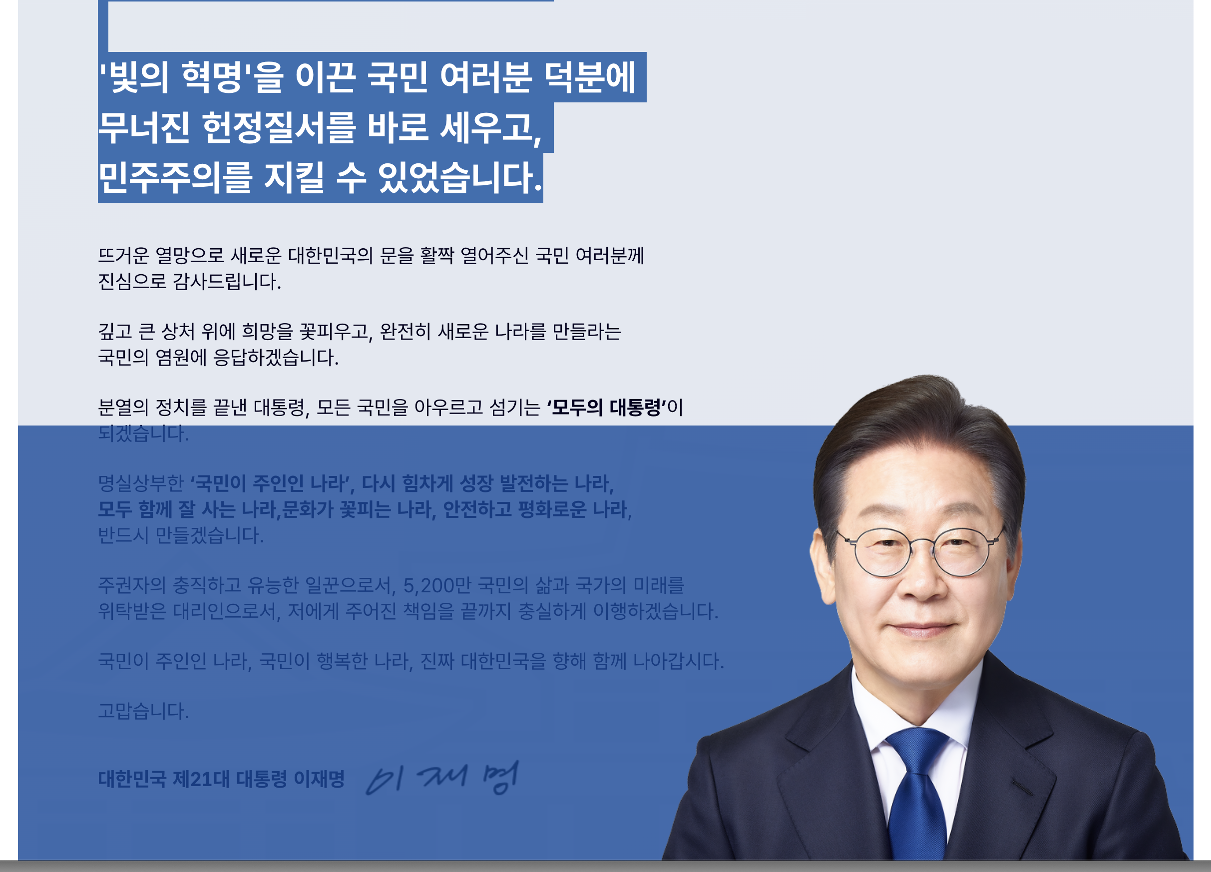
Presidential Greeting — Image and Text in Conflict#
On the greeting page (president.go.kr/president/greeting), trying to drag-select text with a mouse stops working partway through. An image positioned on top of the text is intercepting mouse drag events.
The point in the greeting page where drag selection breaks
Impact
This is a usability issue before it’s even an accessibility issue. Any visitor would find it frustrating, but it’s especially problematic in these situations:
- Low-vision users: who select text to zoom in, copy and paste into a separate tool, or increase readability
- Screen reader virtual cursor mode: some screen readers use mouse drag to define a reading range
- Auto-translate users: translation extensions that rely on text selection
- Anyone quoting the text: presidential greetings are frequently cited and shared
Probable Cause
In most cases, this happens when an absolutely positioned image sits on top of text with pointer-events: auto (the default), causing it to intercept mouse events.
/* Likely problematic structure */
.greeting-image {
  position: absolute;
  /* or float + negative margins overlapping text area */
  z-index: 1; /* Positioned above the text */
}
Suggested Fix
① Add pointer-events: none to the image (quickest fix)
One line prevents the image from intercepting mouse events. The visual layout stays exactly as-is.
② Fix the layout structure (root cause fix)
Use flexbox or grid to place the image and text side by side so they never overlap.
💻 Code for developers
① Apply pointer-events: none
.greeting-image {
  pointer-events: none; /* Image no longer intercepts mouse events */
}
② Fix the layout structure
<div class="greeting-layout">
  <div class="greeting-text">
    <p>Greeting text...</p>
  </div>
  <figure class="greeting-image">
    <img src="president-photo.jpg" alt="Official presidential portrait">
  </figure>
</div>.greeting-layout {
display: grid;
grid-template-columns: 1fr 400px;
gap: 2rem;
align-items: start;
}
/* Image can never overlap the text in this structure */How to Verify
Try drag-selecting from the first paragraph to the last. If selection breaks at any point, inspect the element at that location in DevTools to identify the cause.
🔍 How to verify (for developers)
// Detect the element intercepting click events
document.addEventListener('mousedown', e => {
  console.log('Clicked element:', e.target, e.target.style.position);
});
Speeches Board — From List to Detail#
The speeches list (president.go.kr/speechs) is a core page where citizens go to read the president’s remarks.
List Page#
Current State and Key Issues
Here are the items to check on a board-style list page.
① Date markup
Providing a date as plain text prevents machines from recognizing it as a date. The <time> element communicates date information clearly to browsers, search engines, and screen readers.
💻 Code for developers
<!-- ❌ Plain text -->
<span>2026.04.15</span>

<!-- ✅ Semantic date with time element -->
<time datetime="2026-04-15">2026.04.15</time>
② If the board uses a table — caption and th scope
Without scope="col", screen readers lose context when reading cell data and can’t tell which column a value belongs to.
💻 Code for developers
<!-- ❌ th without scope -->
<table>
  <thead>
    <tr><th>No.</th><th>Title</th><th>Date</th></tr>
  </thead>
  ...
</table>

<!-- ✅ With caption and scope -->
<table>
  <caption>Speeches list</caption>
  <thead>
    <tr>
      <th scope="col">No.</th>
      <th scope="col">Title</th>
      <th scope="col">Date</th>
    </tr>
  </thead>
  ...
</table>
③ Current page in pagination
💻 Code for developers
<!-- ❌ Visually distinguished but not communicated to screen readers -->
<nav>
  <a href="/speechs?page=1">1</a>
  <strong>2</strong>  <!-- Current page, but screen readers don't know that -->
  <a href="/speechs?page=3">3</a>
</nav>

<!-- ✅ Use aria-current to identify the current page -->
<nav aria-label="Page navigation">
  <a href="/speechs?page=1">Page 1</a>
  <a href="/speechs?page=2" aria-current="page">Page 2 (current)</a>
  <a href="/speechs?page=3">Page 3</a>
</nav>
KWCAG 2.2 Success Criterion 2.4.4 Link Purpose (In Context): “The purpose of each link can be determined from the link text alone.”
Detail Page#
On speech detail pages, it matters whether the body text is real HTML text or an image. This is the same issue I raised in the Lunar New Year post about card news. Providing only a file attachment (PDF, HWP) has the same problem. The full text should appear directly in the page body; attachments should be supplementary.
💻 Code for developers
<!-- ❌ Speech body provided only as an image -->
<img src="speech-20260415.jpg">  <!-- Screen readers can't read this -->

<!-- ✅ Provided as text -->
<article>
  <h2>Speech title</h2>
  <p>Full speech text...</p>
</article>
Previous / Next Navigation
💻 Code for developers
<!-- ❌ Vague navigation -->
<a href="/speechs/124">Previous</a>
<a href="/speechs/126">Next</a>

<!-- ✅ Include title or use aria-label for specificity -->
<nav aria-label="Post navigation">
  <a href="/speechs/124" aria-label="Previous speech: Opening remarks at cabinet meeting">
    ← Previous
  </a>
  <a href="/speechs/126" aria-label="Next speech: 1st anniversary commemorative address">
    Next →
  </a>
</nav>
Public Schedule — Accessibility of the Calendar Table#
The public schedule page (president.go.kr/schedule) shows the president’s official schedule in a 7-column calendar layout. Calendars are one of the trickier UI components to make accessible.
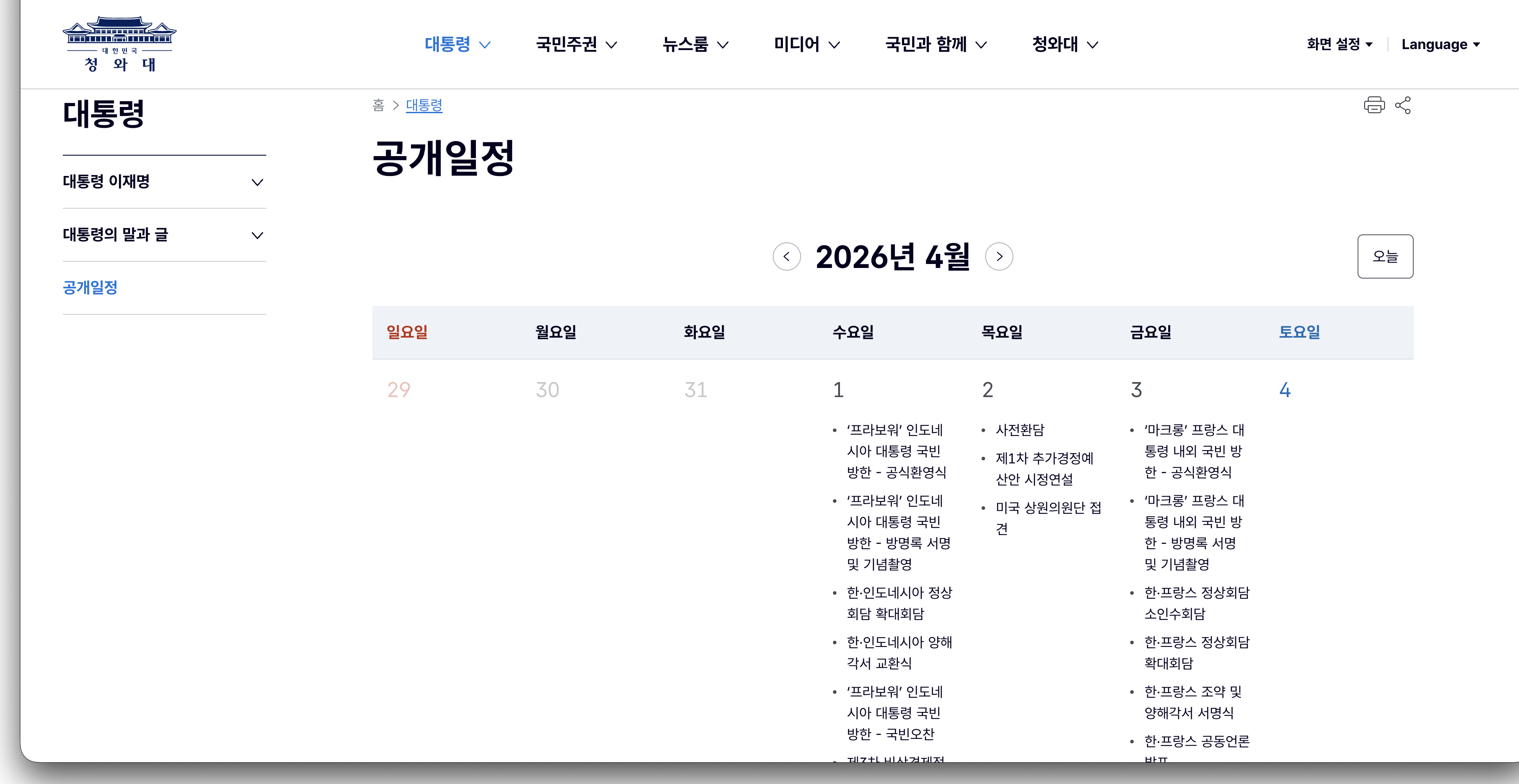
The Cheong Wa Dae public schedule calendar (as of April 2026)
Current State and Key Issues
① Structural markup for the calendar table
Without scope="col", screen readers can’t tell what day of the week a date belongs to when reading calendar cells. The abbr attribute lets you provide a shortened version of the day name to reduce repetitive reading.
💻 Code for developers
<!-- ❌ Calendar without structural information -->
<table>
  <tr><th>Sun</th><th>Mon</th>...<th>Sat</th></tr>
  <tr><td></td><td></td>...<td>1</td></tr>
  ...
</table>

<!-- ✅ Fully semantic calendar structure -->
<table aria-label="President's public schedule for April 2026">
  <caption>April 2026</caption>
  <thead>
    <tr>
      <th scope="col" abbr="Sun">Sunday</th>
      <th scope="col" abbr="Mon">Monday</th>
      <th scope="col" abbr="Tue">Tuesday</th>
      <th scope="col" abbr="Wed">Wednesday</th>
      <th scope="col" abbr="Thu">Thursday</th>
      <th scope="col" abbr="Fri">Friday</th>
      <th scope="col" abbr="Sat">Saturday</th>
    </tr>
  </thead>
  <tbody>
    <tr>
      <td></td>
      <td><span class="sr-only">April </span>1</td>
      ...
    </tr>
  </tbody>
</table>
② Today’s date
💻 Code for developers
<!-- ❌ Visually highlighted only (CSS class) -->
<td class="today">20</td>

<!-- ✅ Use aria-current to identify today's date -->
<td aria-current="date" class="today">
  <span class="sr-only">Today, </span>20
</td>
③ Accessible names for previous/next month buttons
💻 Code for developers
<!-- ❌ Simple text -->
<button>Previous</button>
<button>Next</button>

<!-- ✅ Specify which month the user is navigating to -->
<button aria-label="Go to previous month (March 2026)">Previous</button>
<button aria-label="Go to next month (May 2026)">Next</button>
④ Announcing dynamic content updates when the month changes
Without this attribute, screen readers won’t notice when the calendar updates. Users press the button but hear nothing — as if nothing happened.
💻 Code for developers
<!-- Add aria-live to the calendar region -->
<div aria-live="polite" aria-atomic="true">
  <table>...</table>
</div>
⑤ Schedule item link text
💻 Code for developers
<!-- ❌ Link with just the event title -->
<td>
  <a href="/schedule/123">Cabinet meeting</a>
</td>

<!-- ✅ Link with date context included -->
<td>
  <a href="/schedule/123" aria-label="April 20 cabinet meeting — view details">
    Cabinet meeting
  </a>
</td>
KWCAG 2.2 Success Criterion 1.3.1 Info and Relationships: “Information, structure, and relationships conveyed through presentation can be programmatically determined.”
Newsroom — Usability of Card Listings#
The newsroom (president.go.kr/briefings) and similar card-based list pages share a common set of accessibility checks.
① Alt text handling for card thumbnail images
If a thumbnail conveys the same information as the title, use alt="" to prevent screen readers from reading the same content twice.
💻 Code for developers
<!-- ❌ alt text duplicates the heading (read twice) -->
<article>
  <img src="brief.jpg" alt="Cabinet meeting results briefing">
  <h3><a href="...">Cabinet meeting results briefing</a></h3>
</article>

<!-- ✅ Treat as decorative to prevent duplication -->
<article>
  <img src="brief.jpg" alt="">  <!-- The heading already conveys this information -->
  <h3><a href="...">Cabinet meeting results briefing</a></h3>
</article>
② Making the full card clickable
When making an entire card area clickable, how you provide the link text matters. The recommended pattern: visually the whole card appears clickable, but screen readers only read the heading as a link.
💻 Code for developers
<!-- ❌ Wrapping the full card in a single link -->
<a href="/briefings/123">
  <img src="brief.jpg" alt="...">
  <h3>Cabinet meeting results briefing</h3>
  <time>2026.04.20</time>
  <p>Summary text...</p>
</a>
<!-- Screen readers read alt + h3 + time + p — far too verbose -->

<!-- ✅ Title link + pseudo-element to expand click area -->
<article class="card">
  <img src="brief.jpg" alt="">
  <h3><a href="/briefings/123" class="card-link">Cabinet meeting results briefing</a></h3>
  <time datetime="2026-04-20">2026.04.20</time>
  <p>Summary text...</p>
</article>/* Expand the card's click area via the title link's pseudo-element */
.card { position: relative; }
.card-link::after {
content: '';
position: absolute;
inset: 0;
}4. Summary of Improvement Items#
Here’s a prioritized overview of everything covered across the main page and key sub-pages.
Main Page
| Item | Priority | Difficulty | Scope |
|---|---|---|---|
| ARIA landmarks | 🔴 Immediate | Low | Full site structure |
| tabindex non-standard fix | 🟠 Short-term | Low | Keyboard users |
| Image alt attribute review | 🟠 Short-term | Low | Users with visual impairments |
| Form label association | 🟡 Mid-term | Medium | All form interactions |
| Introduce sr-only text pattern | 🟡 Mid-term | Medium | Ambiguous links and buttons |
Sub-Pages
| Item | Priority | Difficulty | Scope |
|---|---|---|---|
Greeting: pointer-events: none on image | 🔴 Immediate | Very Low | All visitors |
Speeches: <time> element | 🟠 Short-term | Low | List pages generally |
Speeches: table caption + th scope | 🟠 Short-term | Low | Screen reader users |
| Speeches: provide full text directly | 🔴 Immediate | Medium | Users with visual impairments, translation users |
Pagination: aria-current="page" | 🟠 Short-term | Low | Keyboard and screen reader users |
Calendar: caption + th scope="col" | 🔴 Immediate | Low | Screen reader users |
Calendar: aria-current="date" (today) | 🟠 Short-term | Low | Screen reader users |
Calendar: aria-label on prev/next buttons | 🔴 Immediate | Very Low | Keyboard and screen reader users |
Calendar: aria-live="polite" | 🟠 Short-term | Low | Screen reader users |
Card list: thumbnail alt="" | 🟠 Short-term | Low | Screen reader users |
The 🔴 Immediate items are all CSS one-liners or HTML attribute additions. They can be applied quickly without any structural changes.
International Standards (WCAG 2.2 additions — for reference)
| Item | Criterion | Difficulty | Scope |
|---|---|---|---|
| Focus indicator size and contrast | 2.4.13 | Low | All keyboard users |
| Click area for small buttons/icons | 2.5.8 | Low | Mouse and touch users |
| Prevent focus hidden by sticky header | 2.4.11 | Very Low | Keyboard users |
The WCAG 2.2 additions are not yet incorporated into KWCAG, so they’re not currently legal requirements. That said, international standards are clearly moving in this direction, and they’re likely to be reflected in future KWCAG revisions.
5. What’s Changed Since Lunar New Year#
Back in February, in my post on information accessibility during Seollal, I pointed out that card news images had no alternative text and that information was locked inside images.
With the site redesign bringing a new overall structure, it’s worth revisiting how card news is handled. More important than the format is whether the information actually reaches everyone. I’m hopeful the new site gives a better answer to that question.
6. Why Public Website Accessibility Is Different#
Accessibility matters on private services too — but public websites carry a different kind of weight.
Because you don’t have a choice.
If a private service is inconvenient, you can use something else. But when it comes to government announcements, policy guidance, and public service applications, there’s no alternative. Being unable to access information provided by the state means your rights as a citizen are being infringed — full stop.
On January 22, 2026, the Digital Inclusion Act came into effect in South Korea. It explicitly codifies the government’s obligation to ensure accessible digital services. The Cheong Wa Dae website is one of the most symbolic sites subject to this law.
Before it’s a legal obligation, it’s simply a matter of actually opening up information that’s supposed to be open to everyone.
7. Looking Ahead to WCAG 3.0#
WCAG 3.0 is still in draft. The final criteria aren’t set yet, but the direction already made public tells us a lot about where accessibility evaluation is headed. I covered this in detail in earlier posts in this series (WCAG 3.0 Is Coming — Why a New Standard? and The Score-Based Conformance Model), so here I’ll focus on what it means for the Cheong Wa Dae website specifically.
Critical Errors — Automatic Failure Regardless of Score#
One of the defining features of WCAG 3.0 is the Critical Error concept. No matter how high a site’s overall score, a single Critical Error disqualifies it from any conformance level. The standard is whether a fundamental barrier prevents users from completing core tasks.
Looking at the issues raised in this post, likely Critical Error candidates include:
- Missing
langattribute: Screen readers misidentify the language → blocks access for foreign nationals and multilingual users - Speech body provided only as an image: Users with visual impairments simply can’t access the information
- Text drag-select blocked on the greeting page: Copying, translating, and using assistive tools are fundamentally broken
These are serious issues under WCAG 2.x too — but under WCAG 3.0, leaving even one of them in place would mean failing to qualify for even the Bronze level.
Cognitive Accessibility — WCAG 3.0’s Most Expanded Area#
The area most significantly expanded in WCAG 3.0 is Cognitive Accessibility. It starts from the position that “technically accessible content isn’t truly accessible if the content itself is difficult to understand.”
This is especially relevant to government websites.
- Clear Language: Are speeches and policy guides written in language that ordinary citizens can understand?
- Consistent Navigation: Is the menu and navigation pattern consistent across the main page, speeches, and schedule pages?
- Predictable Behavior: Does the calendar’s month navigation and the board’s pagination work the way users expect?
The shift toward evaluating the accessibility of the content itself — beyond technical markup — will have significant implications for public websites.
Functional Needs — The Question Changes#
WCAG 3.0 is moving toward centering Functional Needs as the primary lens. Early Working Drafts proposed categories such as Vision, Hearing, Cognitive, Physical/Motor, and Speech. The exact structure isn’t finalized, but the direction is clear: the core evaluation question is changing.
WCAG 2.x: “Does this meet the technical criteria?” WCAG 3.0 (proposed direction): “Can users in this group actually accomplish their goals?”
Viewed through this lens, the Cheong Wa Dae website would be evaluated not just on whether technical criteria are met, but on whether “a person who is blind can read a full speech” and “a person with a cognitive disability can find a specific date on the public schedule.”
8. Closing: Looking Forward to the Next Redesign#
Accessibility isn’t something you achieve once and call done. It’s a process of ongoing attention and improvement.
The fact that the redesign included skip navigation, dark mode, and multilingual support is a genuinely positive signal. Now it’s just a matter of taking the next step.
The improvements suggested in this post don’t require a visual overhaul or a major budget. Adding ARIA attributes, connecting labels, correcting tabindex values — that’s the level we’re talking about. But the difference those small changes make for people who rely on assistive technology is enormous.
I’m writing this hoping the website that represents the nation stays open to all of its citizens. Here’s looking forward to finding even more improvements next time I check.
질문으로 다시 보기#
Which accessibility issues on the Cheong Wa Dae website need the most urgent attention?
aria-expanded on menu buttons, users can’t tell when the UI has changed. Simply using semantic elements like <nav> and <main>, or adding role attributes, would make a significant difference.What's the difference between KWCAG and WCAG?
Is accessibility compliance legally required for public websites?
How do screen reader users navigate a website?
div tags, are invisible to screen readers.What's the fastest way to start improving web accessibility?
<html lang="en"> (or the appropriate language code), ② write meaningful alt text for all images, and ③ try navigating the entire page using only a keyboard. Just these three steps can dramatically improve the accessibility of any website.References#
- Korean Web Content Accessibility Guidelines (KWCAG) 2.2
- WCAG 2.1 — W3C
- Digital Inclusion and Activation Act — Korean Law Information Center
- WAI-ARIA Authoring Practices — W3C
- axe DevTools — Deque
- WAVE Web Accessibility Evaluation Tool
- Lunar New Year Information — Invisible to Some — Codeslog
- Cheong Wa Dae — Official Website