Opening: treating scroll as “time”#
When you build scroll-based animations, you eventually hit this thought:
- “What if scroll were not just an input event”
- “but a proper timeline?”
Scroll-Driven Animation is that idea made explicit. Instead of treating scroll as a trigger, you treat it as the timeline itself.
In this post, I group implementation strategies into three families:
- Native CSS Scroll-Driven Animation
- IntersectionObserver for state changes
scroll+requestAnimationFramewith manual progress mapping
For each one, we will cover the principle, strengths, tradeoffs, and accessibility concerns. The code samples here are minimal and correct by themselves, and each section ends with a link to a live demo you can poke at directly.

Photo by Gilles Lambert on Unsplash
Core principle: interpret scroll as progress from 0 to 1#
All three approaches share the same mental model:
- pick a reference (the page, a container, or a specific element’s visibility)
- interpret “where we are” as a progress value between 0 and 1
- bind that progress to animation
The main difference is who performs the binding:
- CSS
- the browser’s observer (IntersectionObserver)
- or your own JavaScript mapping
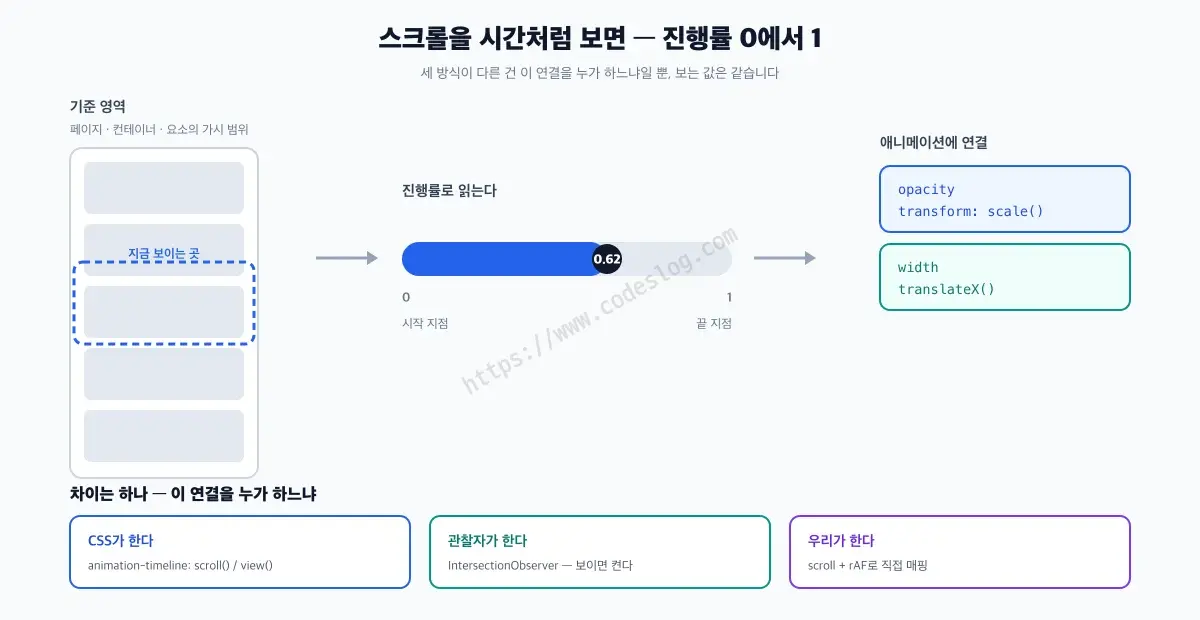
The core idea: interpret scroll as progress and bind it to animation
Let’s walk through them.
1) Native CSS Scroll-Driven Animation#
How it works#
A normal CSS animation runs on time: write animation-duration: 2s and it takes two seconds. Scroll-driven animation swaps that time axis for a scroll axis. That is really all there is to it.
The property that swaps the axis is animation-timeline, and its values come in two flavors.
Anonymous timelines (no name needed)
scroll()uses a scroll container’s scroll progress as time. Inside the parentheses you can name the scroller (nearest,root,self) and the axis (block,inline,x,y), e.g.scroll(root block).view()uses the span during which the element moves through the scrollport as 0 to 1. It fits reveal effects.
Named timelines
- Declare
scroll-timeline: --nameorview-timeline: --nameon the reference element. - Then call it from the animated element with
animation-timeline: --name. - The name must start with
--(CSS’s<dashed-ident>rule). Writingpage-scrollwithout the dashes makes the value invalid, and it is silently ignored.
An earlier draft also had an @scroll-timeline at-rule, but it disappeared when the spec was rewritten. Everything today is a plain property. Copying @scroll-timeline from an older blog post will simply not work.
Small, reliable example: a reading progress bar#
<div class="sda-progress" aria-hidden="true"></div>.sda-progress {
position: fixed;
inset: 0 0 auto 0;
height: 4px;
background: linear-gradient(90deg, #0ea5e9, #22c55e);
transform-origin: 0 50%;
transform: scaleX(0);
animation: sda-fill linear both;
/* Scroll decides the progress, so the duration value itself is
meaningless. It just must not be 0, hence the customary 1ms. */
animation-duration: 1ms;
animation-timeline: scroll(root block);
}
@keyframes sda-fill {
from {
transform: scaleX(0);
}
to {
transform: scaleX(1);
}
}This binds page scroll progress directly to scaleX without JavaScript.
The named-timeline version looks like this. You need it when the scroll container is a specific box rather than the document root.
.article-scroller {
  overflow-y: auto;
  scroll-timeline: --article-scroll block;
}

.sda-progress {
  /* ...same as above... */
  animation-timeline: --article-scroll;
}Pros#
- clean, declarative intent
- little to no JavaScript
- the “scroll as timeline” idea is visible in the code
- when you only touch compositable properties like
transformandopacity, the animation can run off the main thread without any scroll handler — something the Chrome team highlights as the key win of the native approach
Cons / caveats#
- browser support must be checked carefully
- the syntax may still feel unfamiliar in teams
- you may need a fallback strategy
- you cannot pin something in place once it has appeared
That last one ties straight into accessibility, so it is worth unpacking. An animation bound to scroll progress is mapped to position. The state produced at progress 0.6 comes back identically at 0.6, and scrolling back to 0 rewinds it to the start.
animation-fill-mode: forwards looks like the fix but is not. fill-mode only decides the state outside the timeline range; it does nothing about rewinding inside it.
So if you want “content someone has already read never disappears again” — a real courtesy to anyone scrolling back up — native CSS alone will not get you there. You need the IntersectionObserver or rAF approach below, where you simply never turn the state back off.
Browser support: treat it as a strategy question#
Native scroll-driven CSS has left the flag-only phase behind, but it is not something every browser can run yet. Here is where it stands as of August 2026.
| Browser | animation-timeline, scroll(), view() |
|---|---|
| Chrome, Edge | Supported since 115 (July 2023) |
| Safari (macOS, iOS) | Supported since 26 (September 2025) |
| Firefox | Not in stable releases. Enabled by default only in Nightly; other channels need layout.css.scroll-driven-animations.enabled flipped in about:config |
It is worth knowing the word Baseline here. It is the label that says how broadly a web feature works across the major browsers, in three tiers: limited availability, newly available, and widely available. Because Firefox is missing, scroll-driven animation is still at limited availability.
So “everyone supports it now, just ship it” is premature. In practice, I usually take this shape:
- use
animation-timeline/view-timelineas the first path - let older browsers fall back without breaking
An @supports guard helps keep that intent explicit:
.progress-fallback {
  transform: scaleX(1);
}

@supports (animation-timeline: scroll()) {
  .progress-fallback {
    transform: scaleX(0);
    animation: sda-fill linear both;
    animation-duration: 1ms;
    animation-timeline: scroll(root block);
  }
}
There is one trap almost everyone hits once.
The animation shorthand resets animation-timeline back to its initial value, auto. Leaving the timeline out of the shorthand does not preserve it; it wipes it. Reverse the order and your timeline quietly disappears.
/* Wrong order — the timeline is erased */
.bar {
  animation-timeline: scroll(root block);
  animation: sda-fill linear both;
}

/* Right order — shorthand first, timeline after */
.bar {
  animation: sda-fill linear both;
  animation-timeline: scroll(root block);
}
And while animation-duration does not control how fast a scroll-driven animation progresses, a value of 0 can stop it from running at all in some browsers. That is why 1ms is the customary placeholder.
Do not rely on a single source for support data — check caniuse, MDN, and Web Platform Status together. A table that mixes in a preview channel and gets read as all-green will bite you after you ship.
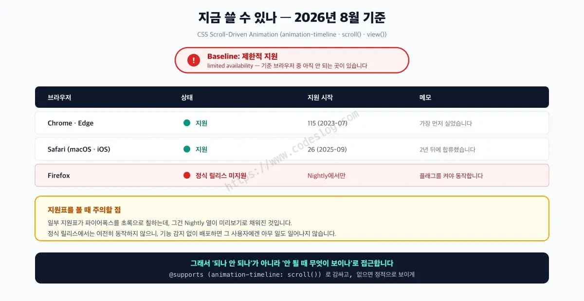
Support data: MDN · Web Platform Status (checked 2026-08)
Try it — native CSS basic · the direction limitation · with reduced motion · unsupported-browser fallback
Nothing animates on a stable Firefox release. That is expected — the fourth link shows what people see instead.
2) IntersectionObserver: change state when visible#
How it works#
IntersectionObserver lets the browser efficiently tell you whether (and how much) an element intersects the viewport. It shines when you care about state transitions rather than continuous progress.
Example: reveal-on-scroll#
<section class="io-section">
  <h2 class="io-reveal">A gentle reveal driven by scroll</h2>
  <p class="io-reveal">IntersectionObserver is great for state changes.</p>
</section>.io-reveal {
opacity: 0;
transform: translateY(16px);
transition: opacity 500ms ease, transform 500ms ease;
will-change: opacity, transform;
}
.io-reveal.is-visible {
opacity: 1;
transform: translateY(0);
}
@media (prefers-reduced-motion: reduce) {
.io-reveal,
.io-reveal.is-visible {
transition: none;
transform: none;
opacity: 1;
}
}const revealEls = document.querySelectorAll(".io-reveal");
const observer = new IntersectionObserver(
(entries, obs) => {
for (const entry of entries) {
if (!entry.isIntersecting) continue;
entry.target.classList.add("is-visible");
obs.unobserve(entry.target);
}
},
{
threshold: 0.2,
}
);
for (const el of revealEls) observer.observe(el);Pros#
- strong performance characteristics
- ideal for enter/exit/activate patterns
- widely supported and stable
Cons / caveats#
- less suited for continuous scroll progress
- often ends up as class toggles + CSS transitions
- complex timeline choreography is harder
Try it — IntersectionObserver basic · toggle on scroll direction · with reduced motion
The third one never hides an element once it has appeared, so text does not vanish on someone scrolling back up.
3) scroll + requestAnimationFrame: map progress yourself#
How it works#
This is the classic, most flexible approach.
requestAnimationFrame (rAF for short) is an API that tells the browser, “run this function once, right before you paint the next frame.” A scroll event can fire multiple times within a single frame, so deferring the calculation to rAF lets you cap the work at once per frame.
- read scroll-related geometry
- compute progress for a section
- map that progress to styles
It gives you precise control, but you also own performance and accessibility details.
Example: scale a card across a scroll range#
<section class="raf-stage">
  <div class="raf-card" data-raf-card>Scroll drives me</div>
</section>.raf-stage {
min-height: 160vh;
display: grid;
place-items: center;
padding: 24vh 0;
}
.raf-card {
width: min(680px, 92vw);
padding: 48px;
border-radius: 20px;
background: #0f172a;
color: #e5e7eb;
font-weight: 700;
font-size: clamp(28px, 4vw, 44px);
box-shadow: 0 30px 80px rgba(15, 23, 42, 0.35);
transform: scale(0.92);
transform-origin: 50% 50%;
will-change: transform, opacity;
}
@media (prefers-reduced-motion: reduce) {
.raf-card {
transform: none !important;
opacity: 1 !important;
}
}const card = document.querySelector("[data-raf-card]");
const reduceMotion = window.matchMedia("(prefers-reduced-motion: reduce)").matches;
if (card && !reduceMotion) {
let ticking = false;
const clamp01 = (v) => Math.min(1, Math.max(0, v));
const update = () => {
ticking = false;
const rect = card.getBoundingClientRect();
const viewportH = window.innerHeight;
// Normalize: from entering at the bottom to exiting at the top
const start = viewportH;
const end = -rect.height;
const progress = clamp01((start - rect.top) / (start - end));
const scale = 0.92 + progress * 0.08;
const opacity = 0.6 + progress * 0.4;
card.style.transform = `scale(${scale.toFixed(4)})`;
card.style.opacity = opacity.toFixed(4);
};
const onScroll = () => {
if (ticking) return;
ticking = true;
window.requestAnimationFrame(update);
};
window.addEventListener("scroll", onScroll, { passive: true });
window.addEventListener("resize", onScroll);
update();
}Pros#
- maximum expressive freedom
- any math mapping is possible
- easy to integrate into existing codebases
Cons / caveats#
- performance pitfalls are on you
- accessibility is easy to forget
- maintainability cost can climb quickly
Try it — scroll + rAF basic · direction toggle · with reduced motion
The progress value is shown on screen as a percentage — scroll and watch it move. Neither of the previous two approaches gives you that number.
React implementation: wrap the rAF pattern cleanly#
In React, this usually works well:
- capture the target with a
ref - register scroll handlers inside
useEffect - short-circuit everything when
prefers-reduced-motionis on
This example ports the manual progress mapping into a React component.
import { useEffect, useRef } from "react";

function clamp01(v: number) {
  return Math.min(1, Math.max(0, v));
}

export default function ScrollMappedCard() {
  const cardRef = useRef<HTMLDivElement | null>(null);

  useEffect(() => {
    const card = cardRef.current;
    if (!card) return;

    const reduceMotion = window.matchMedia("(prefers-reduced-motion: reduce)").matches;
    if (reduceMotion) {
      // Skip the motion and show the final state right away.
      card.style.transform = "none";
      card.style.opacity = "1";
      return;
    }

    let rafId = 0;

    const update = () => {
      rafId = 0;

      const rect = card.getBoundingClientRect();
      const viewportH = window.innerHeight;

      const start = viewportH;
      const end = -rect.height;
      const progress = clamp01((start - rect.top) / (start - end));

      const scale = 0.92 + progress * 0.08;
      const opacity = 0.6 + progress * 0.4;

      card.style.transform = `scale(${scale.toFixed(4)})`;
      card.style.opacity = opacity.toFixed(4);
    };

    const onScroll = () => {
      if (rafId) return;
      rafId = window.requestAnimationFrame(update);
    };

    window.addEventListener("scroll", onScroll, { passive: true });
    window.addEventListener("resize", onScroll);
    update();

    return () => {
      window.removeEventListener("scroll", onScroll);
      window.removeEventListener("resize", onScroll);
      // Cancel a frame that may still be queued after unmount.
      if (rafId) window.cancelAnimationFrame(rafId);
    };
  }, []);

  return (
    <section style={{ minHeight: "160vh", display: "grid", placeItems: "center" }}>
      <div
        ref={cardRef}
        style={{
          width: "min(680px, 92vw)",
          padding: "48px",
          borderRadius: "20px",
          background: "#0f172a",
          color: "#e5e7eb",
          fontWeight: 700,
          fontSize: "clamp(28px, 4vw, 44px)",
          transform: "scale(0.92)",
          transformOrigin: "50% 50%",
          willChange: "transform, opacity",
        }}
      >
        Scroll drives me
      </div>
    </section>
  );
}
The upside is clarity:
- binding and cleanup are explicit
- the effect stays contained within the component
The tradeoff is also clear:
- you still touch the DOM directly
- performance matters even more when multiple effects stack
Even in React, the same rule holds: principle + cost + accessibility should travel together.
Try it There is no React demo yet. The mapping logic is identical, so check the behaviour in the vanilla JS demo and port the hook above as-is.
How I choose in practice#
My default decision rules look like this:

It is less about which is best, and more about which matches the job
- scroll is the timeline -> consider native CSS first
- enter/exit/trigger is the goal -> IntersectionObserver
- precise choreography or custom math -> rAF mapping
In real products, mixing them is often best:
- CSS for a global progress bar
- IntersectionObserver for section reveals
- rAF only for a special hero section
Accessibility concerns: check these before shipping#
So far this has all been about how to build the effect. But there is one more thing we cannot skip.
Scroll animations can easily become “beautiful obstacles.” These are the main things I try to guard against.
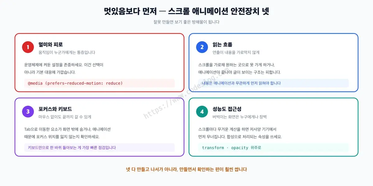
Guardrails to check before the flashy effect
1) motion sensitivity: treat prefers-reduced-motion as a default path#
prefers-reduced-motion is the media query that tells you whether the user turned on “reduce motion” in their OS settings. For people with vestibular disorders, large movement can genuinely cause nausea and dizziness, so this is closer to a physical requirement than a taste setting.
- in CSS, use
@media (prefers-reduced-motion: reduce) - in JS, short-circuit the animation logic with
matchMedia
All code samples above already include this.
There is a standard to anchor it to. WCAG 2.2 success criterion 2.3.3 Animation from Interactions (Level AAA) says that motion animation triggered by interaction must be able to be disabled, unless the animation is essential to the functionality or the information being conveyed. Scrolling is an interaction, so this lands squarely on us. Content simply moving into view as you scroll is considered essential to scrolling itself; it is the parallax and zoom effects layered on top that fall under the criterion.
Level AAA is above the bar most legal requirements set (usually AA), but the risk the criterion points at is ours either way once we ship scroll animation.
One caveat about the code below: reading matchMedia(...).matches only once misses users who change the setting while the page is open. To be strict, listen for changes with mql.addEventListener("change", ...) as well. I keep the single read here to make the flow easier to follow.
Before and after: actually honoring reduced motion#
Code that “looks fine” but skips the accessibility path is common:
Before:
const observer = new IntersectionObserver((entries) => {
  for (const entry of entries) {
    if (!entry.isIntersecting) continue;
    entry.target.classList.add("is-visible");
  }
});

document.querySelectorAll(".io-reveal").forEach((el) => observer.observe(el));
After:
const reduceMotion = window.matchMedia("(prefers-reduced-motion: reduce)").matches;
const targets = document.querySelectorAll(".io-reveal");

if (reduceMotion) {
  // Drop the motion, but leave the content immediately readable.
  targets.forEach((el) => el.classList.add("is-visible"));
} else {
  const observer = new IntersectionObserver((entries, obs) => {
    for (const entry of entries) {
      if (!entry.isIntersecting) continue;
      entry.target.classList.add("is-visible");
      obs.unobserve(entry.target);
    }
  }, { threshold: 0.2 });

  targets.forEach((el) => observer.observe(el));
}
The rAF mapping splits the same way.
Before:
const card = document.querySelector("[data-raf-card]");
window.addEventListener("scroll", () => {
  const rect = card.getBoundingClientRect();
  const progress = (window.innerHeight - rect.top) / (window.innerHeight + rect.height);
  card.style.transform = `scale(${0.92 + progress * 0.08})`;
});
After:
const card = document.querySelector("[data-raf-card]");
const reduceMotion = window.matchMedia("(prefers-reduced-motion: reduce)").matches;

if (card && !reduceMotion) {
  let ticking = false;
  const clamp01 = (v) => Math.min(1, Math.max(0, v));

  const update = () => {
    ticking = false;
    const rect = card.getBoundingClientRect();
    const start = window.innerHeight;
    const end = -rect.height;
    const progress = clamp01((start - rect.top) / (start - end));
    const scale = 0.92 + progress * 0.08;
    card.style.transform = `scale(${scale.toFixed(4)})`;
  };

  const onScroll = () => {
    if (ticking) return;
    ticking = true;
    window.requestAnimationFrame(update);
  };

  window.addEventListener("scroll", onScroll, { passive: true });
  window.addEventListener("resize", onScroll);
  update();
}
2) do not break reading order#
Scroll effects often distort meaning:
- something appears visually later
- but is read earlier by assistive tech
Try to keep semantic order and visual order aligned as much as possible. Animation should support meaning, not scramble it.
3) focus and keyboard flows#
Avoid these patterns:
- interactive elements disappearing with
display: noneon scroll - focus moving somewhere that is visually “gone”
Safer patterns:
- prefer
opacity/visibilityto manage presence - do not sacrifice focusable UI to a scroll effect
4) performance is also accessibility#
Jank hurts everyone, but it hurts some users more.
- animate
transformandopacitywhen possible - combine passive scroll listeners with rAF
- keep layout reads (
getBoundingClientRect) deliberate
The
will-changein the samples above is a hint telling the browser “this property is about to change,” so it can prepare a separate layer. Handy, but leaving it on hundreds of elements permanently just eats memory. Remove it once the effect is done, or add it only right before the animation starts.
Demos and external sharing: make it reproducible#
With scroll animation, reading about it and actually scrolling it are unusually different experiences. So each section ends with a demo, and they all live in one place.
Each approach ships the same result in three variants, so you can compare them side by side.
- basic — the simplest form, elements reacting to scroll
- direction / limitation — deliberately exposing what that approach cannot do (native CSS has no idea which way you are scrolling)
- with reduced motion — respecting
prefers-reduced-motion, and never re-hiding content once it has appeared (with one exception: native CSS cannot pin content this way. An animation bound to scroll progress always rewinds when you scroll back up. Only the IntersectionObserver and rAF demos genuinely lock.)
Native CSS has one extra: what unsupported browsers show. Open it in a stable Firefox release and you will get the static version — the point is to confirm that this is the design, not a bug.
At a glance#
- All three approaches do the same job: read scroll as a progress value between 0 and 1 and bind it to animation. The difference is who performs that binding.
- Native CSS (
animation-timeline: scroll(),view()) needs almost no JavaScript, but with Firefox missing from stable releases, Baseline still rates it limited availability. Wrap it in@supportsand decide what the fallback should look like. - IntersectionObserver is strong for state transitions like reveal and activation, and it is broadly supported. It just is not built for continuous progress values.
- scroll + rAF can map anything you want, but you own performance and accessibility. The default is a
passivelistener paired with rAF, computing once per frame. - Whatever you pick, treat
prefers-reduced-motionas a default behavior (this is the risk WCAG 2.3.3 points at). But pinning content in place is a JS-only move — a CSS animation bound to scroll progress always rewinds on the way back up.
Closing: scroll is not just input, it can be time#
Scroll can be more than an event; it can be a timeline.
The key is not which tool looks flashiest, but whether you understand the principle, the tradeoffs, and the accessibility costs together. When you carry all three, scroll-driven animation becomes a much more trustworthy tool.
Leave a comment