“I’ve looked at WCAG 2.1, but what’s new in 2.2?”
I get this question a lot doing frontend work. WCAG 2.2 became a W3C Recommendation on October 5, 2023, so it’s been nearly three years now. For reference, the document currently posted at w3.org/TR/WCAG22/ is a December 12, 2024 revised recommendation — the success criteria themselves haven’t changed, it’s just a republication with post-finalization corrections folded in. Yet plenty of teams are still running their checklists against 2.1. It’s not that they don’t know the new criteria exist — it’s more that “nine new ones, do we really have to look at all of them?” has kept it on the back burner.
Short answer: you don’t need to memorize all nine. This post walks through the 6 A/AA-level criteria you’re most likely to run into in practice, with code, and covers the remaining 3 AAA-level criteria more briefly. Once you see who each criterion is for and which code fails versus which passes, “why this was needed” should click.
The four criteria covered here also come with a hands-on demo page. If you hit a spot where you’re thinking “wait, really?”, open the WCAG 2.2 New Criteria demo and check it yourself with the Tab key. Violations and fixes sit side by side, so doing the same action on both makes the difference obvious immediately. Reading about focus disappearing behind a header and actually watching it happen are pretty different experiences.
Why Look at This Again Now#
There are two reasons to dig up a 3-year-old standard again.
One is that Korea’s own standard has already moved. KWCAG 2.2 (Korea’s national web content accessibility guidelines), revised in December 2022, already incorporates part of WCAG 2.2’s direction. Concepts like accessible authentication, a consistent location for help information, and redundant entry information are already built into the domestic standard.
The other is what’s happening in Europe. EN 301 549, used in EU procurement, is currently based on WCAG 2.1, but a revised draft aligned with WCAG 2.2 AA has already been published. If your product touches Europe, it’s worth knowing about ahead of time. We’ll come back to this in more detail later.
The 6 New Criteria at a Glance#
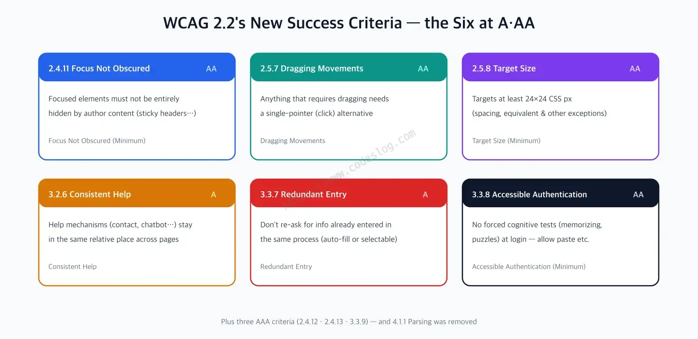
Here’s a table of the 6 criteria this post covers.
| Success Criterion | Name | Level |
|---|---|---|
| 2.4.11 | Focus Not Obscured (Minimum) | AA |
| 2.5.7 | Dragging Movements | AA |
| 2.5.8 | Target Size (Minimum) | AA |
| 3.2.6 | Consistent Help | A |
| 3.3.7 | Redundant Entry | A |
| 3.3.8 | Accessible Authentication (Minimum) | AA |
2.4.11 Focus Not Obscured (Minimum) — Focus Can’t Be Hidden#
If you’ve ever filled out a form using only the keyboard, you’ve probably run into a case where focus moved but the focused element itself wasn’t visible. A sticky header, a bottom banner, a chatbot widget — authored content (elements a developer built) ends up covering the focused element. Mouse users just scroll around it without thinking, but someone navigating with a keyboard or a switch device gets lost the moment they can’t visually confirm where focus is.
2.4.11 exists to prevent this. It requires that a focused element not be entirely hidden by authored content. The word “entirely” matters here — the Minimum level still allows partial obscuring. Ruling out partial obscuring too is the job of the AAA-level criterion covered later.
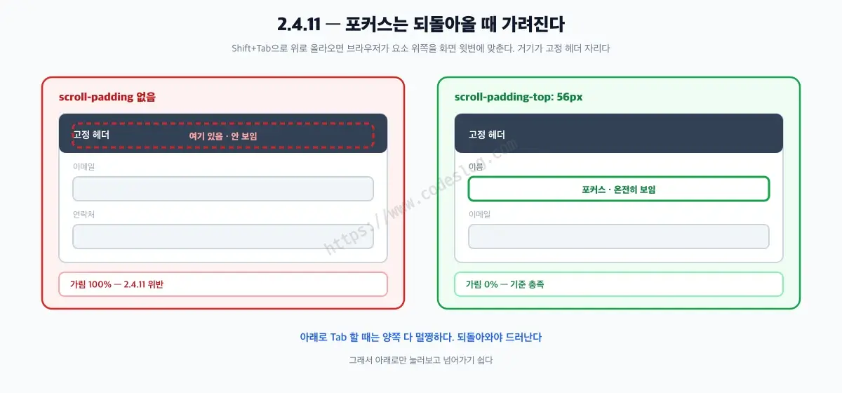
Try it yourself — tab down to the last field, then Shift+Tab back up
When exactly it gets covered is surprising, though. I only found out by measuring it myself.
On a long form with a sticky header, tabbing forward never covers it. When the browser scrolls an element into view, it scrolls the minimum amount needed — and going forward, it aligns the bottom of the element with the bottom of the viewport. The header sits at the top, so it never gets in the way.
The problem shows up on Shift+Tab, going backward. This time the browser aligns the top of the element with the top of the viewport — exactly where the sticky header lives. The input field disappears completely behind it.
| Direction | No scroll-padding | scroll-padding-top: 56px |
|---|---|---|
| Tab (forward) | 0% covered | 0% covered |
| Shift+Tab (backward) | 100% covered | 0% covered |
These numbers come from the same form, with the header set to 56px tall. This is exactly why it’s easy to only test tabbing forward, decide “looks fine,” and move on.
The fix touches the scroll container, not the header’s own styles.
/* Sticky header — not a problem by itself */
.site-header {
  position: sticky;
  top: 0;
  z-index: 100;
  height: 56px;
}

/* Fix: reserve space equal to the header's height when the browser scrolls an element into view */
html {
  scroll-padding-top: 56px;
}
scroll-padding-top means “when scrolling something into view, keep this much as a safe zone.” Set it on html if the whole page scrolls, or on the specific container if only one region scrolls on its own.
/* When only a region scrolls on its own — set it on that container */
.form-panel {
  overflow-y: auto;
  scroll-padding-top: 56px;
}
The value has to match the header’s height, and writing that number in two places by hand is a recipe for the two drifting apart later. It’s safer to tie them together with a variable.
:root { --header-h: 56px; }

.site-header { height: var(--header-h); }
html { scroll-padding-top: var(--header-h); }
If you’re showing a cookie banner or chat widget at the bottom, take care of scroll-padding-bottom too. Bottom obstructions cover the element the opposite way — when tabbing forward.
2.5.7 Dragging Movements — Dragging Needs a Click Alternative#
Reordering a list, adjusting a slider, moving a shape on a canvas — most of these interactions get built with dragging. The problem is that dragging is a precise, continuous motion. For someone with a hand tremor, or someone using a switch or head pointer instead of a mouse, dragging is a lot harder than clicking a button.
2.5.7 requires that any function that only works by dragging also offer an alternative that achieves the same result through a single pointer action (one click or tap). It’s not asking you to remove dragging — just to make sure the same thing can be done without it.
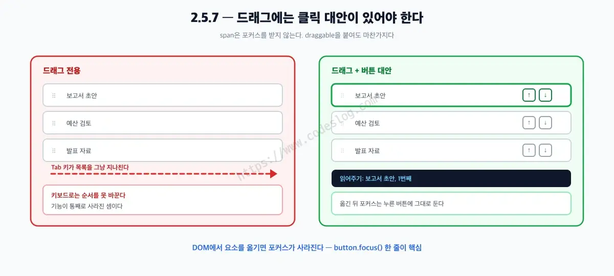
Try it yourself — reorder the list above using only the keyboard
Here’s a common way this gets violated:
<!-- Violation: reordering only works by dragging -->
<ul id="tasks">
  <li><span class="handle" draggable="true">⠿</span> Draft the report</li>
  <li><span class="handle" draggable="true">⠿</span> Review the budget</li>
</ul>
A <span> doesn’t take focus by default, and adding draggable doesn’t change that. Keyboard users have no way to even reach this handle, so the reordering feature is effectively gone for them.
The weight of this criterion goes beyond the keyboard, though. HTML drag and drop doesn’t fire on touch at all. Events like dragstart and dragover simply never happen from a finger. Open this list on a phone or tablet and no amount of pressing and pulling does anything.
Laid out, it looks like this.
| Input method | On a drag-only list |
|---|---|
| Mouse | Works |
| Keyboard | Handle never takes focus, so no |
| Screen reader | Nothing there to operate |
| Touch (phone, tablet) | Drag events never fire |
Only the mouse works. 2.5.7 often gets introduced as a criterion for people with hand tremors, but in practice it catches everyone browsing on a phone. Supporting touch dragging means reimplementing it with pointer events — and if you’re going to spend that effort, building the button alternative first is far cheaper.
The alternative is a button. Here’s the markup first:
<ul id="tasks">
  <li>
    <span class="handle" draggable="true" aria-hidden="true">⠿</span>
    <span class="name">Draft the report</span>
    <button type="button" class="move" data-dir="up" aria-label="Move Draft the report up">↑</button>
    <button type="button" class="move" data-dir="down" aria-label="Move Draft the report down">↓</button>
  </li>
  <!-- Remaining items follow the same structure -->
</ul>
<p class="sr-only" role="status" aria-live="polite" id="order-status"></p>
Three choices here are deliberate.
aria-hidden="true" on the drag handle. Mouse users still see something to grab, but screen readers won’t read it out — there’s no upside to announcing “six dots.” The actual controls are the buttons below.
The item’s name goes into each button’s aria-label. With just an arrow, a screen reader would read “move up button” once per item, with no way to tell which item’s button it is.
A live region with role="status". The reorder is visible immediately if you can see the screen, but for someone who can’t, nothing appears to have happened at all. The result needs to be announced in words.
Here’s the behavior. It’s wired up with event delegation on the list once, rather than per button.
const list = document.getElementById('tasks');
const status = document.getElementById('order-status');

list.addEventListener('click', (event) => {
  const button = event.target.closest('.move');
  if (!button) return;

  const item = button.closest('li');
  const goUp = button.dataset.dir === 'up';
  const sibling = goUp ? item.previousElementSibling : item.nextElementSibling;
  if (!sibling) return;                       // Already at the end — do nothing

  goUp ? list.insertBefore(item, sibling)
       : list.insertBefore(sibling, item);

  button.focus();                             // Moving a node in the DOM drops focus back to body
  const position = [...list.children].indexOf(item) + 1;
  status.textContent = `${item.querySelector('.name').textContent}, position ${position}`;
});
The button.focus() line is the key part. Moving an element in the DOM drops any focus that was inside it. Skip this line and every button press sends focus back to the very start of the document, so moving an item two spots up means tabbing all the way through from the top again. It’s the single most common way a dragging alternative gets built and then quietly becomes unusable.
If your team already uses a drag-and-drop sorting library, you don’t need to rip it out. Wire the buttons above and the library’s own reorder API into the same function, and both paths produce the same result.
2.5.8 Target Size (Minimum) — Buttons Need at Least 24×24px#
You’ve probably had this happen on a touchscreen — you go to tap a small icon button and hit the one next to it instead. Fingers stay roughly the same size while buttons keep shrinking; it’s an old dilemma in frontend design. For someone with a hand tremor, that dilemma turns straight into “I can’t tap this.”
2.5.8 draws a hard number through that dilemma. Any target operated by touch or click needs to be at least 24×24 CSS px. There’s a generous list of exceptions, though.
- Spacing: even if the target itself is small, it’s fine as long as it sits far enough from adjacent targets that their 24px circles don’t overlap.
- Equivalent alternative: fine if another control on the same page does the same thing and meets the size requirement.
- Inline: exempt if the target sits within a run of text, like a link in the middle of a sentence.
- User agent control: fine if you’re just using the default size the browser or OS provides.
- Essential: fine when a small size is functionally necessary, like precise zoom controls on a map.
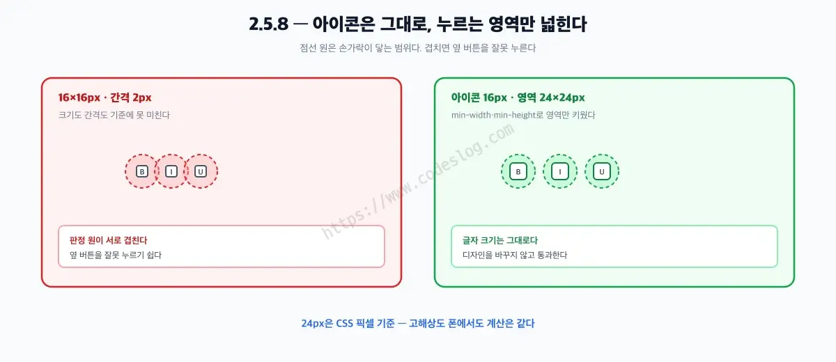
Try it yourself — the difference is obvious on a phone
/* Violation: 16x16px buttons packed 2px apart */
.icon-button {
  width: 16px;
  height: 16px;
  padding: 0;
}
There are two ways to fix this. Which one you pick depends on the situation.
Option 1 — grow the button itself. The simplest fix, and enough in most cases.
.icon-button {
  display: inline-flex;      /* To center the icon */
  align-items: center;
  justify-content: center;
  min-width: 24px;           /* min-width, not width */
  min-height: 24px;
  padding: 4px;
}
The trick is using min-width instead of width. That way the button grows to fit its content instead of clipping it when text gets longer or a user bumps up the browser’s font size. Adding padding on top of a fixed width behaves differently depending on box-sizing, and won’t reliably hit 24px in a project where a global reset sets border-box.
Option 2 — keep the visible size, widen only the hit area. Use this where you can’t disturb the layout, like a tightly packed toolbar.
.icon-button {
  position: relative;
  width: 16px;
  height: 16px;
}

/* Overlay an invisible hit area on top of the button */
.icon-button::after {
  content: "";
  position: absolute;
  inset: -4px;               /* 4px on every side = 24x24px */
}
Because a pseudo-element doesn’t take up space in the layout flow, the spacing between buttons stays exactly as it was. If adjacent buttons’ hit areas overlap, though, whichever one is drawn on top wins the click — so skip this approach if the gap is narrower than 8px.
And whichever option you use, make sure the focus indicator gets the same treatment. Widening only the hit area changes nothing for keyboard users.
.icon-button:focus-visible {
  outline: 2px solid currentColor;
  outline-offset: 2px;
}
The 24px here is measured in CSS pixels, not the device’s physical pixels — so the math holds on high-DPI phones too. For reference, 2.5.5 (Target Size, Enhanced) requires 44×44px at the AAA level, which lands close to the 44–48px range Apple’s and Google’s design guidelines have long recommended — which is why plenty of teams treat 24px as the floor and 44px as the actual target.
3.2.6 Consistent Help — Keep Help in the Same Place#
In a multi-page service, if the “Contact us” link sits in the header on some pages and buried in the footer on others, users have to go hunting for it all over again every time they need help. For users with cognitive disabilities or low vision, that repeated searching is a real burden on its own.
3.2.6 requires that when help mechanisms — live chat, contact information, FAQ links — repeat across multiple pages, they stay in a consistent relative position. This one’s more about layout rules than code, so here’s a checklist version:
- Standardize where “getting help” elements (chatbot button, contact link, FAQ link) sit across the whole site.
- Even if different pages use different components, keep the same relative order against other repeated content (header, navigation).
- When building a new page template, record this positioning rule in your design system docs.
Teams with a solid design system probably already follow this. In organizations where multiple teams build their own pages independently, though, it breaks more often than you’d expect.
3.3.7 Redundant Entry — Don’t Ask for What They Already Told You#
You’ve probably run into a form that makes you type your billing address all over again right after you already typed your shipping address. For someone with limited hand mobility, where every keystroke is a cost, or someone for whom re-entering the same information is cognitively taxing, that’s not just annoying — it’s the kind of barrier that makes people abandon the form.
3.3.7 says not to ask users to re-enter information they’ve already provided within the same process. Auto-fill it, or at least let them select it. There are exceptions: when re-entry is the actual point of the task (memorization practice, say), when re-entry is needed for security (confirming a password change), or when the previously entered information is no longer valid.
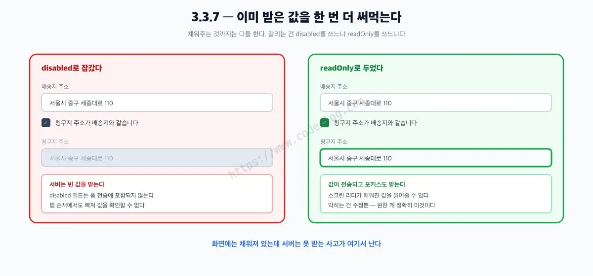
Try it yourself — toggle the checkbox on and off
<label for="shipping-address">Shipping address</label>
<input type="text" id="shipping-address" name="shippingAddress" autocomplete="shipping street-address">

<label>
  <input type="checkbox" id="same-as-shipping">
  Billing address is the same as shipping
</label>

<label for="billing-address">Billing address</label>
<input type="text" id="billing-address" name="billingAddress" autocomplete="billing street-address">
Using a real <label> instead of a placeholder as the field’s name matters here. A placeholder disappears the moment you start typing, so there’s no way to double back later and confirm “wait, what was this field again?” once it’s filled in.
const sameAsShipping = document.getElementById('same-as-shipping');
const shipping = document.getElementById('shipping-address');
const billing = document.getElementById('billing-address');

sameAsShipping.addEventListener('change', () => {
  if (sameAsShipping.checked) {
    billing.value = shipping.value;
    billing.readOnly = true;        // Not disabled — see below
  } else {
    billing.value = '';
    billing.readOnly = false;
  }
});readOnly, not disabled. Code in this spot reaches for disabled a lot, and that breaks two things.
- A
disabledfield’s value doesn’t get included in form submission. The screen shows the address filled in, but the server receives an empty value. - A
disabledfield drops out of the tab order, and most screen readers skip it too — so a user trying to confirm the filled-in value has no way to reach that field.
readOnly keeps the value in the submission, keeps the field focusable, and keeps it readable. Only editing is blocked — which is exactly what’s needed here.
Clearing the value when the checkbox gets unchecked is also deliberate. Leaving the shipping value behind would just make the user erase it and retype something else. That said, it’s a judgment call that depends on the service — sometimes leaving the value in place and letting people edit it is the better choice.
3.3.8 Accessible Authentication (Minimum) — Logging In Shouldn’t Be a Test#
Some login screens use a CAPTCHA that makes you transcribe letters from an image, or block pasting into the password field so you have to type it out by hand every time. For users with cognitive disabilities, or anyone who can’t reliably rely on memory, these mechanisms become a wall that blocks login entirely. Logging in is supposed to be just an identity check, but it ends up requiring you to pass a memory test as a side quest.
3.3.8 requires that the authentication process not depend on a cognitive function test — things like remembering and typing something back, solving a puzzle, or transcribing text. It’s fine as long as an alternative or assistive mechanism exists, and allowing password paste or supporting password managers both count as that mechanism. The minimum level has two exceptions too: object recognition tests (picking out the cars in a set of images, say) and tests that recognize non-text content the user provided themselves (a photo they uploaded, for example).
<!-- Violation: blocks paste, which breaks password manager use -->
<input type="password" onpaste="return false" onCopy="return false"><!-- Fix: allow paste and stay compatible with browser/password-manager autofill -->
<input type="password" name="password" autocomplete="current-password">onpaste="return false" used to be treated as a “security hardening” practice, but by today’s standards it’s actually an anti-accessibility pattern. For someone using a password manager, that one line can block them from logging in at all.
A Quick Look at the 3 AAA Criteria#
The remaining 3 belong to AAA, the highest level, which sets a higher bar than the AA level most web services aim for. Teams rarely target these directly in practice, but it’s worth knowing their names.
- 2.4.12 Focus Not Obscured (Enhanced): the stronger version of 2.4.11 above. The focused element can’t be obscured even partially.
- 2.4.13 Focus Appearance: requires specific minimum size and contrast numbers for the focus indicator (like an outline).
- 3.3.9 Accessible Authentication (Enhanced): the stronger version of 3.3.8. Same structure — an alternative or assistive mechanism is enough — but the object-recognition and user-provided-content exceptions allowed at the minimum level disappear.
One Criterion That Quietly Disappeared#
This revision didn’t just add things. The existing 4.1.1 Parsing criterion (which required markup to validate against spec) was removed in 2.2 — the spec’s own text even marks the criterion’s title with “Obsolete and removed.”
The reason isn’t a guess — the standard states it directly. The criterion originally existed to handle problems caused by assistive technology parsing HTML directly, and the rationale for removing it is that assistive technology no longer needs to parse HTML directly at all. Those problems either no longer exist or are already covered by other criteria, making this one redundant. Nine added, one removed — a net gain of eight.
Don’t take this the wrong way, though — it doesn’t mean markup can be sloppy. Duplicate ids or badly closed tags that break the accessibility tree still get caught under 4.1.2 Name, Role, Value or 1.3.1 Info and Relationships. One checkpoint disappeared; the benefits of valid markup didn’t.
How KWCAG 2.2 Reflects This#
The full structure of Korea’s national standard, KWCAG 2.2, is covered in The Complete Guide to KWCAG 2.2; here we only look at how it maps onto these 6 criteria.
Korea’s KWCAG 2.2, revised on December 28, 2022, already incorporates part of the direction covered here. Rather than a precise 1:1 mapping of provision numbers, it’s more accurate to describe which concepts correspond to which.
| WCAG 2.2 Success Criterion | Corresponding KWCAG 2.2 Checkpoint |
|---|---|
| 3.3.8 Accessible Authentication | 7.3.3 Accessible Authentication |
| 3.2.6 Consistent Help | 7.2.2 Easy-to-Find Help Information |
| 3.3.7 Redundant Entry | 7.3.4 Redundant Entry Information |
| 2.5.7 Dragging Movements | 6.5.1 Single-Pointer Input Support |
If you’re preparing a domestic project against KWCAG, you can treat these concepts as already being in scope for review. Check NIA’s standard review guidelines for exact provision wording. The certification process itself, from document review to the passing bar, is covered separately in Web Accessibility Quality Certification (WA Certification): How to Get It Today.
Global Status: How Far Has the World Gotten?#
In Europe, EN 301 549 — the standard used for EU procurement and presumption of conformity — is on the move. The version currently in official use, V3.2.1 (2021), is still based on WCAG 2.1, but the V4.1.0 draft published in November 2025 is aligned with WCAG 2.2 AA. Commercial sources mention around October 2026 for when the final version might be published in the Official Journal of the European Union (OJEU), but that’s low-confidence information, so treat it as a rough pointer only. The direction itself is clear, though — Europe is heading toward 2.2.
The US is a different story. The ADA (Americans with Disabilities Act) Title II web rule, finalized in 2024, is based on WCAG 2.1 AA, not 2.2. The compliance deadline is April 26, 2027 for jurisdictions with populations of 50,000 or more, and April 26, 2028 for everyone else — pushed back a year from the original schedule by the DOJ’s interim final rule in April 2026. Section 508, which covers federal agencies, still runs on the even older WCAG 2.0 AA.
In short: Europe is moving toward 2.2, while the US is still on 2.1 (2.0 for federal agencies). Which standard you should target right now depends on which market you’re mainly serving.
One-Page Summary#
- WCAG 2.2 became a Recommendation on October 5, 2023 (the current document is a December 12, 2024 revised recommendation) — 9 new success criteria added, 4.1.1 Parsing removed.
- The 6 A/AA criteria that matter most in practice: 2.4.11 (focus can’t be obscured) · 2.5.7 (dragging needs an alternative) · 2.5.8 (24×24px targets) · 3.2.6 (consistent help location) · 3.3.7 (no redundant entry) · 3.3.8 (authentication without a cognitive test).
- A drag-only UI works for mouse users and nobody else. HTML drag never fires on touch, so phone users are locked out too.
- The 3 AAA criteria (2.4.12, 2.4.13, 3.3.9) are stronger versions of the ones above — for most services, AA is the realistic target.
- KWCAG 2.2 (revised 2022-12-28) already incorporates part of this direction — authentication, help information, redundant entry, and single-pointer input.
- Europe’s EN 301 549 is aligning with 2.2 AA, while the US ADA is still on 2.1 AA (Section 508 for federal agencies is on 2.0) — your target standard depends on which market you serve.
Quick answers#
What's different between WCAG 2.1 and 2.2?
Do we need to switch to 2.2 right now?
Are these criteria reflected in KWCAG too?
References#
WCAG 2.2 (W3C Recommendation, finalized 2023-10-05 / revised recommendation 2024-12-12)
Web Accessibility Quality Certification (WA Certification): How to Get It Today
Keyboard Accessibility A to Z: Building Websites Everyone Can Use Without a Mouse
Form Accessibility Mastery: Designing Accessible Input Forms for Everyone
Leave a comment