Introduction#
“1.3.1 Info and Relationships - Level A”
If you’ve worked with WCAG 2.2, you’re familiar with this format of Success Criteria. Numbers, levels, and clear test conditions. This structure has been the standard for web accessibility for over 15 years.
However, as we explored in the previous article, this approach had limitations. “Websites that pass checkboxes but are actually unusable” are proof of this.
WCAG 3.0 has completely redesigned the structure itself to address this issue. It didn’t just add items—it changed the way we evaluate accessibility.
In this article, we’ll dive deep into WCAG 3.0’s new structure. From a practitioner’s perspective, let’s explore specifically how to apply it.
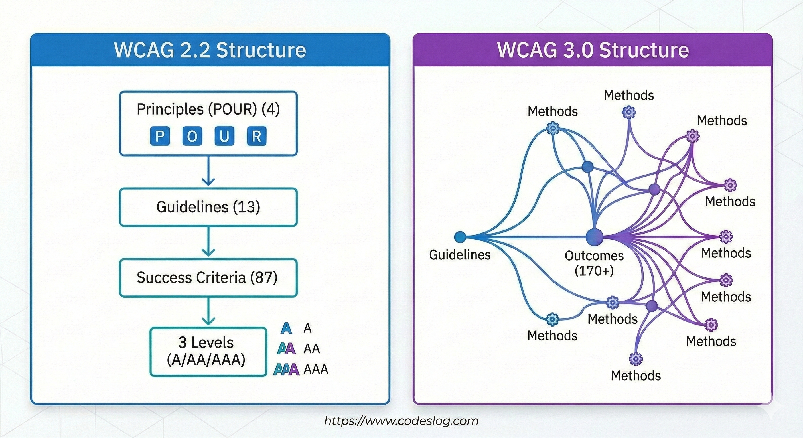
WCAG 2.2 Structure: Familiar Hierarchy#
Before understanding the new structure, let’s revisit the familiar WCAG 2.2 structure.
The 4-13-86 Formula#
WCAG 2.2 has the following hierarchical structure:
4 Principles - POUR
- Perceivable
- Operable
- Understandable
- Robust
13 Guidelines
- Examples: “Provide text alternatives”, “Provide alternatives for time-based media”, etc.
86 Success Criteria
- Expanded from 78 in WCAG 2.1 with 8 new additions in WCAG 2.2
- Each criterion is classified as Level A, AA, or AAA
- Written as clearly testable conditions
In practice, we typically reference them like this:
1.1.1 Non-text Content (Level A)
1.3.1 Info and Relationships (Level A)
2.4.7 Focus Visible (Level AA)
Advantages and Limitations of Clarity#
The biggest advantage of this structure is clarity. Each Success Criterion is:
- Objectively testable
- Clear pass/fail determination
- Suitable for legal requirements
However, this clarity became a trap. “Does the alt text exist?” is easy to determine, but “Is the alt text useful?” is difficult to judge.

Photo by Jakub Żerdzicki on Unsplash
WCAG 3.0’s New Structure: User-Centered#
WCAG 3.0 takes a completely different approach. It shifts focus from “what to comply with” to “what users should be able to achieve.”
Guidelines → Outcomes → Methods#
Let’s look at the new 3-tier structure:
Tier 1: Guidelines
- Similar to WCAG 2.x but broader concept
- Reorganized around user needs
- Examples: “Clear Words”, “Flexible Target Sizes”
Tier 2: Outcomes (This is the key!)
- Describes the actual results users should achieve
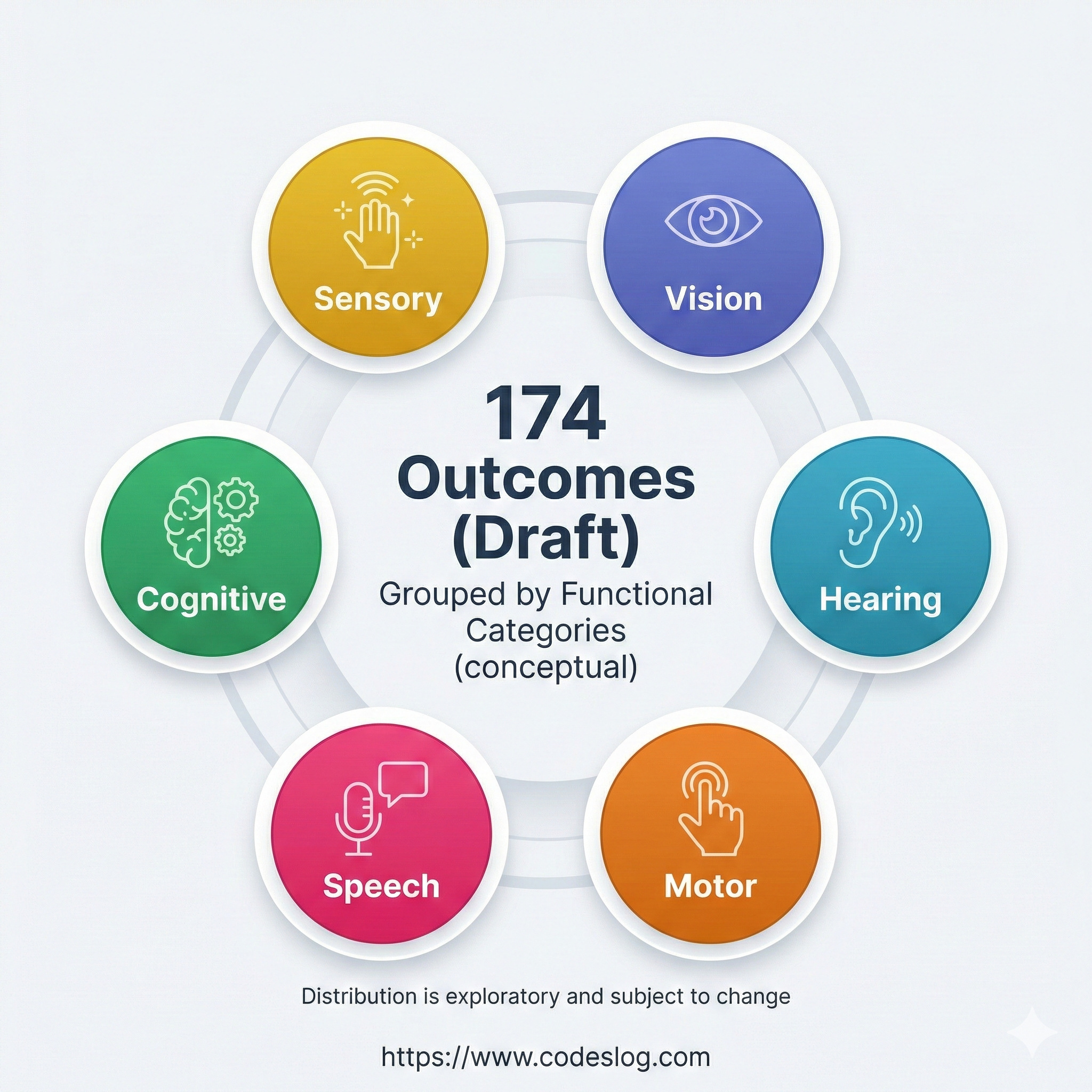
- 174 Outcomes defined (as of September 2025)
- Specifies “what” to achieve, not “how”
Tier 3: Methods
- Specific methods to achieve Outcomes
- Multiple methods to choose from
- Flexibly applied according to technology and context
Outcomes: The New Center of Evaluation#
Outcomes are WCAG 3.0’s most innovative concept. Let’s compare how they differ from traditional Success Criteria with a real example.
WCAG 2.2 Approach:
1.1.1 Non-text Content (Level A)
"All non-text content must provide alternative text"
✅ Test: Does the <img> tag have an alt attribute?
- Yes → Pass
- No → Fail
WCAG 3.0 Approach:
Outcome: Text alternatives for images
"Users must be able to understand the purpose and content of images"
✅ Evaluation:
- Does the alternative text convey the image’s purpose?
- Does it provide information appropriate to the context?
- Can users actually understand it?
See the difference? WCAG 3.0 shifts from “exists/doesn’t exist” to “effective/ineffective” evaluation criteria.
Real-World Example: Comparing with a Login Form#
Theoretical explanations are helpful, but seeing actual examples is better for understanding. Let’s evaluate a simple login form using both WCAG 2.2 and 3.0 approaches.
Example: Basic Login Form#
<form>
  <div>
    <label for="username">Username</label>
    <input type="text" id="username" name="username">
  </div>
  <div>
    <label for="password">Password</label>
    <input type="password" id="password" name="password">
  </div>
  <button type="submit">Login</button>
</form>
WCAG 2.2 Evaluation Approach#
Checklist Approach:
✅ 1.3.1 Info and Relationships (A)
<label>and<input>are connected viafor/id- Verdict: Pass
✅ 3.3.2 Labels or Instructions (A)
- All input fields have labels
- Verdict: Pass
✅ 4.1.2 Name, Role, Value (A)
- Appropriate HTML elements used
- Verdict: Pass
Conclusion: Fully compliant with WCAG 2.2 AA ✅
WCAG 3.0 Evaluation Approach#
Outcomes-Based Approach:
Outcome 1: “Users must be able to understand the purpose of each input field”
Evaluation:
- Are labels clear? ✅
- Is required/optional indicated? ❌
- Is input format explained? ❌
- Is there clear guidance when errors occur? ❌
Outcome 2: “Users must be able to successfully complete the form”
Evaluation:
- Can all functions be used with keyboard only? ✅
- Does screen reader understand form structure? ✅
- Is there password show/hide functionality? ❌
- Is autocomplete supported? ❌
Conclusion: Technically passes, but needs improvement in user experience 🟡
Improved Version: Meeting WCAG 3.0 Outcomes#
<form aria-labelledby="login-heading">
  <h2 id="login-heading">Login</h2>

  <div>
    <label for="username">
      Username <span aria-label="required">*</span>
    </label>
    <input
      type="text"
      id="username"
      name="username"
      autocomplete="username"
      required
      aria-required="true"
      aria-describedby="username-format">
    <p id="username-format" class="input-hint">
      Enter email or phone number
    </p>
  </div>

  <div>
    <label for="password">
      Password <span aria-label="required">*</span>
    </label>
    <div class="password-wrapper">
      <input
        type="password"
        id="password"
        name="password"
        autocomplete="current-password"
        required
        aria-required="true"
        aria-describedby="password-requirement">
      <button
        type="button"
        aria-label="Show password"
        aria-pressed="false"
        onclick="togglePassword()">
        👁️
      </button>
    </div>
    <p id="password-requirement" class="input-hint">
      8+ characters, including letters/numbers/symbols
    </p>
  </div>

  <button type="submit">Login</button>

  <div role="alert" aria-live="polite" class="error-message" hidden>
    <!-- Error messages displayed here -->
  </div>
</form>
This version includes:
- Required field indicators
- Input format guidance
- Password show/hide functionality
- Autocomplete support
- Error message area
- Clear form structure
Now it’s a form where users can actually log in easily.
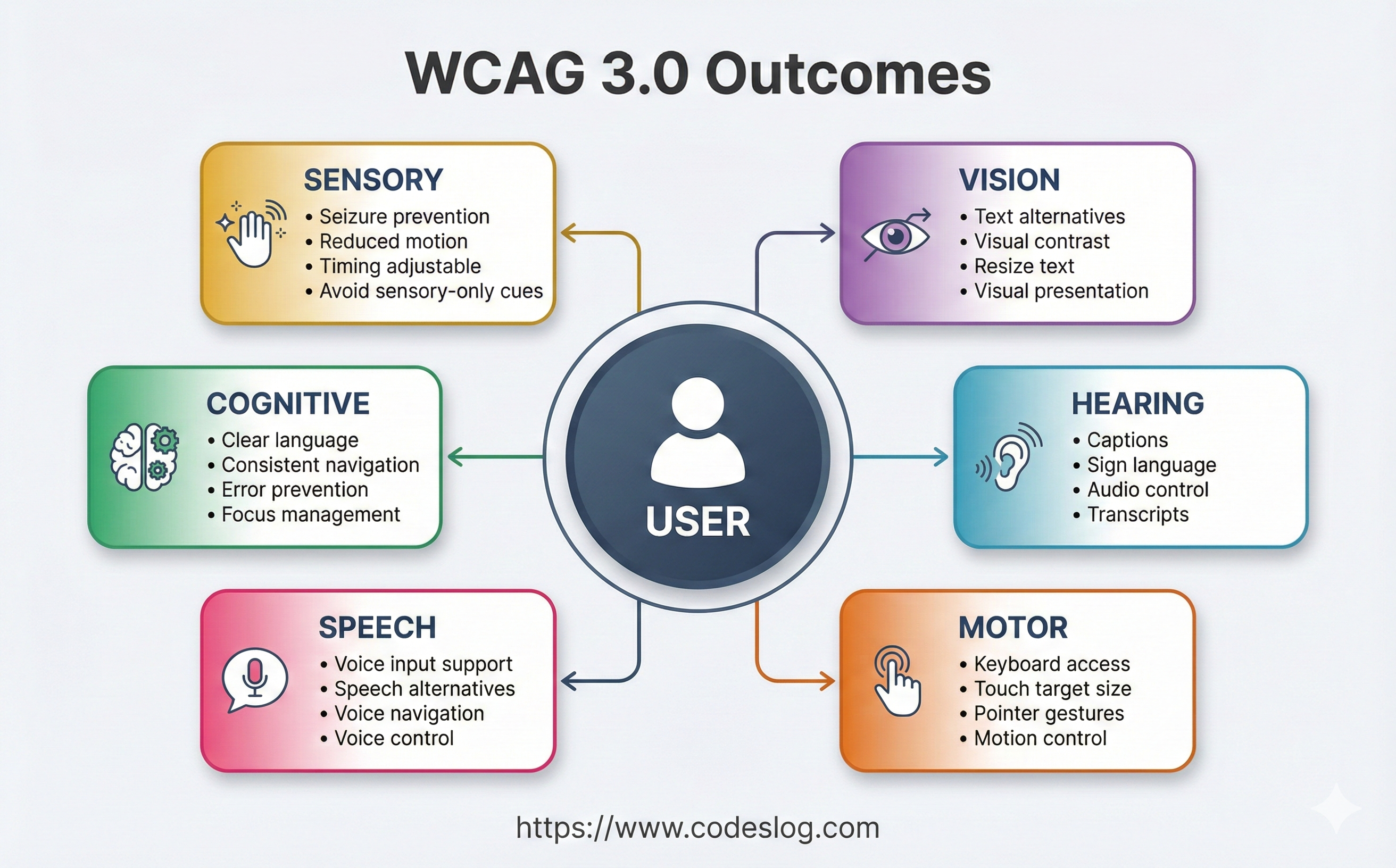
170+ Outcomes: Understanding the Overall Structure#
The WCAG 3.0 Working Draft (as of September 2025) defines 170+ Outcomes. You don’t need to memorize all of them, but it’s good to know how they’re organized.
Outcomes by Major Categories#
1. Text Alternatives
- Alternative text for images, icons, charts, etc.
- Captions and transcripts for audio/video content
- Examples: “Text alternatives for images”, “Captions for audio”
2. Input and Controls
- Keyboard accessibility
- Touch target size
- Focus management
- Examples: “Keyboard accessible”, “Target size sufficient”
3. Visual Presentation
- Color contrast
- Text resizing
- Layout adaptability
- Examples: “Contrast sufficient”, “Text resizable”
4. Understandability
- Clear language
- Consistent navigation
- Error prevention and recovery
- Examples: “Clear language”, “Consistent navigation”
5. Robustness
- Assistive technology compatibility
- Structural markup
- State and property information
- Examples: “Compatible with assistive technology”
Outcomes Naming Patterns#
You’ll notice patterns in Outcomes names:
Pattern 1: [Target] + [Action]
- “Text alternatives provided”
- “Captions included”
- “Labels visible”
Pattern 2: [Adjective] + [Target]
- “Sufficient contrast”
- “Clear headings”
- “Consistent navigation”
Pattern 3: [Capability] + [Possibility]
- “Keyboard accessible”
- “Pointer cancelable”
- “Content hideable”
Knowing these patterns helps you quickly understand new Outcomes.
Methods: Ways to Achieve Outcomes#
If Outcomes define “what” to achieve, Methods show “how” to achieve it.
Flexibility of Methods#
A major advantage of WCAG 3.0 is being able to choose from multiple methods.
For example, Methods to achieve the “Text alternatives for images” Outcome:
Method 1: Using HTML alt attribute
<img src="chart.png" alt="2024 Sales Status: Q1 12B, Q2 14.5B">Method 2: Using aria-label
<svg aria-label="Pie chart: Product A 40%, Product B 35%, Product C 25%">
  <!-- SVG content -->
</svg>
Method 3: Description via surrounding text
<figure>
  <img src="data-viz.png" alt="">
  <figcaption>
    The above graph shows user growth over the past 5 years.
    Starting with 100,000 in 2020, it has grown to 2.5 million as of 2024.
  </figcaption>
</figure>
Method 4: Long description link
<img src="complex-diagram.png" alt="System architecture diagram">
<a href="/diagram-description">View detailed description</a>
Whichever method you use, as long as you achieve the Outcome (“users can understand image content”).

Photo by Thomas Jarrand on Unsplash
Critical vs. Supplemental Methods#
Methods are classified into two types:
Critical Methods
- Core methods that must be implemented
- Cannot achieve Outcome without them
- Example: Using basic HTML elements for keyboard accessibility
Supplemental Methods
- Additional improvement methods
- Further enhance user experience
- Example: Additional ARIA attributes, advanced interactions
In practice, we recommend starting with Critical Methods and progressively adding Supplemental Methods.
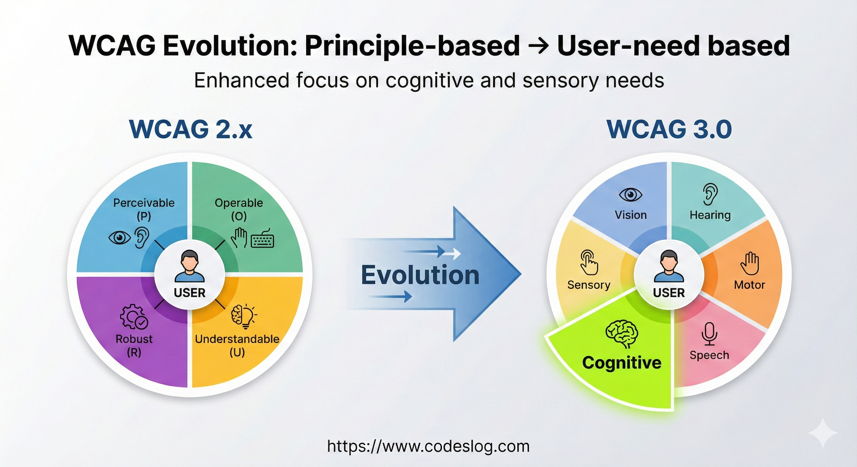
Functional Categories: New Classification System#
WCAG 3.0 introduces a new classification system to replace the POUR principles: Functional Categories.
5 Functional Categories#
1. Perceivable
- Similar to WCAG 2.x Perceivable
- Users must be able to perceive content
2. Operable
- Similar to WCAG 2.x Operable
- Users must be able to operate the interface
3. Understandable
- Similar to WCAG 2.x Understandable
- Users must be able to understand information and UI operation
4. Robust
- Similar to WCAG 2.x Robust but expanded
- Must work across various technologies and assistive technologies
5. Cognitive Support - New Addition!
- WCAG 3.0’s innovative addition
- Support for users with cognitive and learning disabilities
- Clear language, simple structure, error prevention, etc.
This new category demonstrates W3C’s strong commitment to cognitive accessibility, which was relatively neglected in WCAG 2.x.
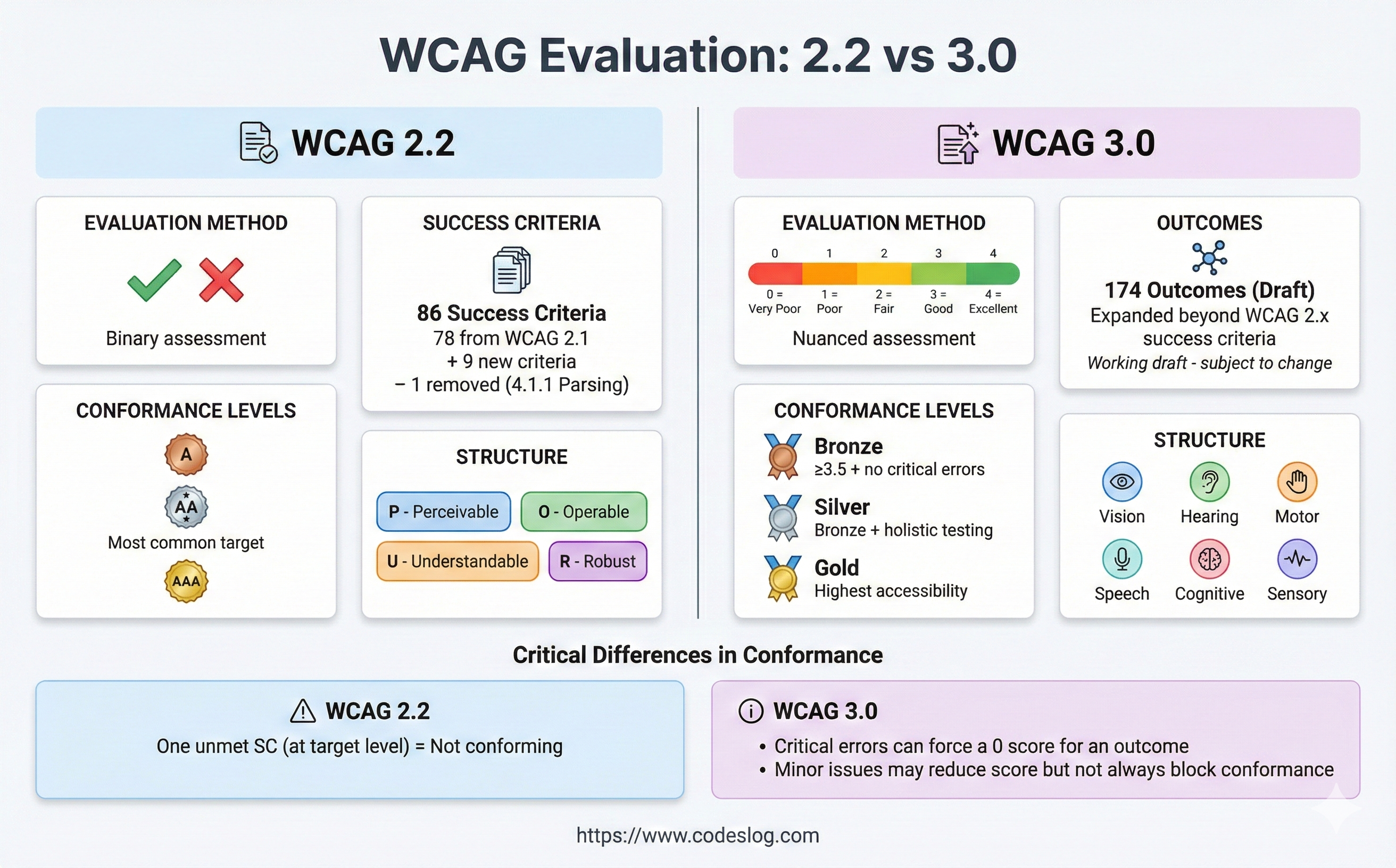
Tests: How to Actually Evaluate#
Now that we understand Outcomes and Methods, an important question remains: “How do we test?”
WCAG 3.0 provides two testing methods.
Atomic Tests: Automated Technical Testing#
Characteristics:
- Clear and objective
- Testable with automation tools
- Binary judgment (pass/fail)
Example: Image Alternative Text Atomic Test
// Automated test example
function testImageAlternatives() {
  const images = document.querySelectorAll('img');
  const results = [];

  images.forEach(img => {
    const test = {
      element: img,
      passed: false,
      reason: ''
    };

    // Atomic Test 1: alt attribute exists
    if (!img.hasAttribute('alt')) {
      test.reason = 'Missing alt attribute';
      results.push(test);
      return;
    }

    // Atomic Test 2: If not decorative, alt content exists
    if (img.getAttribute('alt') === '' && !isDecorative(img)) {
      test.reason = 'Alt attribute is empty (not decorative)';
      results.push(test);
      return;
    }

    test.passed = true;
    results.push(test);
  });

  return results;
}
Atomic Tests play a role similar to WCAG 2.x Success Criteria. They verify basic technical compliance.
Holistic Tests: User Experience-Centered Evaluation#
Characteristics:
- Considers actual usage context
- Requires human judgment
- Score-based evaluation (0-4 points)
Example: Login Form Holistic Test
## Holistic Test: Login Form Usability

### Test Scenario
A screen reader user completes login on a first-time visit to the site.

### Evaluation Criteria

**4 points (Excellent):**
- Form structure clearly communicated
- Easy to understand purpose and format of all fields
- Clear correction methods when errors occur
- All functions usable with keyboard only
- Input simplified with autocomplete

**3 points (Good):**
- Form is usable but somewhat inconvenient
- Field descriptions slightly ambiguous
- Error messages present but room for improvement

**2 points (Fair):**
- Basic login is possible
- Success after multiple attempts
- Difficult without assistance

**1 point (Poor):**
- Login possible but very difficult
- Requires external help

**0 points (Failed):**
- Login impossible
Holistic Tests are WCAG 3.0’s core innovation. They evaluate whether actual users can complete tasks.

Photo by Vitaly Gariev on Unsplash
Practical Application: Where to Start?#
“Great, I understand the structure… but how do I actually start?”
This is a natural question. WCAG 3.0 is still in Working Draft stage, and it will take years before it becomes an official recommendation (target: around end of 2025). However, there are things you can start preparing now.
Step 1: Shift Your Mindset#
The first thing to do is change your evaluation approach.
Old Questions:
- “Did this checkbox pass?”
- “Is there an alt attribute?”
- “Is color contrast 4.5:1 or higher?”
New Questions:
- “Can users understand this content?”
- “Can users complete this task?”
- “Is it actually convenient to use?”
Starting tomorrow, ask these questions during code reviews. You can start without separate tools or training.
Step 2: Rewrite Checklist Based on Outcomes#
Restructure your existing WCAG 2.2 checklist from an Outcomes perspective.
Before:
- [ ] 1.1.1 Non-text Content
- [ ] 1.3.1 Info and Relationships
- [ ] 1.4.3 Contrast (Minimum)
After:
- [ ] Users can understand the content of all images
- [ ] All users can recognize form structure and relationships
- [ ] Text is clearly distinguishable from background and readable
This may seem like a small change, but it’s the first step in changing your team’s perspective.
Step 3: Introduce User Testing#
The best way to apply Holistic Tests in practice is through actual user testing.
Good Ways to Start:
Invite colleagues with disabilities
- Utilize internal company or personal networks
- 30 minute to 1 hour test sessions
- Ask “Can you use this feature?”
Use assistive technology yourself
- Turn on Windows Narrator or macOS VoiceOver
- Work for an hour using only keyboard, no mouse
- Use at 150% screen magnification for a day
Simulate various situations
- View screen in bright sunlight
- Watch videos in a noisy café
- Imagine situations where only one hand is available

Photo by Joao paulo m ramos paulo on Unsplash
Step 4: Document Progressively#
Documentation is important when introducing new concepts to a team.
Recommended Documentation Structure:
# [Project Name] Accessibility Guide

## Our Outcomes
1. Users can perceive all content
2. Users can complete all tasks with keyboard only
3. Users can submit forms without errors
...

## Methods by Outcome
### Outcome 1: Content Perception
- Images: alt attribute or aria-label
- Videos: Provide captions
- Charts: Text summary or data table

### Outcome 2: Keyboard Access
- All buttons: Use <button> element
- Custom widgets: Implement tabindex and keyboard events
...

## Testing Methods
### Atomic Tests (Automated)
- npm run test:accessibility

### Holistic Tests (Manual)
- Conduct user testing quarterly
- Checklist: [link]
Next Steps: Understanding the Scoring System#
Now that we understand WCAG 3.0’s structure, the next question arises:
“A/AA/AAA changes to Bronze/Silver/Gold, but how exactly do we evaluate?”
This is the topic of the next article. In Series Episode 3, we’ll cover:
- Detailed explanation of the 0-4 point scoring system
- Bronze/Silver/Gold rating criteria
- Comparison with WCAG 2.2 AA
- How to calculate scores in practice
In Conclusion#
WCAG 3.0’s structure may seem complex at first, but the core is simple:
From Checklists to User Experience
- 3-tier structure of Guidelines → Outcomes → Methods
- 170+ Outcomes define user needs
- Choose from multiple Methods according to situation
- Comprehensive evaluation with Atomic + Holistic Tests
This structure is a tool for better accessibility. It lets us focus on whether users can actually use the website, without being confined to numbers and levels.
It will still take time for WCAG 3.0 to become an official recommendation. However, if you start applying this philosophy to your practice now, it will be much easier when that time comes.
In the next article, we’ll dive deep into the scoring and rating system. We’ll learn how to actually achieve Bronze/Silver/Gold, including specific calculation methods!
References#
- WCAG 3.0 Working Draft (September 2025)
- W3C Accessibility Guidelines (WCAG) 3.0 Explainer
- WCAG 3.0 Outcomes List
- Understanding WCAG 3 Methods
- WCAG 2 to WCAG 3 Transition Resources
Coming Next:
- Scoring and Ratings: From A/AA/AAA to Bronze/Silver/Gold (Next Episode)