Introduction#
We live in an age where generative AI like ChatGPT, Claude, and Gemini has become part of daily life. AI chatbots have established themselves on websites, and automated content generation has become commonplace. Amid this rapid technological advancement, we must ask an important question:
“Is the web created by AI usable by everyone?”
Web Accessibility means ensuring that everyone—people with disabilities, elderly users, those with slow network connections, and more—can use the web equally. In the AI era, or rather because it is the AI era, web accessibility has become even more critical.
This article examines how the advancement of AI technology affects web accessibility and the core principles that developers must know.
Why Web Accessibility Is More Important in the AI Era#
1. Increased Complexity of AI Interfaces#
As new interaction methods emerge—AI chatbots, voice interfaces, gesture-based UIs—the web has become increasingly complex.
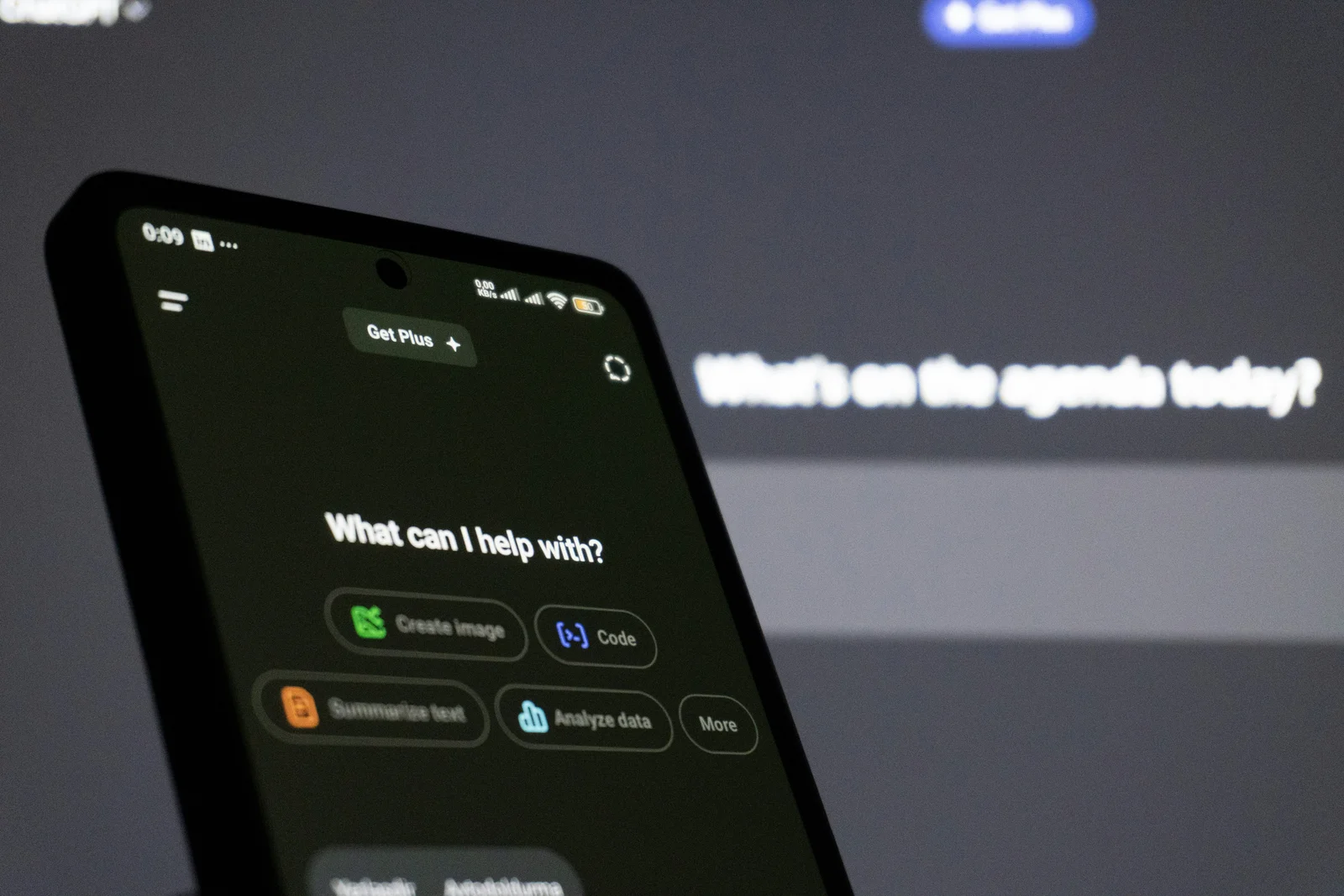
Image: Zulfugar Karimov / Unsplash
<!-- Bad example: AI chatbot button -->
<div class="chat-button" onclick="openChat()">
  <img src="chat-icon.png">
</div>

<!-- Good example: Accessible AI chatbot button -->
<button
  type="button"
  aria-label="Open AI chat assistant"
  aria-expanded="false"
  aria-controls="chat-widget"
  onclick="openChat()">
  <img src="chat-icon.png" alt="Chat icon">
</button>
Screen reader users cannot recognize buttons made with <div> as actual buttons. You must use semantic HTML together with ARIA attributes.
2. Quality Issues With AI-Generated Content#
HTML generated by AI may look visually perfect, but often has serious accessibility problems. AI tends to overlook:
- Missing alternative text (alt)
- Improper heading structure
- Keyboard focus order
- Insufficient color contrast
- Misuse of ARIA attributes
<!-- AI-generated code (problematic) -->
<div class="card">
  <img src="product.jpg">
  <div class="title">Product Name</div>
  <div class="price">$29.99</div>
  <div class="button" onclick="buy()">Buy Now</div>
</div>

<!-- Accessibility-conscious code -->
<article class="card">
  <img src="product.jpg" alt="Wireless earbuds in black">
  <h3>Wireless Earbuds</h3>
  <p><strong>Price:</strong> $29.99</p>
  <button type="button" onclick="buy()">Buy Now</button>
</article>
3. The Automation Paradox#
While AI automates web development, accessibility testing is difficult to automate.
Automated tools (Lighthouse, axe, etc.) find technical errors but miss problems like:
- Alt text that doesn’t match context
- Confusing navigation structures
- Unclear error messages
- Information conveyed only visually
Human judgment is ultimately necessary.
Core Principles of Web Accessibility: WCAG 2.2#
W3C’s WCAG (Web Content Accessibility Guidelines) 2.2 presents four core principles. Published in October 2023, WCAG 2.2 strengthens mobile accessibility and low-vision user standards beyond the previous version (2.1).
1. Perceivable#
All users must be able to perceive content.
Provide Alternative Text#
A screen reader never sees the image. It reads only the sentence sitting in the alt attribute, which is why something like “chart image” tells the listener essentially nothing. Put the information the image carries into words.
<!-- Bad example -->
<img src="chart.png">

<!-- Good example -->
<img
  src="chart.png"
  alt="Monthly sales trends for 2024: steadily rising from $100K in January to $300K in December">
Adequate Color Contrast#
Contrast ratio is a number describing the brightness gap between text and its background. Black on white sits at the top with 21:1, and the lower it goes the hazier the text reads. WCAG asks for at least 4.5:1 on body text.
/* Bad example: contrast ratio 2.5:1 (fails WCAG AA) */
.text {
  color: #999999;
  background: #ffffff;
}

/* Good example: contrast ratio 4.5:1 or higher (passes WCAG AA) */
.text {
  color: #595959;
  background: #ffffff;
}
You can check color contrast ratios with WebAIM Contrast Checker.
Provide Captions for Multimedia#
<video controls>
  <source src="tutorial.mp4" type="video/mp4">
  <track
    kind="captions"
    src="captions-ko.vtt"
    srclang="ko"
    label="Korean Captions">
  <track
    kind="captions"
    src="captions-en.vtt"
    srclang="en"
    label="English Captions">
</video>
2. Operable#
All functionality must be operable with keyboard alone, without a mouse.
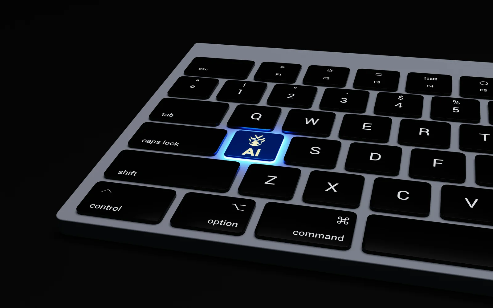
Image: BoliviaInteligente / Unsplash
Keyboard Focus Management#
Open a modal while focus stays behind on the page and a keyboard user ends up tabbing through elements they can’t even see. Move focus into the dialog when it opens, and keep it from leaking back out while it’s open.
// Opening an AI modal
function openModal() {
  const modal = document.getElementById('modal');
  const closeButton = modal.querySelector('.close-button');

  modal.style.display = 'block';
  modal.setAttribute('aria-hidden', 'false');

  // Move focus to the first focusable element when modal opens
  closeButton.focus();

  // Trap focus within modal (focus trap)
  trapFocus(modal);
}

// Focus trap function
function trapFocus(element) {
  const focusableElements = element.querySelectorAll(
    'button, [href], input, select, textarea, [tabindex]:not([tabindex="-1"])'
  );
  const firstElement = focusableElements[0];
  const lastElement = focusableElements[focusableElements.length - 1];

  element.addEventListener('keydown', function(e) {
    if (e.key !== 'Tab') return;

    if (e.shiftKey) {
      // Shift + Tab: backward
      if (document.activeElement === firstElement) {
        lastElement.focus();
        e.preventDefault();
      }
    } else {
      // Tab: forward
      if (document.activeElement === lastElement) {
        firstElement.focus();
        e.preventDefault();
      }
    }
  });
}
Skip Links#
With twenty links in the header, a keyboard user presses Tab twenty times on every page just to reach the content. A skip link jumps past all of it in one press. It hides off-screen until focus lands on it.
<!-- Place at the top of the page -->
<a href="#main-content" class="skip-link">
  Skip to main content
</a>

<style>
.skip-link {
  position: absolute;
  top: -40px;
  left: 0;
  background: #000;
  color: #fff;
  padding: 8px;
  text-decoration: none;
  z-index: 9999;
}

.skip-link:focus {
  top: 0; /* Appears on focus */
}
</style>
WCAG 2.2 New: Enhanced Focus Appearance (2.4.11, 2.4.13)#
WCAG 2.2 adds criteria specifying minimum size and clarity for focus indicators.
/* Meeting minimum focus indicator requirements */
button:focus,
a:focus,
input:focus {
  outline: 2px solid #0066cc;
  outline-offset: 2px;
  /* Minimum 2px thickness, 2px offset from element boundary */
}

/* Ensure 3:1 contrast ratio */
.dark-theme button:focus {
  outline-color: #4d94ff; /* Sufficient contrast even on dark backgrounds */
}
3. Understandable#
Content and interfaces must be clear and predictable.
Clear Error Messages#
“Invalid input” doesn’t tell anyone what to change or how. And if the message isn’t wired to the field in code, a screen reader can’t even say which field the complaint belongs to.
<!-- Bad example -->
<form>
  <input type="email" required>
  <span class="error">Invalid input</span>
</form>

<!-- Good example -->
<form>
  <label for="email">Email Address</label>
  <input
    type="email"
    id="email"
    aria-describedby="email-error"
    aria-invalid="true"
    required>
  <span id="email-error" class="error" role="alert">
    Please enter a valid email format. Example: [email protected]
  </span>
</form>
Consistent Navigation#
When the same links appear in the same order on every page, people build a mental map and stop hunting. That matters most for anyone navigating by keyboard or screen reader, where re-scanning a reshuffled menu is expensive.
<!-- Same order and structure across all pages -->
<nav aria-label="Main menu">
  <ul>
    <li><a href="/">Home</a></li>
    <li><a href="/about">About</a></li>
    <li><a href="/services">Services</a></li>
    <li><a href="/contact">Contact</a></li>
  </ul>
</nav>
WCAG 2.2 New: Consistent Help (3.2.6)#
Help or contact information should be provided in a consistent location across the website.
<!-- Place help in the same location on all pages -->
<nav aria-label="Main menu">
  <ul>
    <li><a href="/">Home</a></li>
    <li><a href="/about">About</a></li>
    <li><a href="/services">Services</a></li>
    <li><a href="/help">Help</a></li> <!-- Always in the same order -->
  </ul>
</nav>
4. Robust#
Content must be compatible with various assistive technologies.
Use Semantic HTML#
<!-- Bad example: div overuse -->
<div class="header">
  <div class="nav">...</div>
</div>
<div class="main">
  <div class="article">...</div>
</div>
<div class="footer">...</div>

<!-- Good example: semantic HTML -->
<header>
  <nav aria-label="Main menu">...</nav>
</header>
<main>
  <article>...</article>
</main>
<footer>...</footer>
Use ARIA Correctly#
ARIA is a set of attributes that tells assistive technology about roles and states HTML can’t express on its own. Its first rule, though, is “try not to use it.” Layering ARIA onto something semantic HTML already handles tends to make the announcement worse, not better.
<!-- ARIA usage principle: semantic HTML first -->

<!-- Bad example: unnecessary ARIA -->
<button role="button">Click</button>

<!-- Good example: semantic HTML is sufficient -->
<button>Click</button>

<!-- When ARIA is needed: custom widgets -->
<div
  role="tablist"
  aria-label="Account settings">
  <button
    role="tab"
    aria-selected="true"
    aria-controls="panel-1"
    id="tab-1">
    Profile
  </button>
  <button
    role="tab"
    aria-selected="false"
    aria-controls="panel-2"
    id="tab-2">
    Security
  </button>
</div>
Web Accessibility Checklist for the AI Era#
Check this list when developing with AI:

Image: Jakub Żerdzicki / Unsplash
HTML Structure#
- All images have meaningful
alttext - Headings (
<h1>~<h6>) are in logical order - Use semantic HTML (
<header>,<nav>,<main>,<article>,<footer>) - Form elements connected to
<label>(for/idor nested) - Link text is clear (avoid “click here”)
Keyboard Accessibility#
- All interactive elements are keyboard accessible
- Focus order is logical
- Focus indication is clear (minimum 2px, 3:1 contrast - WCAG 2.2)
- Focus trap implemented in modals/dropdowns
- Esc key closes functionality implemented
ARIA Usage#
-
role,aria-label,aria-labelledbyused appropriately -
aria-livefor dynamic content changes - Expand/collapse states with
aria-expanded - Error messages with
role="alert"
Visual Design#
- Color contrast meets WCAG AA standard (4.5:1 or higher)
- Information not conveyed by color alone
- Text size adjustable (minimum 200%)
- Focus indicator visually clear (WCAG 2.2 enhanced)
Multimedia#
- Videos have captions
- Audio content has transcripts
- No autoplay or control options provided
Mobile Accessibility (WCAG 2.2 Enhanced)#
- Touch target size minimum 24x24px (2.5.8)
- Alternative methods for drag operations (2.5.7)
Testing#
- Test entire site navigation with keyboard only
- Test with screen readers (NVDA, JAWS, VoiceOver)
- Run automated tools (Lighthouse, axe DevTools)
- Real user testing (if possible)
Improving Web Accessibility Using AI#
AI is a double-edged sword. Used incorrectly, it harms accessibility; used correctly, it can enhance it.
1. AI-Generated Alternative Text#
Writing alt text by hand for a site with hundreds of images is a slog. Handing the first draft to a model that can read images, then editing it yourself, is the realistic middle ground.
// Generate alt text using OpenAI Vision API
async function generateAltText(imageUrl) {
  const response = await openai.chat.completions.create({
    model: "gpt-4o",
    messages: [
      {
        role: "user",
        content: [
          {
            type: "text",
            text: "Describe this image in detail so visually impaired users can understand it. Keep it under 100 characters."
          },
          {
            type: "image_url",
            image_url: { url: imageUrl }
          }
        ]
      }
    ]
  });

  return response.choices[0].message.content;
}

// Usage example
const altText = await generateAltText("https://example.com/chart.png");
// Result: "Line chart showing 2024 sales trends. Starting at $100K in January, steadily increasing to $300K by December"
Caution: Alt text generated by AI must always be reviewed by humans. It may miss context or omit important information.
2. Accessible AI Chatbots#
What makes a chatbot tricky is that replies arrive later. Sighted users just watch the text fill in; a screen reader stays silent unless you explicitly tell it a new message has landed.
<!-- Accessible AI chatbot widget -->
<div
  id="chat-widget"
  role="region"
  aria-label="AI customer support chat"
  aria-live="polite">

  <div
    id="chat-messages"
    role="log"
    aria-live="polite"
    aria-atomic="false">
    <!-- Messages added here -->
  </div>

  <form onsubmit="sendMessage(event)">
    <label for="chat-input" class="visually-hidden">
      Enter message
    </label>
    <input
      type="text"
      id="chat-input"
      aria-describedby="chat-help"
      placeholder="Type your message">
    <span id="chat-help" class="visually-hidden">
      Chat with our AI bot. Press Enter to send.
    </span>
    <button type="submit">Send</button>
  </form>
</div>

<style>
/* Visually hidden but readable by screen readers */
.visually-hidden {
  position: absolute;
  width: 1px;
  height: 1px;
  padding: 0;
  margin: -1px;
  overflow: hidden;
  clip: rect(0, 0, 0, 0);
  white-space: nowrap;
  border-width: 0;
}
</style>
3. Voice Interface and Screen Reader Compatibility#
A notice like “Saved” usually flashes in a corner of the screen and disappears. To deliver it by sound as well, the text has to go into an aria-live region. The function below creates that region on demand and cleans it up afterward.
// Voice announcements using Web Speech API
function announceToScreenReader(message) {
  const announcement = document.createElement('div');
  announcement.setAttribute('role', 'status');
  announcement.setAttribute('aria-live', 'polite');
  announcement.classList.add('visually-hidden');
  announcement.textContent = message;

  document.body.appendChild(announcement);

  // Remove after 1 second (ensure screen reader has time to read)
  setTimeout(() => {
    document.body.removeChild(announcement);
  }, 1000);
}

// Usage example
announceToScreenReader('New message received.');
Legal Requirements and Business Value#
Legal Obligations#
In South Korea, the Act on the Prohibition of Discrimination Against Persons with Disabilities mandates web accessibility for:
- Public institution websites
- Corporations (based on revenue or business size)
- Special schools and welfare facilities for people with disabilities
Violations can result in fines and corrective orders.
Business Value#
Web accessibility is not merely a legal obligation. It provides business value:
- Broader user base: 15% of the global population (about 1 billion people) has a disability.
- Improved SEO: Semantic HTML and clear structure help with search engine optimization.
- Better mobile UX: Touch target sizes and clear labels enhance mobile usability.
- Easier maintenance: Well-structured code is easier to modify and extend.
- Brand image: Build an inclusive brand image.
Practical Example: Improving AI Search Interface#
Let’s improve the accessibility of an AI search feature with a real-world example.
Before: Code With Accessibility Issues#
<div class="search-container">
  <div class="search-icon">🔍</div>
  <div class="search-input" contenteditable="true">Enter search term</div>
  <div class="ai-suggestions">
    <div onclick="selectSuggestion('React')">React</div>
    <div onclick="selectSuggestion('Vue')">Vue</div>
    <div onclick="selectSuggestion('Angular')">Angular</div>
  </div>
</div>Problems:
- No semantic HTML
- Not keyboard operable
- Screen reader can’t detect state changes
- No ARIA attributes
After: Improved Accessibility Code#
<div class="search-container" role="search">
  <label for="search-input" class="visually-hidden">
    AI Search
  </label>

  <div class="search-wrapper">
    <span aria-hidden="true">🔍</span>
    <input
      type="text"
      id="search-input"
      role="combobox"
      aria-expanded="true"
      aria-autocomplete="list"
      aria-controls="suggestions-list"
      aria-activedescendant="suggestion-0"
      placeholder="Enter search term"
      onkeydown="handleKeyNavigation(event)"
      oninput="updateSuggestions()">
  </div>

  <ul
    id="suggestions-list"
    role="listbox"
    aria-label="AI search suggestions">
    <li
      id="suggestion-0"
      role="option"
      aria-selected="true"
      onclick="selectSuggestion('React')"
      onkeydown="handleSelection(event)">
      React
    </li>
    <li
      id="suggestion-1"
      role="option"
      aria-selected="false"
      onclick="selectSuggestion('Vue')">
      Vue
    </li>
    <li
      id="suggestion-2"
      role="option"
      aria-selected="false"
      onclick="selectSuggestion('Angular')">
      Angular
    </li>
  </ul>
</div>

<script>
function handleKeyNavigation(event) {
  const list = document.getElementById('suggestions-list');
  const options = list.querySelectorAll('[role="option"]');
  const currentIndex = Array.from(options).findIndex(
    opt => opt.getAttribute('aria-selected') === 'true'
  );

  let newIndex = currentIndex;

  switch(event.key) {
    case 'ArrowDown':
      newIndex = Math.min(currentIndex + 1, options.length - 1);
      event.preventDefault();
      break;
    case 'ArrowUp':
      newIndex = Math.max(currentIndex - 1, 0);
      event.preventDefault();
      break;
    case 'Enter':
      selectSuggestion(options[currentIndex].textContent);
      event.preventDefault();
      return;
    case 'Escape':
      document.getElementById('search-input').setAttribute('aria-expanded', 'false');
      list.style.display = 'none';
      return;
  }

  // Update selection state
  options.forEach((opt, idx) => {
    opt.setAttribute('aria-selected', idx === newIndex ? 'true' : 'false');
  });

  // Update aria-activedescendant
  document.getElementById('search-input').setAttribute(
    'aria-activedescendant',
    options[newIndex].id
  );

  // Screen reader announcement
  announceToScreenReader(options[newIndex].textContent);
}

function selectSuggestion(value) {
  document.getElementById('search-input').value = value;
  document.getElementById('search-input').setAttribute('aria-expanded', 'false');
  document.getElementById('suggestions-list').style.display = 'none';

  announceToScreenReader(`${value} selected`);
}
</script>Improvements:
- ✅ Uses semantic HTML (
<input>,<ul>,<li>) - ✅ Keyboard navigation (arrows, Enter, Esc)
- ✅ State conveyed via ARIA attributes
- ✅ Screen reader announcements (
aria-live) - ✅ Clear labels
Conclusion: Balancing Technology and Humanity#
AI technology is advancing at an astonishing pace, but the essence of the web has not changed. The web was created to provide information and services equally to everyone.

Image: Possessed Photography / Unsplash
Web accessibility is essential, not optional. Remember:
- Semantic HTML is fundamental: Don’t blindly trust AI-generated code—always prioritize semantic HTML.
- Keyboard accessibility: All functionality must work without a mouse.
- Clear feedback: Provide visual and auditory feedback for user actions.
- Testing is essential: Combine automated tools with real user testing.
- Continuous improvement: Web accessibility is not a one-time implementation.
In the AI era, or rather because it is the AI era, we must create a human-centered web. Never forget that the web we build can open up someone’s world.