ARIA를 배운 개발자들이 자주 하는 실수가 있습니다. ARIA의 개념은 이해했지만, 실제 프로젝트에서 어떻게 적용할지, 언제 써야 하는지 확실하지 않은 거죠.
커버 이미지(예시): ARIA 속성 적용 흐름을 상징하는 비주얼 · 제작: Nanobanana AI
“ARIA는 마지막 수단이다"라는 말이 있습니다. 먼저 시맨틱 HTML을 사용하고, HTML의 기본 기능으로 부족할 때만 ARIA를 더하는 거예요. 이 가이드는 이 원칙을 바탕으로 실제 프로젝트에서 ARIA를 효과적으로 활용하는 방법을 다룹니다.
1. ARIA의 황금률: 언제 써야 하고, 언제 쓰면 안 되는가?#
1.1 ARIA를 쓰지 말아야 할 때#
많은 개발자가 ARIA를 과다 사용합니다. 먼저 ARIA가 필요 없는 경우를 확인해보세요.
ARIA 사용 전후 비교(잘못된 예 vs 올바른 예) · 제작: Nanobanana AI
<!-- ❌ 나쁜 예: 불필요한 ARIA -->
<button role="button" aria-label="클릭">클릭</button>
<!-- <button>은 이미 button이므로 role 중복 -->

<!-- ❌ 나쁜 예: 시맨틱 HTML이 존재하는데 ARIA 사용 -->
<div role="heading" aria-level="1">제목</div>
<!-- <h1>제목</h1>을 쓰면 ARIA 불필요 -->

<!-- ❌ 나쁜 예: aria-label이 필요 없는 경우 -->
<button aria-label="저장">
  <i class="icon-save"></i> 저장
</button>
<!-- 시각적 텍스트가 이미 있으면 aria-label 불필요 -->

<!-- ✅ 좋은 예: 아무 ARIA 없음 (시맨틱만으로 충분) -->
<button>저장</button>
<h1>제목</h1>
<form>
  <label for="email">이메일</label>
  <input id="email" type="email">
</form>
ARIA 없이 충분한 엘리먼트들:
- 버튼:
<button> - 링크:
<a> - 폼:
<form>,<input>,<textarea>,<select> - 제목:
<h1>~<h6> - 탐색:
<nav> - 메인:
<main> - 아티클:
<article> - 섹션:
<section>
1.2 ARIA를 써야 할 때#
ARIA는 다음과 같은 경우에 필요합니다:
- 시맨틱 HTML이 없을 때: 커스텀 위젯이나 특수한 상황이에요
- 추가 정보 제공: HTML의 기본 정보만으로는 부족할 때
- 상태 변화 알림: 동적으로 변하는 콘텐츠를 스크린 리더에 알릴 때
<!-- ✅ 필요한 경우 1: 커스텀 위젯 -->
<div class="custom-tabs">
<div role="tablist">
<button role="tab" aria-selected="true" aria-controls="panel-1" tabindex="0">
탭 1
</button>
<button role="tab" aria-selected="false" aria-controls="panel-2" tabindex="-1">
탭 2
</button>
</div>
<div id="panel-1" role="tabpanel">내용 1</div>
<div id="panel-2" role="tabpanel" hidden>내용 2</div>
</div>
<!-- ✅ 필요한 경우 2: 추가 정보 제공 -->
<button aria-label="차트 열기">📊</button>
<!-- 아이콘만 있는 경우 aria-label이 필수 -->
<!-- ✅ 필요한 경우 3: 상태 변화 알림 -->
<span aria-live="polite" aria-atomic="true" id="notifications"></span>
<script>
// 사용자 액션 후 동적으로 메시지 추가
document.getElementById('notifications').textContent = '저장되었습니다.';
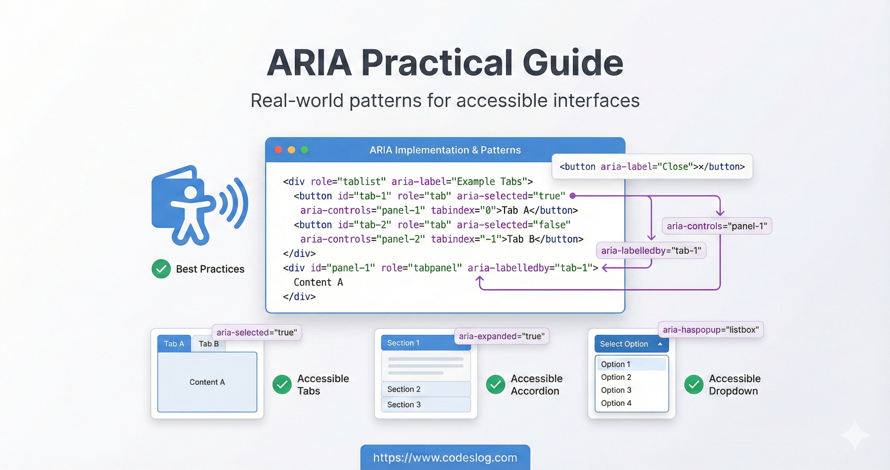
</script>2. ARIA 속성 실전 패턴#
ARIA role 유형을 계층적으로 정리한 다이어그램 · 제작: Nanobanana AI
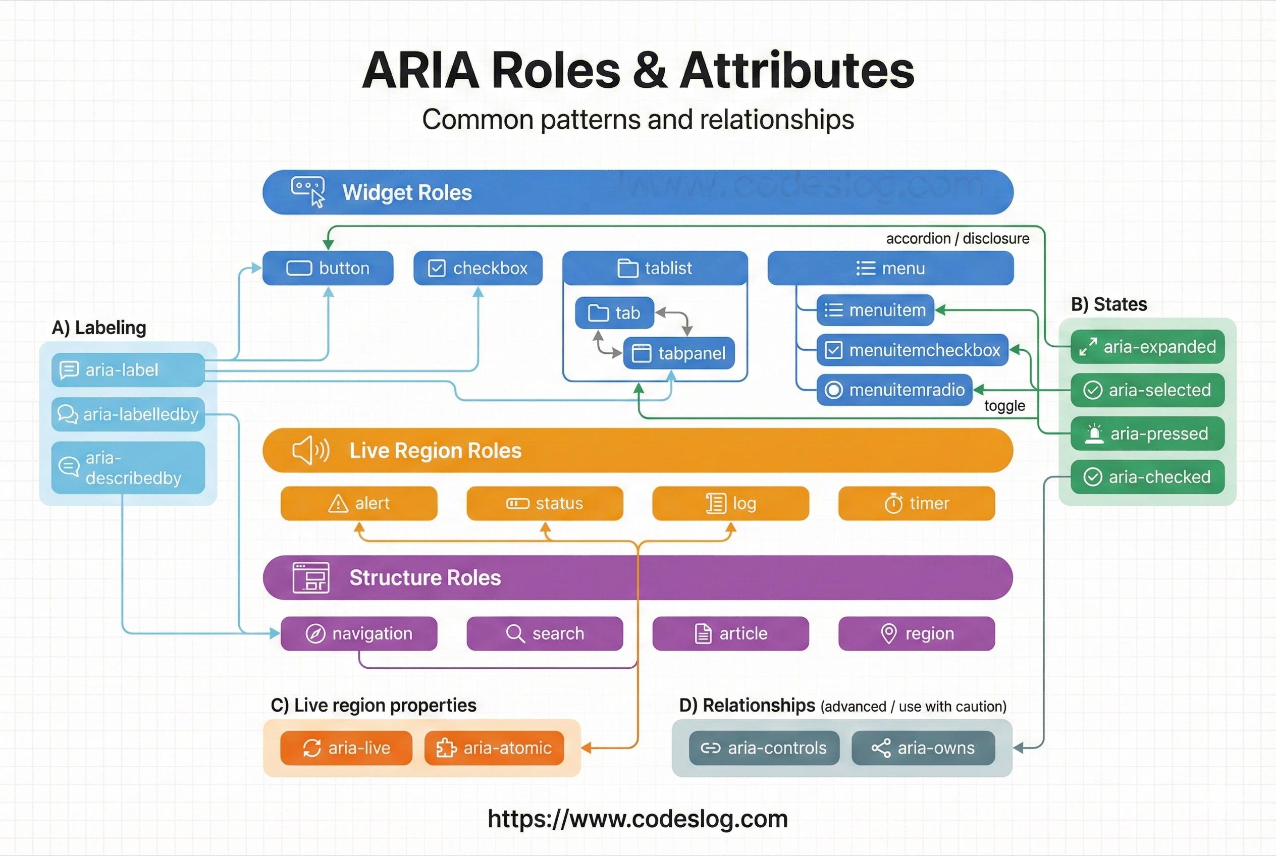
2.1 라벨링: aria-label vs aria-labelledby#
이 두 속성은 **“이 요소가 무엇인지”**를 스크린 리더에 알려줍니다.
aria-label은 짧은 텍스트를 직접 지정할 때 유용합니다(아이콘 버튼 등).aria-labelledby는 화면에 이미 있는 텍스트를 참조해 라벨을 연결할 때 적합합니다. 시각적 라벨과 읽히는 라벨을 일치시키는 것이 핵심입니다.
<!-- 1. aria-label: 간단한 라벨 제공 -->
<button aria-label="닫기">×</button>

<!-- 2. aria-labelledby: 페이지의 다른 엘리먼트를 라벨로 참고 -->
<h2 id="dialog-title">사용자 설정</h2>
<div role="dialog" aria-labelledby="dialog-title">
  <!-- 다이얼로그 내용 -->
</div>

<!-- 3. 라벨 결합: 여러 엘리먼트를 조합 -->
<span id="search-label">상품 검색</span>
<span id="search-hint">(상품명, 카테고리)</span>
<input
  aria-labelledby="search-label search-hint"
  placeholder="검색어 입력"
>

<!-- 4. 숨겨진 라벨 -->
<!-- 스크린 리더만 읽는 라벨 클래스 -->
<style>
  .sr-only {
    position: absolute;
    width: 1px;
    height: 1px;
    padding: 0;
    margin: -1px;
    overflow: hidden;
    clip: rect(0, 0, 0, 0);
    border: 0;
  }
</style>

<button>
  <span class="sr-only">이전 페이지로</span>
  ←
</button>
2.2 설명 및 힌트: aria-describedby#
aria-describedby는 라벨과 달리 **“추가 설명”**을 연결합니다. 입력 힌트, 오류 메시지, 부가 정보를 스크린 리더가 라벨 다음에 읽도록 만들 때 사용합니다. 라벨과 설명을 구분해 전달하면 정보 구조가 명확해집니다.
<!-- 입력 필드에 추가 설명 -->
<label for="password">비밀번호</label>
<input
  id="password"
  type="password"
  aria-describedby="pwd-requirements pwd-strength"
>
<div id="pwd-requirements" class="hint">
  최소 8자, 대문자, 숫자, 특수문자(@, #, $) 포함
</div>
<div id="pwd-strength" aria-live="polite">
  강도: 약함
</div>

<!-- 복잡한 이미지에 설명 -->
<img
  src="chart.png"
  alt="월별 판매량"
  aria-describedby="chart-desc"
>
<p id="chart-desc">
  2024년 1월부터 12월까지의 판매량.
  최고점은 7월의 15,000개, 최저점은 2월의 5,000개
</p>

<!-- 폼 필드의 에러 메시지 -->
<label for="email">이메일</label>
<input id="email" type="email" aria-describedby="email-error">
<span id="email-error" role="alert">
  올바른 이메일 형식이 아닙니다.
</span>
2.3 상태 전달: aria-checked, aria-pressed, aria-current#
이 속성들은 UI의 현재 상태를 보조기술에 전달합니다. 핵심은 “시각적으로 보이는 변화(체크됨, 눌림, 현재 위치 등)를 스크린 리더도 동일하게 인지”하도록 만드는 것입니다. 네이티브 요소는 상태가 자동으로 노출되므로, 보통은 커스텀 위젯에서만 직접 관리합니다.
<!-- 1. 체크박스/라디오 상태 -->
<label>
  <input type="checkbox">
  약관에 동의합니다
</label>

<!-- 네이티브 체크박스/라디오는 상태를 자동 노출하므로 aria-checked를 수동 설정하지 않습니다. 커스텀 위젯일 때만 aria-checked를 관리하세요. -->

<!-- 2. 토글 버튼 상태 -->
<button
  aria-pressed="false"
  aria-label="음소거"
  id="mute-btn"
>
  🔊
</button>

<script>
  const muteBtn = document.getElementById('mute-btn');
  muteBtn.addEventListener('click', function() {
    const isPressed = this.getAttribute('aria-pressed') === 'true';
    this.setAttribute('aria-pressed', !isPressed);
    // 음소거 토글 로직
  });
</script>

<!-- 3. 현재 페이지 표시 (네비게이션) -->
<nav>
  <a href="/products">상품</a>
  <a href="/blog" aria-current="page">블로그</a> <!-- 현재 페이지 -->
  <a href="/about">소개</a>
</nav>

<!-- 4. 트리 구조의 열기/닫기 상태 -->
<button aria-expanded="false" aria-controls="submenu">
  카테고리
</button>
<ul id="submenu" hidden>
  <li><a href="#">서브메뉴 1</a></li>
  <li><a href="#">서브메뉴 2</a></li>
</ul>

<script>
  document.querySelector('button').addEventListener('click', function() {
    const isExpanded = this.getAttribute('aria-expanded') === 'true';
    this.setAttribute('aria-expanded', !isExpanded);
    document.getElementById('submenu').hidden = isExpanded;
  });
</script>
정리하면
aria-checked: 선택/체크 상태를 표현합니다. 체크박스, 스위치, 라디오의 커스텀 구현에 사용합니다.aria-pressed: 토글 버튼의 켜짐/꺼짐 상태를 표현합니다.aria-current: “현재 위치”를 알려줍니다. 보통 네비게이션에서 현재 페이지를 표시할 때 사용합니다.aria-expanded: 열림/닫힘 상태를 알립니다. 아코디언, 드롭다운, 트리 등의 확장 상태를 표현합니다.
3. 라이브 리전: 동적 콘텐츠 알림#
라이브 리전은 페이지를 새로고침하지 않고 콘텐츠가 변할 때 스크린 리더 사용자에게 알려줍니다.
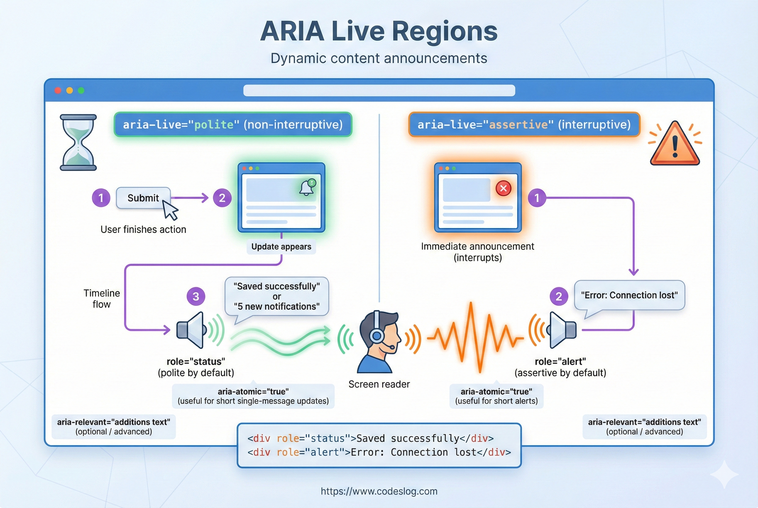
라이브 리전 알림 흐름 요약 · 제작: Nanobanana AI
3.1 aria-live 속성#
aria-live는 화면이 바뀔 때 자동으로 읽어줄 영역을 지정합니다. 페이지 전환 없이 텍스트가 바뀌는 상황(저장 완료, 에러, 검색 결과 업데이트 등)에서 스크린 리더 사용자도 변화를 즉시 인지할 수 있도록 해줍니다. 핵심은 필요한 곳에만, 최소한으로 사용하는 것입니다.
<!-- 1. aria-live="polite" (기본) -->
<!-- 사용자가 현재 작업을 완료한 후 변경사항 알림 -->
<div id="notifications" aria-live="polite">
  <!-- 메시지가 여기에 추가됨 -->
</div>

<!-- 2. aria-live="assertive" -->
<!-- 즉시 변경사항 알림 (남용하면 방해됨, 긴급 상황에만) -->
<div id="error-alert" aria-live="assertive">
  <!-- 즉각적인 에러 메시지 -->
</div>

<!-- 3. aria-atomic="true" -->
<!-- 변경된 부분만이 아니라 전체 콘텐츠를 읽음 -->
<div aria-live="polite" aria-atomic="true" id="search-results">
  <p>검색 결과: 23개</p>
  <ul>
    <li>상품 1</li>
    <li>상품 2</li>
  </ul>
</div>

<!-- 4. aria-relevant="additions text" -->
<!-- 어떤 변경사항을 알릴지 지정 -->
<div aria-live="polite" aria-relevant="additions text">
  <!-- 추가된 항목과 텍스트 변경만 알림 -->
</div>
주의할 점: aria-live="assertive"는 긴급 알림(에러, 보안 경고)에서만 사용하고, 대부분의 상태 메시지는 polite로 두세요. 너무 자주 알림을 보내면 사용자를 방해할 수 있거든요.
3.2 실제 사용 예제: 실시간 검색#
실시간 검색처럼 입력할 때마다 결과가 바뀌는 UI는 시각적으로는 직관적이지만, 스크린 리더 사용자에게는 변화가 전달되지 않습니다. role="status"나 aria-live를 통해 결과 업데이트를 알려주면 동등한 피드백을 제공할 수 있습니다.
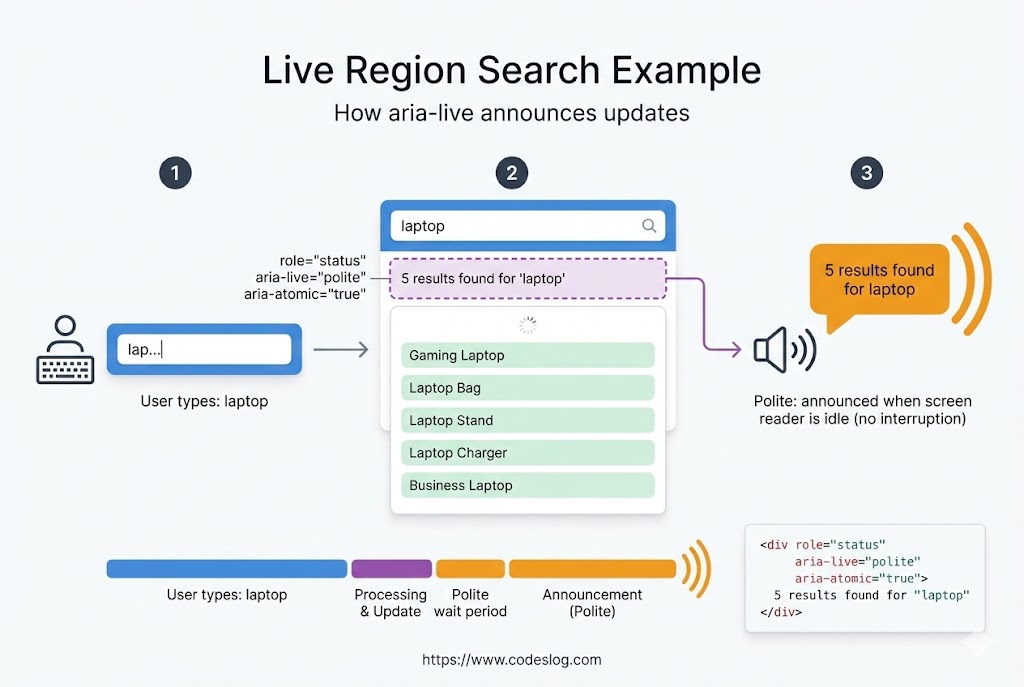
실시간 검색 결과 알림 예시 · 제작: Nanobanana AI
<div class="search-container">
  <input
    id="search-input"
    type="text"
    placeholder="검색..."
    aria-describedby="search-help"
  >
  <span id="search-help" class="sr-only">
    입력하면 실시간으로 검색 결과가 표시됩니다.
  </span>
</div>

<!-- 검색 결과 라이브 리전 -->
<div id="search-results" role="status">
  <!-- 결과가 여기에 표시됨 -->
</div>

<script>
  const input = document.getElementById('search-input');
  const resultsDiv = document.getElementById('search-results');

  input.addEventListener('input', function(e) {
    const query = e.target.value.trim();

    if (!query) {
      resultsDiv.innerHTML = '';
      return;
    }

    // API 호출 (예시)
    fetch(`/api/search?q=${query}`)
      .then(res => res.json())
      .then(data => {
        // 결과 업데이트 - aria-live가 변경을 감지
        resultsDiv.innerHTML = `
          <p>
            ${data.count}개 결과를 찾았습니다.
          </p>
          <ul>
            ${data.items.map(item => `<li>${item.name}</li>`).join('')}
          </ul>
        `;
      });
  });
</script>
4. 커스텀 위젯 구현#
시맨틱 HTML만으로는 해결할 수 없는 복잡한 인터페이스를 만들 때 ARIA를 사용합니다.
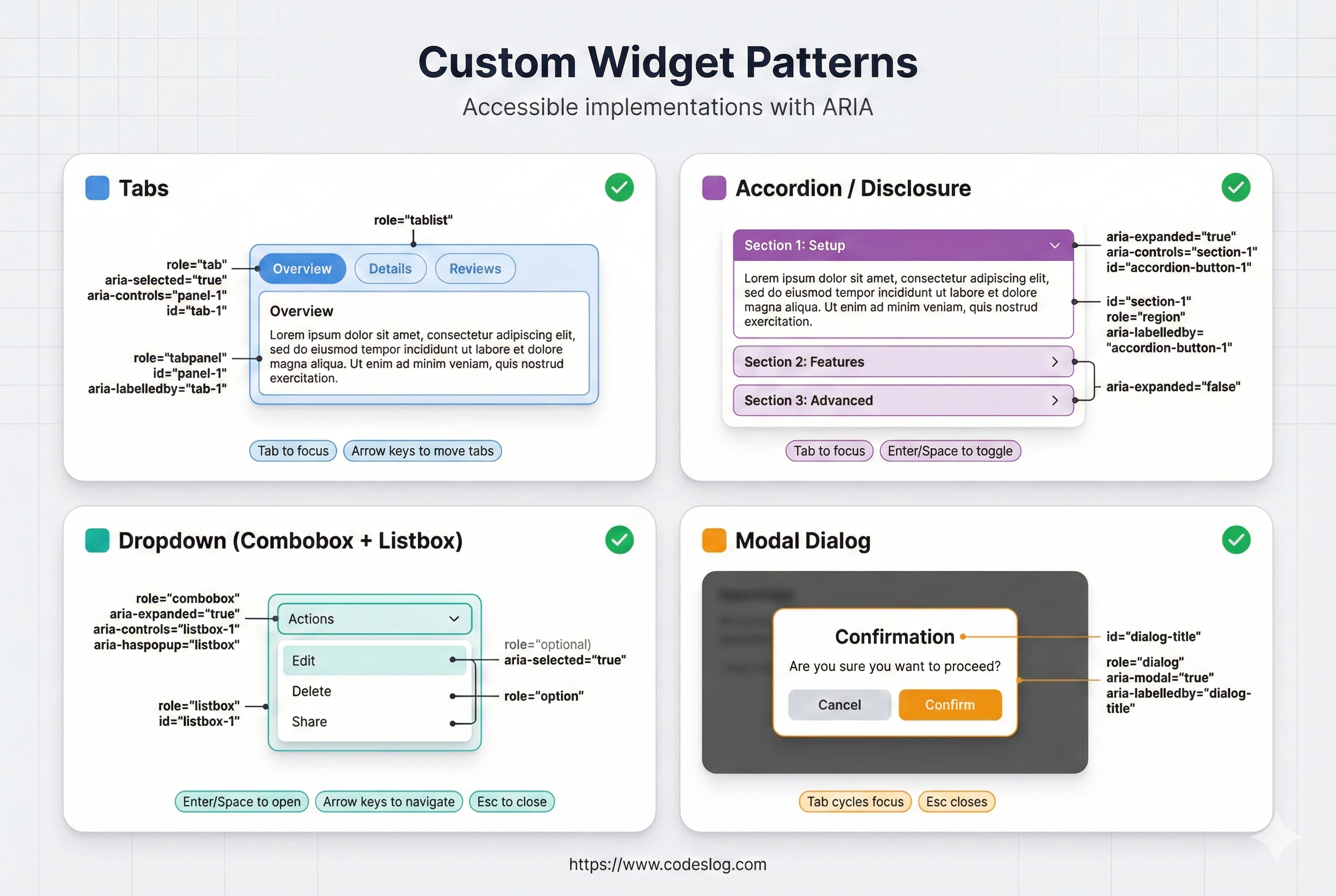
대표 위젯 패턴 요약(탭/아코디언/드롭다운/모달) · 제작: Nanobanana AI
4.1 탭 위젯#
탭은 대표적인 커스텀 위젯입니다. role="tablist", role="tab", role="tabpanel" 조합으로 구조를 만들고, 키보드 이동 규칙(좌/우 화살표, Home/End)을 구현해야 접근성이 완성됩니다.
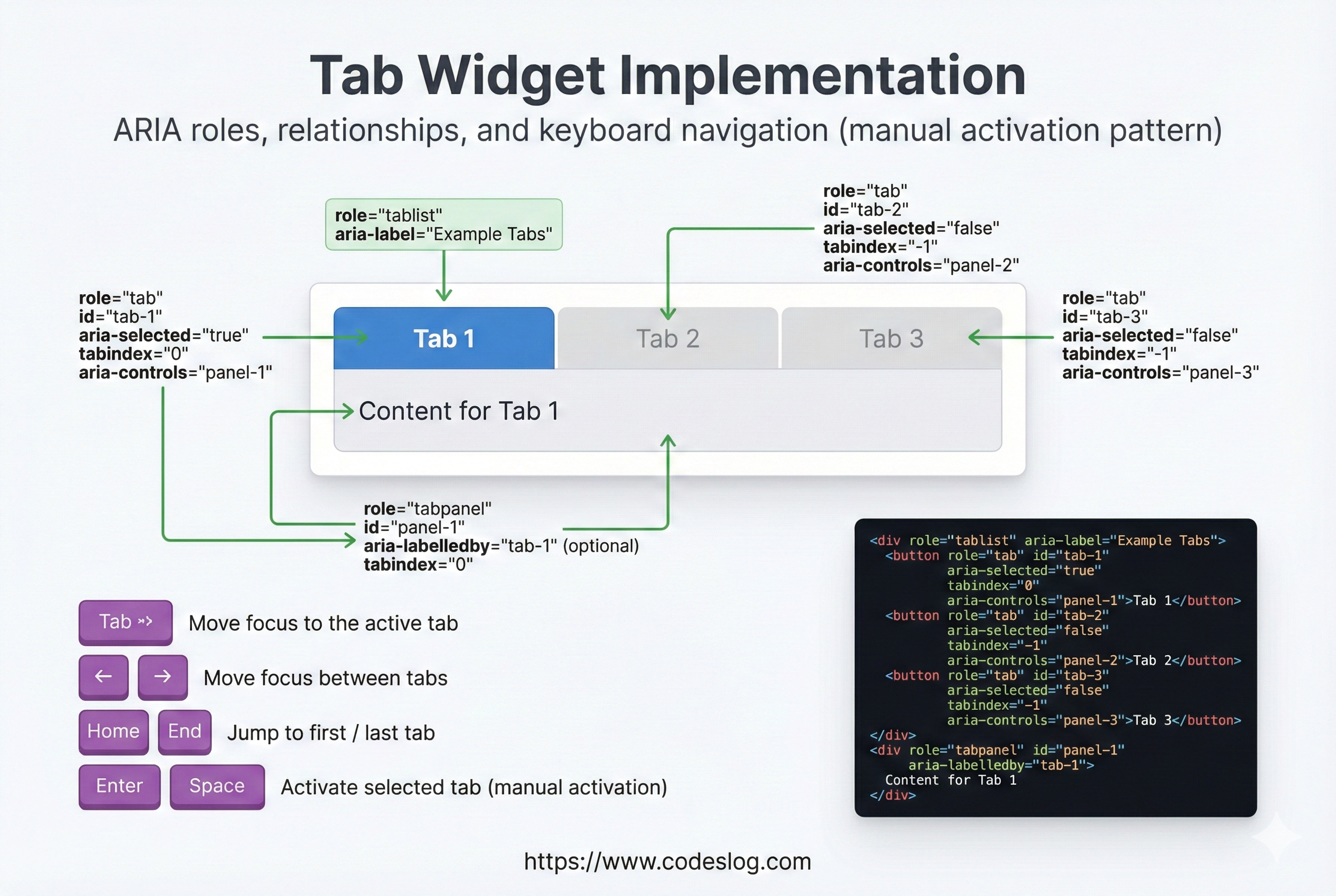
탭 위젯의 role/aria 연결과 키보드 흐름 · 제작: Nanobanana AI
<div class="tabs">
  <div role="tablist">
    <button
      role="tab"
      aria-selected="true"
      aria-controls="panel-1"
      tabindex="0"
      id="tab-1"
    >
      기본 정보
    </button>
    <button
      role="tab"
      aria-selected="false"
      aria-controls="panel-2"
      tabindex="-1"
      id="tab-2"
    >
      상세 정보
    </button>
  </div>

  <div id="panel-1" role="tabpanel" aria-labelledby="tab-1">
    기본 정보 내용
  </div>
  <div id="panel-2" role="tabpanel" aria-labelledby="tab-2" hidden>
    상세 정보 내용
  </div>
</div>

<style>
  [role="tab"][aria-selected="false"] {
    opacity: 0.6;
  }
</style>

<script>
  const tabs = document.querySelectorAll('[role="tab"]');
  const panels = document.querySelectorAll('[role="tabpanel"]');

  tabs.forEach(tab => {
    tab.addEventListener('click', function() {
      // 모든 탭 비활성화
      tabs.forEach(t => {
        t.setAttribute('aria-selected', 'false');
        t.setAttribute('tabindex', '-1');
      });
      panels.forEach(p => p.hidden = true);

      // 클릭된 탭 활성화
      this.setAttribute('aria-selected', 'true');
      this.setAttribute('tabindex', '0');
      const panelId = this.getAttribute('aria-controls');
      document.getElementById(panelId).hidden = false;
    });

    // 키보드 네비게이션
    tab.addEventListener('keydown', function(e) {
      let nextTab;
      if (e.key === 'ArrowRight' || e.key === 'ArrowDown') {
        nextTab = this.nextElementSibling || tabs[0];
      } else if (e.key === 'ArrowLeft' || e.key === 'ArrowUp') {
        nextTab = this.previousElementSibling || tabs[tabs.length - 1];
      } else if (e.key === 'Home') {
        nextTab = tabs[0];
      } else if (e.key === 'End') {
        nextTab = tabs[tabs.length - 1];
      }

      if (nextTab) {
        e.preventDefault();
        nextTab.click();
        nextTab.setAttribute('tabindex', '0');
        this.setAttribute('tabindex', '-1');
        nextTab.focus();
      }
    });
  });
</script>
4.2 아코디언 위젯#
아코디언은 펼침/닫힘 상태가 핵심입니다. aria-expanded로 상태를 노출하고, 각 패널을 role="region"과 aria-labelledby로 연결하면 스크린 리더에서 구조가 명확해집니다.
<div class="accordion">
  <div class="accordion-item">
    <button
      aria-expanded="false"
      aria-controls="section-1"
      id="accordion-1"
      class="accordion-btn"
    >
      자주 묻는 질문 1
    </button>
    <div
      id="section-1"
      role="region"
      aria-labelledby="accordion-1"
      hidden
      class="accordion-content"
    >
      <p>답변 내용 1</p>
    </div>
  </div>

  <div class="accordion-item">
    <button
      aria-expanded="false"
      aria-controls="section-2"
      id="accordion-2"
      class="accordion-btn"
    >
      자주 묻는 질문 2
    </button>
    <div
      id="section-2"
      role="region"
      aria-labelledby="accordion-2"
      hidden
      class="accordion-content"
    >
      <p>답변 내용 2</p>
    </div>
  </div>
</div>

<style>
  .accordion-content {
    max-height: 0;
    overflow: hidden;
    transition: max-height 0.3s ease;
  }

  .accordion-content:not([hidden]) {
    max-height: 500px;
  }

  button[aria-expanded="true"]::after {
    content: '▼';
  }

  button[aria-expanded="false"]::after {
    content: '▶';
  }
</style>

<script>
  document.querySelectorAll('.accordion-btn').forEach(btn => {
    btn.addEventListener('click', function() {
      const isExpanded = this.getAttribute('aria-expanded') === 'true';
      this.setAttribute('aria-expanded', !isExpanded);
      document.getElementById(this.getAttribute('aria-controls')).hidden = isExpanded;
    });
  });
</script>
4.3 드롭다운 메뉴#
드롭다운은 토글 버튼 + 목록 구조입니다. 일반적인 내비게이션이라면 단순한 button + ul 패턴이 가장 안전합니다. 필요할 때만 복잡한 menu 역할을 사용하세요.
<div class="dropdown">
  <button
    id="menu-btn"
    aria-expanded="false"
    aria-controls="menu-list"
  >
    메뉴
  </button>

  <ul id="menu-list" hidden aria-labelledby="menu-btn">
    <li><a href="#">옵션 1</a></li>
    <li><a href="#">옵션 2</a></li>
    <li><a href="#">옵션 3</a></li>
  </ul>
</div>

<script>
  const btn = document.getElementById('menu-btn');
  const menu = document.getElementById('menu-list');
  const items = menu.querySelectorAll('a');

  btn.addEventListener('click', () => {
    const isExpanded = btn.getAttribute('aria-expanded') === 'true';
    btn.setAttribute('aria-expanded', !isExpanded);
    menu.hidden = isExpanded;

    if (!isExpanded) {
      items[0].focus();
    }
  });

  // Escape 키로 메뉴 닫기
  menu.addEventListener('keydown', (e) => {
    if (e.key === 'Escape') {
      btn.click();
      btn.focus();
    }
  });

  // 외부 클릭으로 메뉴 닫기
  document.addEventListener('click', (e) => {
    if (!e.target.closest('.dropdown')) {
      menu.hidden = true;
      btn.setAttribute('aria-expanded', 'false');
    }
  });
</script>
5. 모달/다이얼로그 패턴#
모달은 포커스 관리가 가장 중요합니다. 열릴 때 포커스를 모달 안으로 이동하고, 닫힐 때 원래 위치로 복귀해야 합니다. aria-modal="true"로 보조기술에 “이 영역이 현재 상호작용 대상”임을 알립니다.
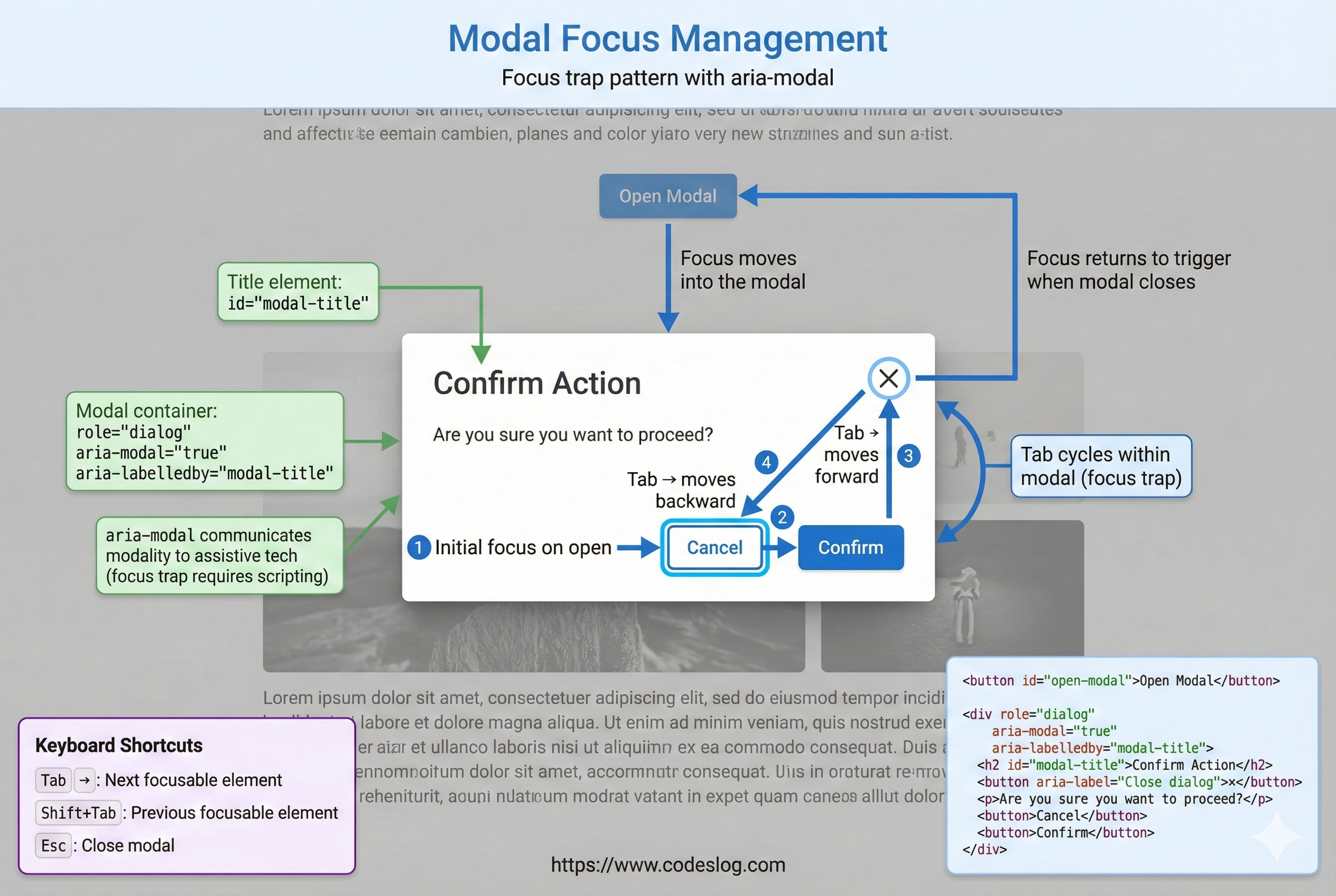
모달 포커스 관리 흐름(열기/닫기/복귀) · 제작: Nanobanana AI
<button id="open-modal">모달 열기</button>

<div
  id="modal"
  role="dialog"
  aria-labelledby="modal-title"
  aria-modal="true"
  hidden
>
  <div class="modal-content">
    <h2 id="modal-title">중요한 정보</h2>

    <p>여기는 모달의 내용입니다.</p>

    <button id="close-modal">닫기</button>
  </div>
</div>

<style>
  #modal:not([hidden]) {
    display: flex;
    position: fixed;
    top: 0;
    left: 0;
    width: 100%;
    height: 100%;
    background: rgba(0, 0, 0, 0.5);
  }

  .modal-content {
    margin: auto;
    background: white;
    padding: 2rem;
    border-radius: 8px;
  }
</style>

<script>
  const modal = document.getElementById('modal');
  const openBtn = document.getElementById('open-modal');
  const closeBtn = document.getElementById('close-modal');
  let previousFocus = null;

  openBtn.addEventListener('click', () => {
    previousFocus = document.activeElement;
    modal.hidden = false;
    // 모달 밖 요소만 inert 처리해 포커스가 밖으로 나가지 않게 함
    const siblings = Array.from(document.body.children).filter(el => el !== modal);
    siblings.forEach(el => (el.inert = true));

    // 포커스를 모달로 이동
    const focusableElements = modal.querySelectorAll(
      'button, [href], input, select, textarea, [tabindex]:not([tabindex="-1"])'
    );
    focusableElements[0]?.focus();

    // 모달 내에서만 포커스 이동 가능 (포커스 트래핑)
    focusableElements[focusableElements.length - 1].addEventListener('keydown', (e) => {
      if (e.key === 'Tab' && !e.shiftKey) {
        e.preventDefault();
        focusableElements[0].focus();
      }
    });

    focusableElements[0].addEventListener('keydown', (e) => {
      if (e.key === 'Tab' && e.shiftKey) {
        e.preventDefault();
        focusableElements[focusableElements.length - 1].focus();
      }
    });
  });

  closeBtn.addEventListener('click', () => {
    modal.hidden = true;
    const siblings = Array.from(document.body.children).filter(el => el !== modal);
    siblings.forEach(el => (el.inert = false));
    previousFocus?.focus();
  });

  // Escape 키로 닫기
  document.addEventListener('keydown', (e) => {
    if (e.key === 'Escape' && !modal.hidden) {
      closeBtn.click();
    }
  });
</script>
6. ARIA와 접근성 검증#
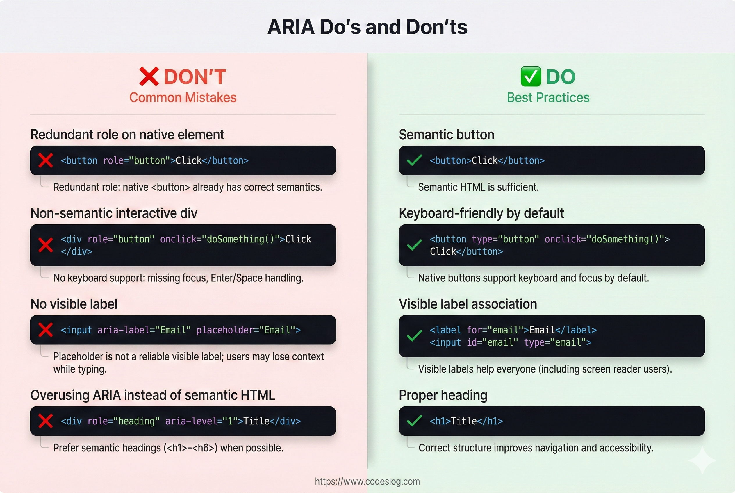
6.1 흔한 ARIA 실수#
ARIA는 강력하지만, 잘못 쓰면 접근성을 오히려 악화시킵니다. 아래 실수들은 현장에서 가장 자주 발생하는 패턴들이니, 코드 리뷰나 QA에서 꼭 확인하세요.
<!-- ❌ 실수 1: 역할 오용 -->
<div role="button" onclick="alert('클릭')">클릭하세요</div>
<!-- 문제: 키보드 포커스 없음, 키보드 네비게이션 불가 -->

<!-- ✅ 올바른 방법 -->
<button onclick="alert('클릭')">클릭하세요</button>

<!-- ❌ 실수 2: 시각적 라벨 없이 aria-label만 사용 -->
<input aria-label="검색" placeholder="검색어 입력">
<!-- 문제: 화면에는 라벨이 없고, 보조기술에만 라벨이 전달됨 -->

<!-- ✅ 올바른 방법 -->
<label for="search">검색</label>
<input id="search" placeholder="검색어 입력">

<!-- ❌ 실수 3: 부정확한 라이브 리전 -->
<div aria-live="assertive" id="log">
  로그 메시지들...
</div>
<!-- 문제: 모든 메시지를 읽음, 성능 저하 -->

<!-- ✅ 올바른 방법 -->
<div aria-live="polite" aria-atomic="false" id="notification">
  <!-- 최신 메시지만 추가 -->
</div>

<!-- ❌ 실수 4: 역순 접근 가능 엘리먼트들 -->
<div role="tablist">
  <div role="tab" tabindex="0">첫 번째</div>
  <div role="tab">두 번째</div> <!-- tabindex 없음 -->
  <div role="tab" tabindex="0">세 번째</div>
</div>
<!-- 문제: 일관성 없는 포커스 순서 -->

<!-- ✅ 올바른 방법: 첫 탭만 tabindex="0", 나머지는 -1 -->
<div role="tablist">
  <div role="tab" tabindex="0">첫 번째</div>
  <div role="tab" tabindex="-1">두 번째</div>
  <div role="tab" tabindex="-1">세 번째</div>
</div>
6.2 ARIA 검증 체크리스트#
언제 ARIA를 쓸까?
- 시맨틱 HTML로는 표현 불가능한가?
- 커스텀 위젯인가?
- 스크린 리더 사용자에게 중요한 정보인가?
ARIA 사용 시 확인사항
- role, aria-label/labelledby, aria-describedby 모두 설정했는가?
- 키보드 네비게이션이 작동하는가?
- 상태 변화를 aria-* 속성으로 반영하는가?
- 자동 포커스 관리가 있는가? (예: 모달 열 때)
- aria-live를 과도하게 사용하지는 않았는가?
테스트
- 스크린 리더 (NVDA, JAWS, VoiceOver) 테스트
- 키보드만으로 모든 기능 접근 가능한가?
- axe DevTools, Lighthouse 검증
- WAI-ARIA 패턴 라이브러리와 비교
7. ARIA 사용 팁과 베스트 프랙티스#
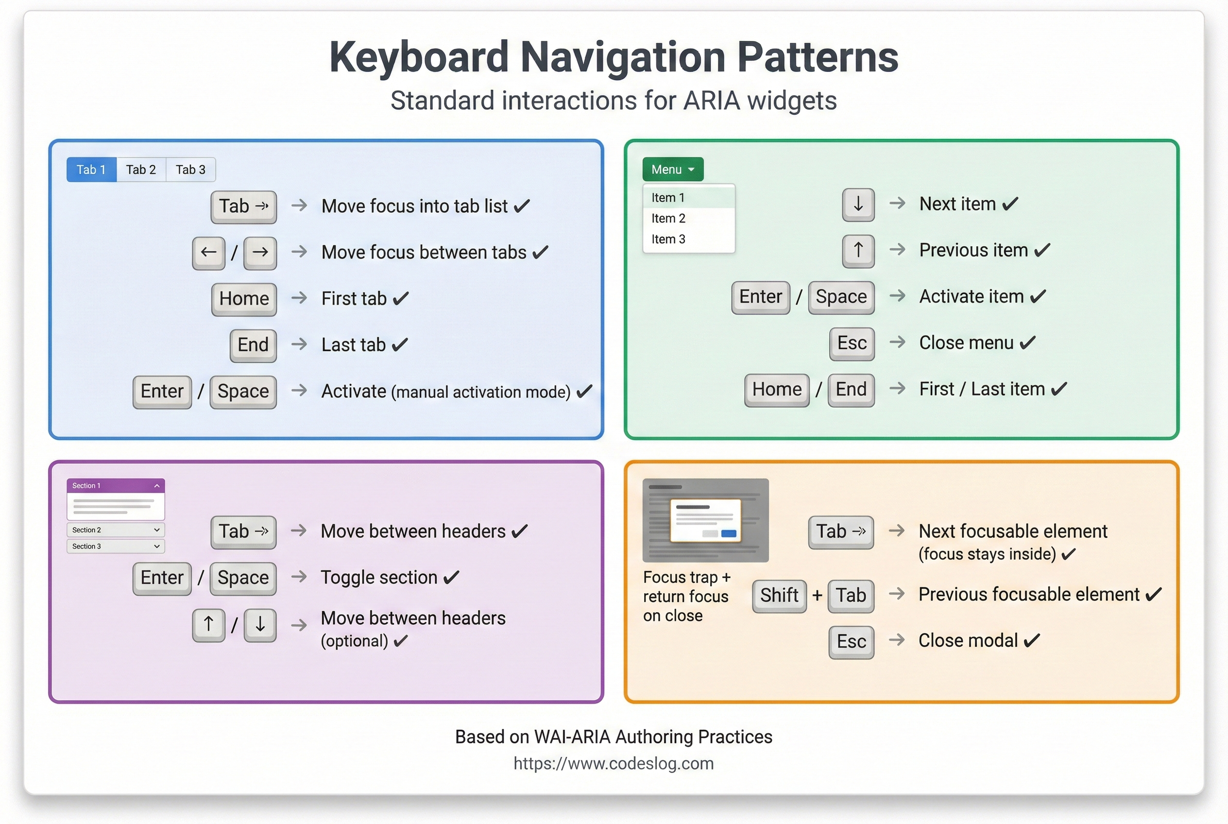
위젯별 키보드 조작 요약 · 제작: Nanobanana AI
7.1 role 사용 팁#
role은 시맨틱이 없는 요소에 의미를 부여하기 위한 장치입니다. 네이티브 요소에 role을 중복하면 혼란을 줄 수 있으니, “필요할 때만” 사용하는 것이 원칙입니다.
<!-- 1. 네이티브 엘리먼트에는 역할을 중복하지 않기 -->
<button>좋음</button>
<div role="button">필요할 때만 사용</div>

<!-- 2. 역할 변경보다 엘리먼트 교체가 나음 -->
<!-- ❌ 안 좋음 -->
<div id="button" role="button">클릭</div>
<script>
  document.getElementById('button').setAttribute('role', 'link');
</script>

<!-- ✅ 좋음 -->
<button>클릭</button>

<!-- 3. 복합 역할은 명시적으로 -->
<div role="tablist">
  <div role="tab">탭 1</div>
  <div role="tabpanel">콘텐츠 1</div>
</div>
7.2 ARIA와 CSS#
ARIA 상태를 스타일과 연결하면 시각적 상태와 접근성 상태를 일치시킬 수 있습니다. 예를 들어 aria-pressed="true"일 때 색상을 변경하면 사용자 경험이 더 일관됩니다.
/* ARIA 상태로 스타일링 - 접근성 정보와 시각 표현 동기화 */
button[aria-pressed="true"] {
  background-color: #4A90E2;
  color: white;
}

button[aria-pressed="false"] {
  background-color: #f0f0f0;
  color: #333;
}

/* 포커스 표시 */
[role="button"]:focus {
  outline: 3px solid #4A90E2;
  outline-offset: 2px;
}

/* 라이브 리전 변경 시각화 (선택사항) */
[aria-live="polite"] {
  border-left: 3px solid #27AE60;
  padding-left: 0.5rem;
}

/* 숨겨진 탭 스타일 */
[role="tabpanel"][hidden] {
  display: none;
}
7.3 성능 고려사항#
라이브 리전은 작은 변경에도 큰 읽기 비용이 발생할 수 있습니다. 한 번에 많은 업데이트를 넣거나 과도하게 메시지를 누적하면 성능과 사용자 경험이 모두 나빠집니다. 가능한 배치 처리와 최신 상태 유지 전략을 쓰세요.
// ❌ 나쁜 예: 모든 변경사항을 aria-live에 추가
const notifications = document.getElementById('notifications');
for (let i = 0; i < 1000; i++) {
  notifications.innerHTML += `<p>알림 ${i}</p>`;
}

// ✅ 좋은 예: 배치 업데이트
const notifications = document.getElementById('notifications');
const fragment = document.createDocumentFragment();
for (let i = 0; i < 1000; i++) {
  const p = document.createElement('p');
  p.textContent = `알림 ${i}`;
  fragment.appendChild(p);
}
notifications.appendChild(fragment);

// ✅ 좋은 예: 최신 메시지만 유지
const notification = document.getElementById('notification');
function showNotification(message) {
  notification.innerHTML = message;
  // 5초 후 제거
  setTimeout(() => {
    notification.innerHTML = '';
  }, 5000);
}
8. 실제 프로젝트에서의 ARIA#
8.1 라이브러리와 프레임워크#
많은 현대적 프레임워크가 ARIA 지원을 내장하고 있어요:
// React 예제
function Tabs() {
  const [selected, setSelected] = useState(0);

  return (
    <div role="tablist">
      {tabs.map((tab, i) => (
        <button
          key={i}
          role="tab"
          aria-selected={i === selected}
          aria-controls={`panel-${i}`}
          onClick={() => setSelected(i)}
        >
          {tab.label}
        </button>
      ))}
      {tabs.map((tab, i) => (
        <div
          key={i}
          id={`panel-${i}`}
          role="tabpanel"
          aria-labelledby={`tab-${i}`}
          hidden={i !== selected}
        >
          {tab.content}
        </div>
      ))}
    </div>
  );
}
8.2 ARIA 패턴 라이브러리#
WAI-ARIA Authoring Practices는 공식 패턴 모음입니다. 바퀴를 다시 발명하지 말고 검증된 패턴을 참고하세요:
- 버튼, 링크 패턴
- 폼 입력 패턴
- 네비게이션 패턴
- 탭, 아코디언, 메뉴
- 다이얼로그, 알럿 박스
- 그리드, 테이블 패턴
결론#
ARIA는 강력한 도구지만, 책임감 있게 사용해야 합니다. 몇 가지만 기억해주세요:
- 먼저 시맨틱 HTML 사용: HTML의 기본 기능을 최대한 활용하세요
- HTML이 부족할 때만 ARIA 추가: 꼭 필요한 곳에만 사용하세요
- 키보드 네비게이션 필수: 모든 기능이 키보드만으로 작동해야 합니다
- 스크린 리더로 테스트: 실제 사용자 경험을 확인하세요
- 포커스 관리와 상태 추적: 동적 변화를 사용자에게 알려주세요
접근 가능한 인터페이스는 모든 사용자에게 더 좋은 경험을 제공합니다. ARIA를 올바르게 사용하면 보조 기술 사용자뿐만 아니라 모든 사용자가 이익을 얻을 수 있어요.